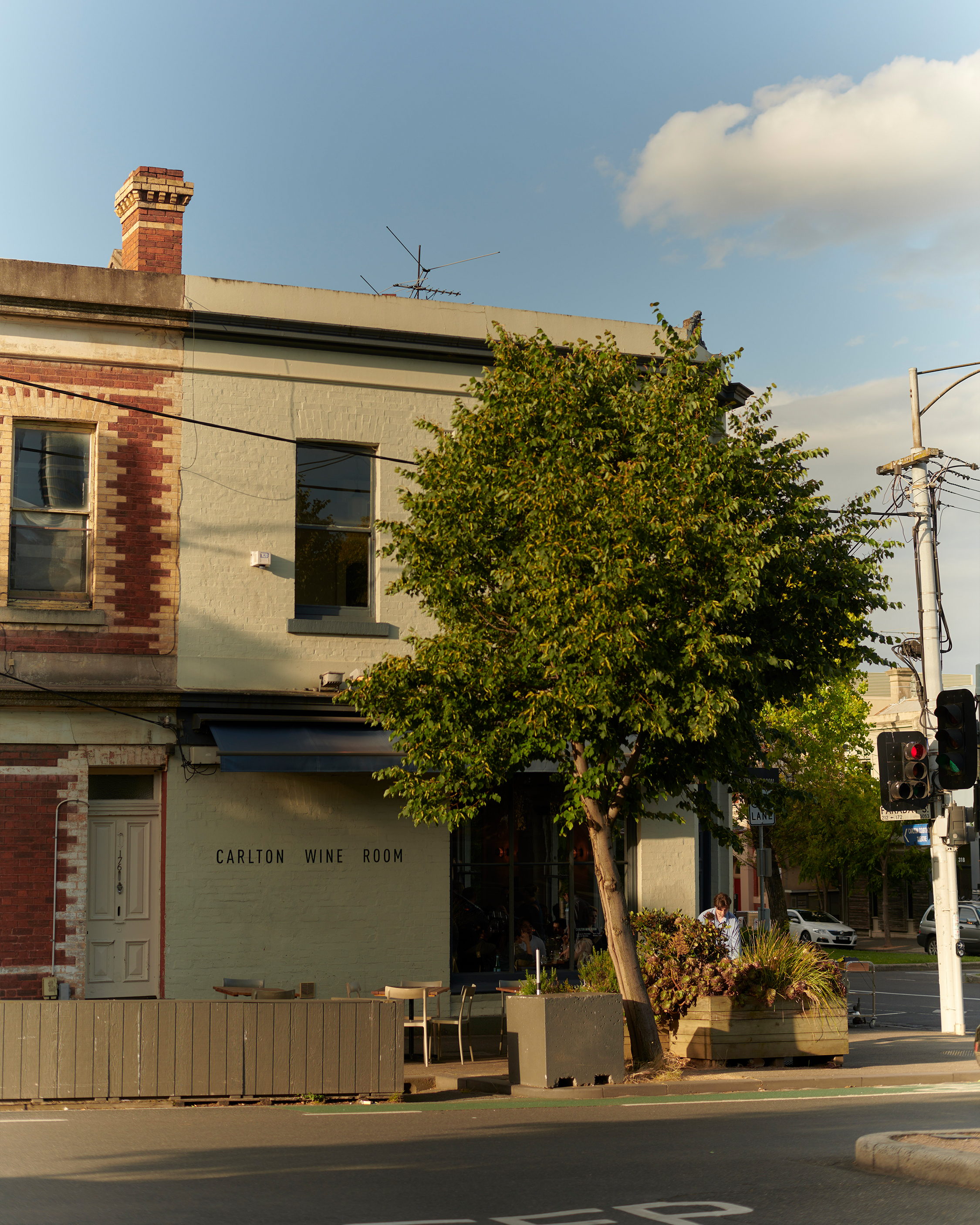
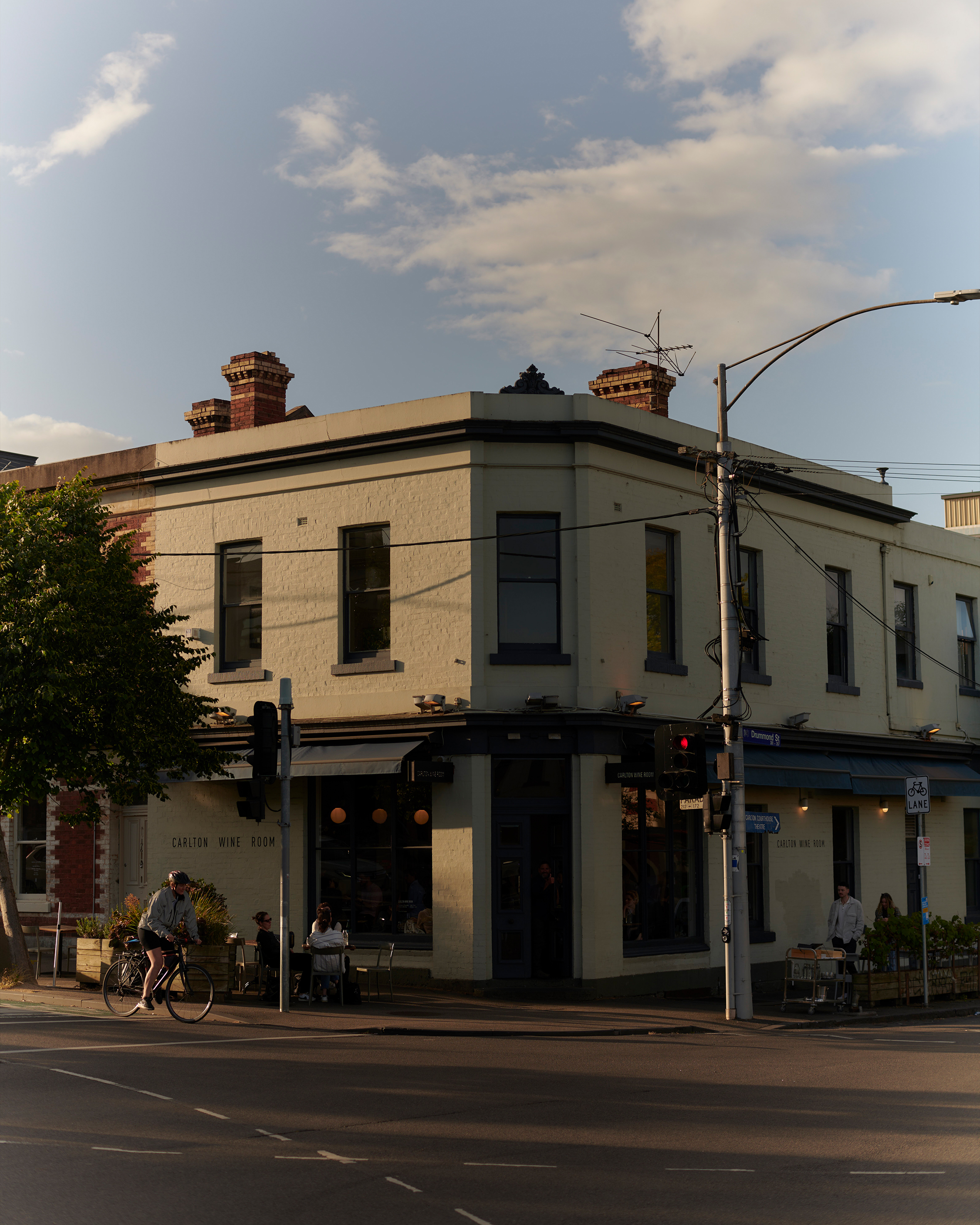
Carlton Wine Room approached us with a clear brief: refine their visual identity and bring greater cohesion to their print materials. With wine at the core of their offering, we sought to build a tactile, ownable system that reflected both the sophistication and informality of their experience.
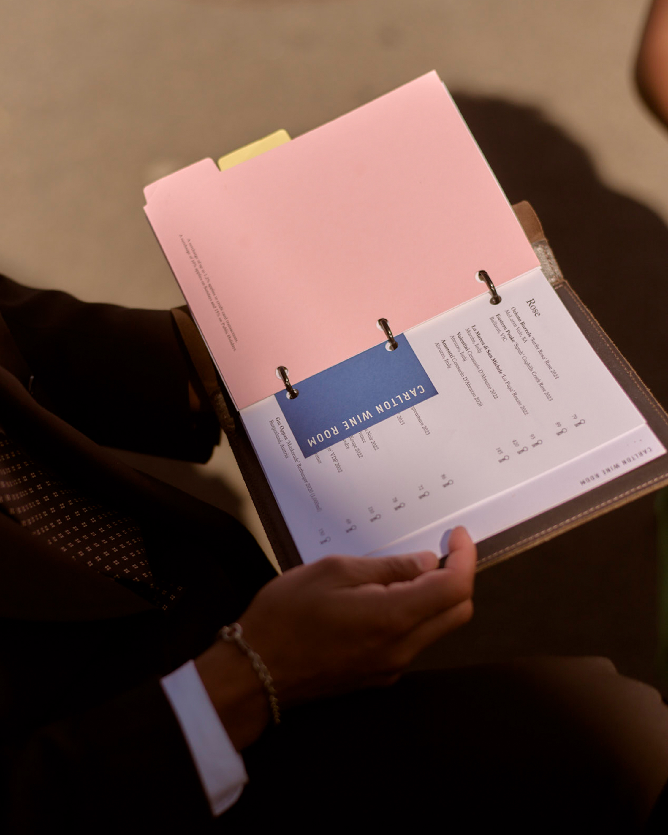
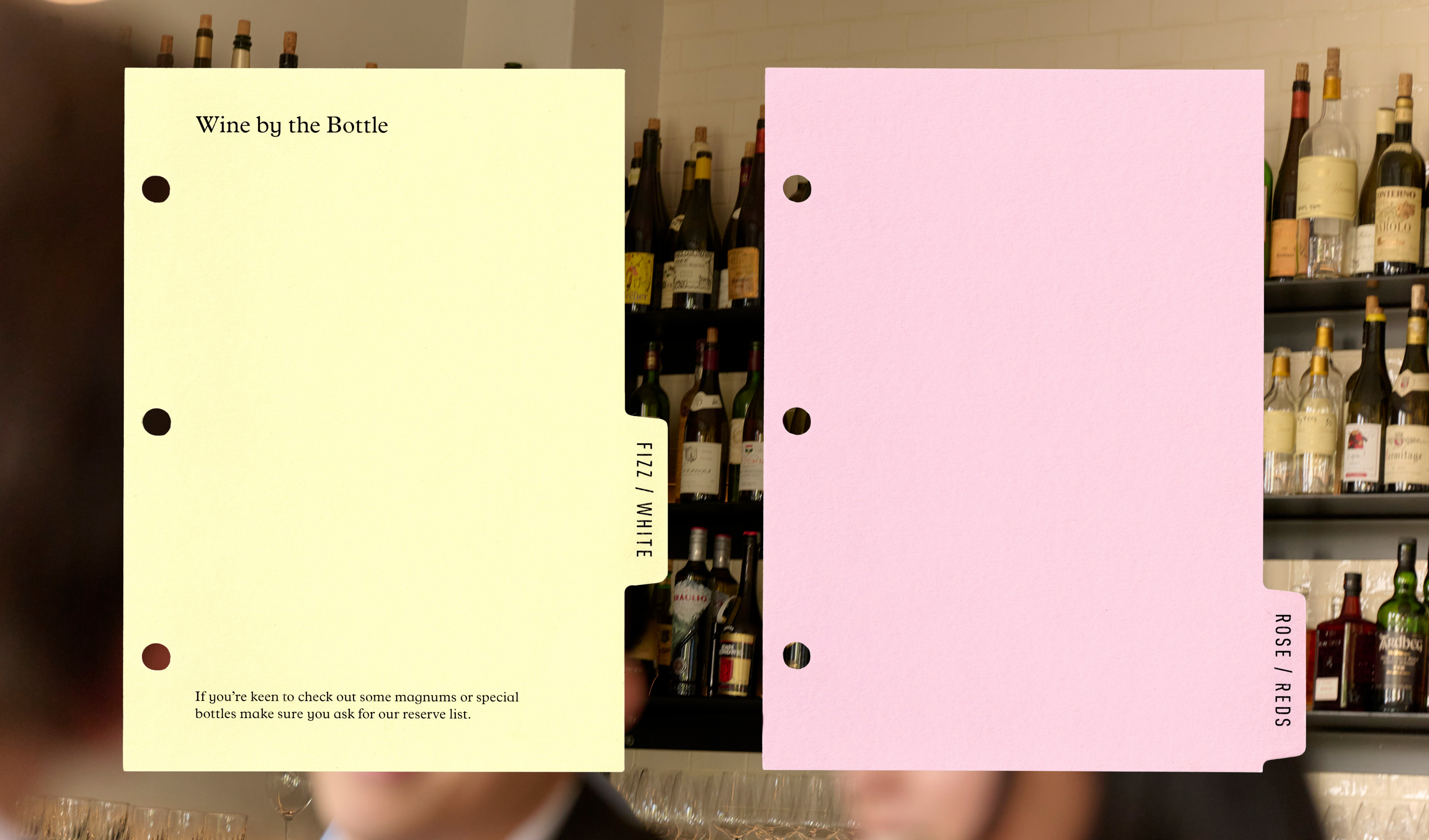
The solution was a unified design system anchored by a single idea. Wine as the central organising principle. Every printed element, from business card to wine list to food menu, shares a signature diecut. Together, they stack and file like a modern day Rolodex. It is an indexical design gesture that is both playful and precise, referencing cellar records and the ritual of wine cataloguing.
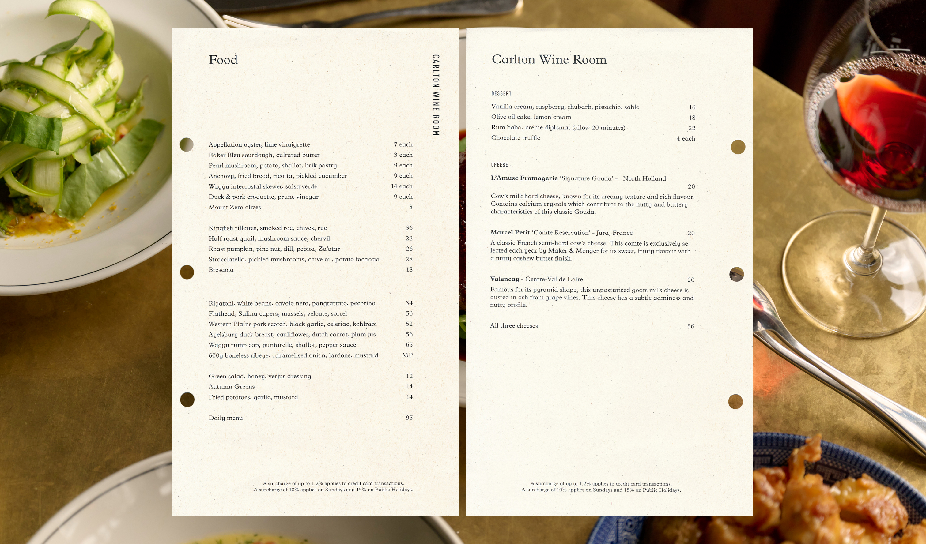
The refreshed identity leans on restraint and quiet detail. Typography is clean and contemporary, with subtle quirks that give character without overpowering. Print materials are grounded in a tactile sensibility using thick textural stocks and rich muted tones that evoke a nostalgic warmth and depth.
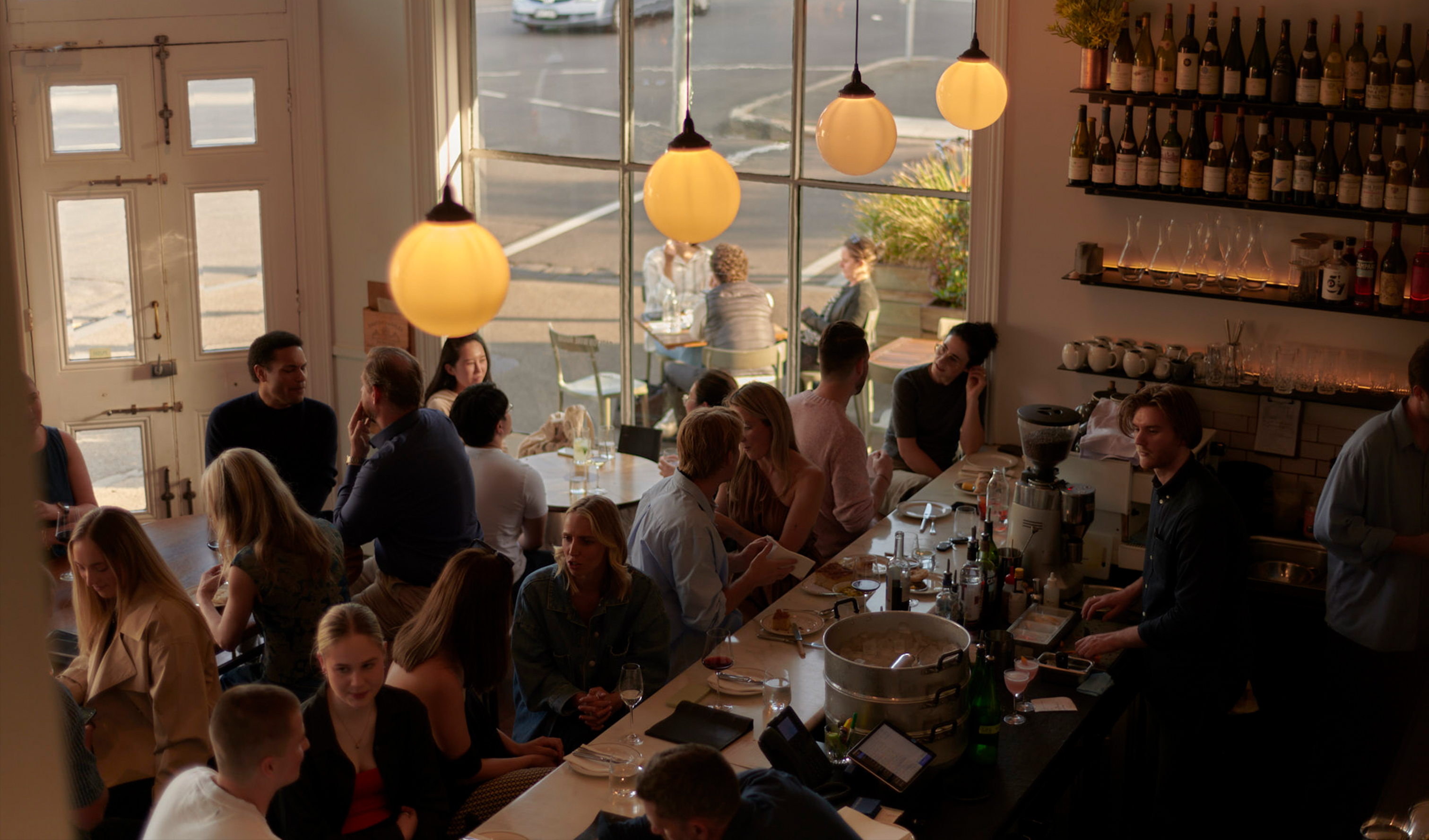
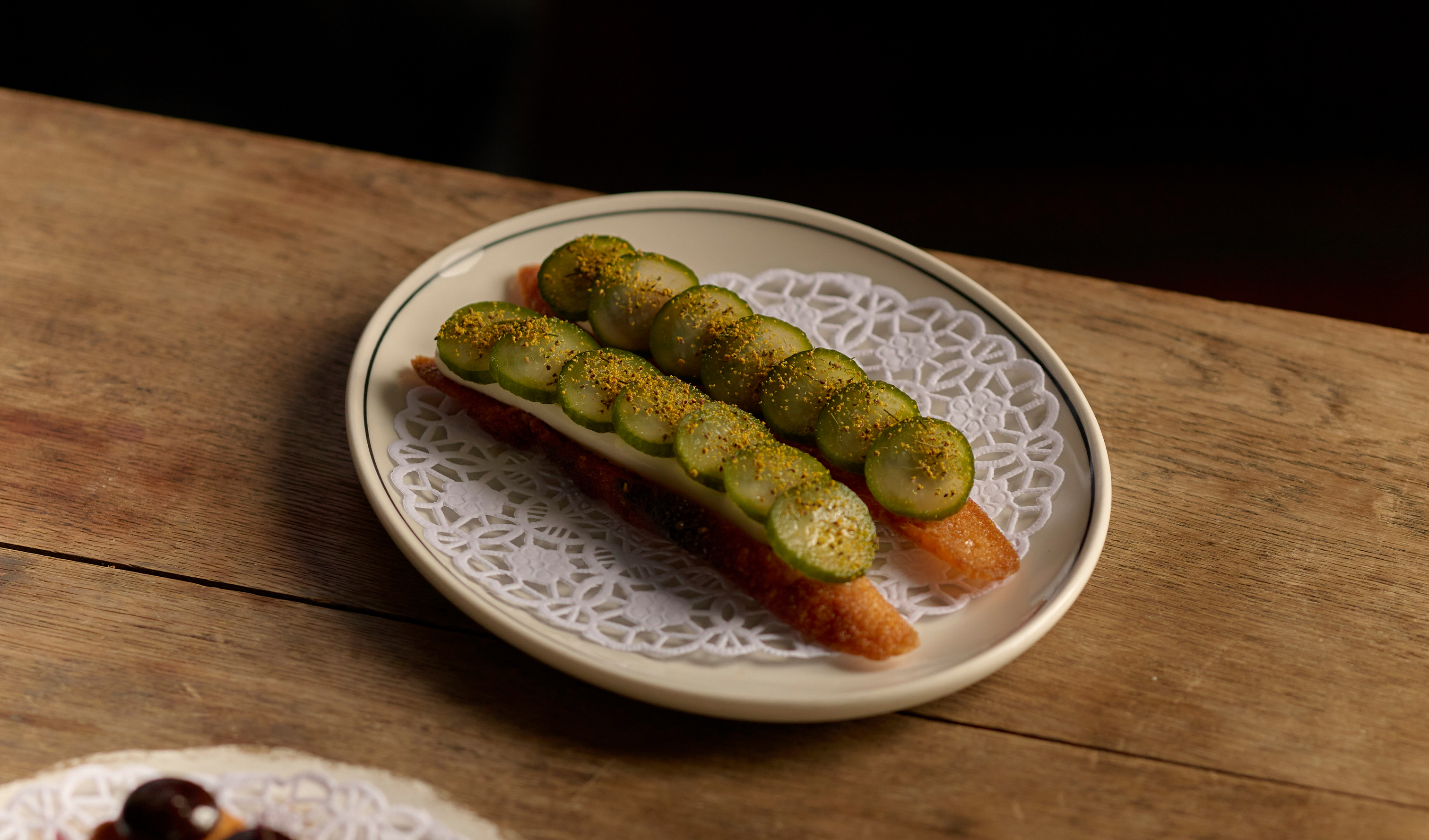
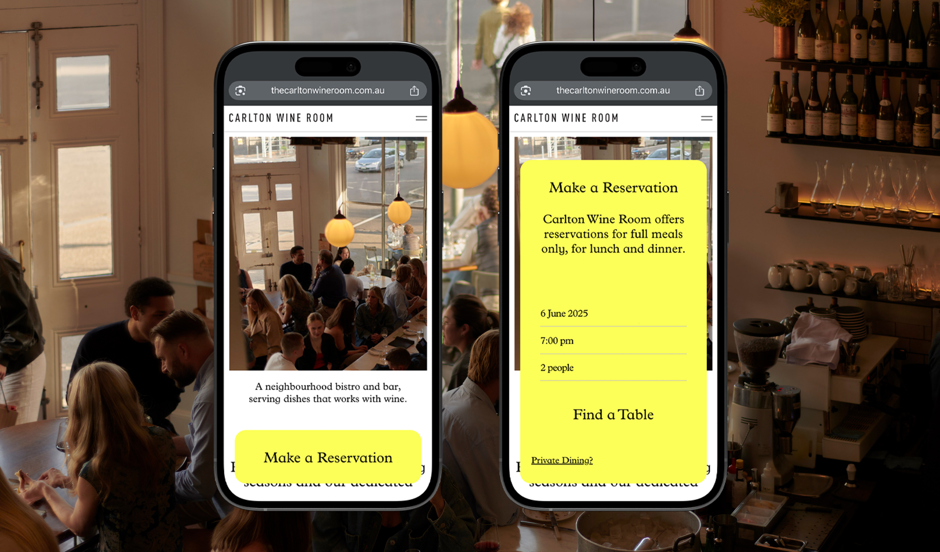
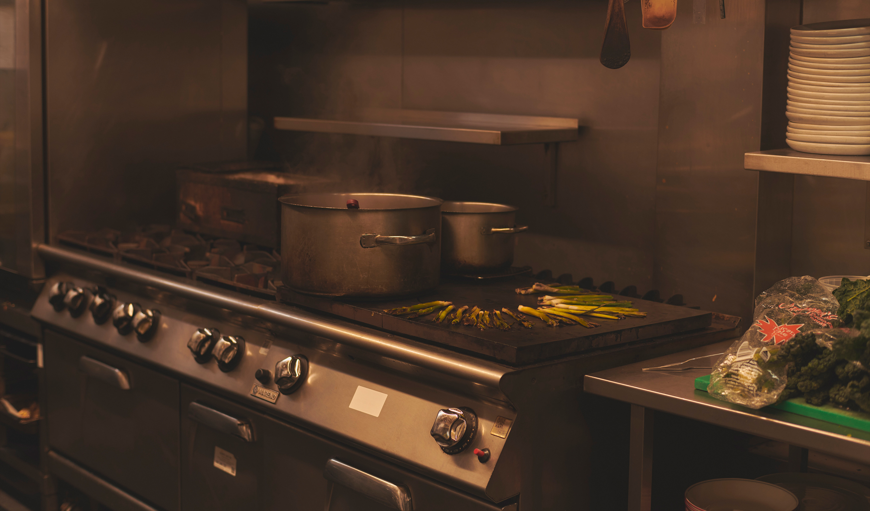
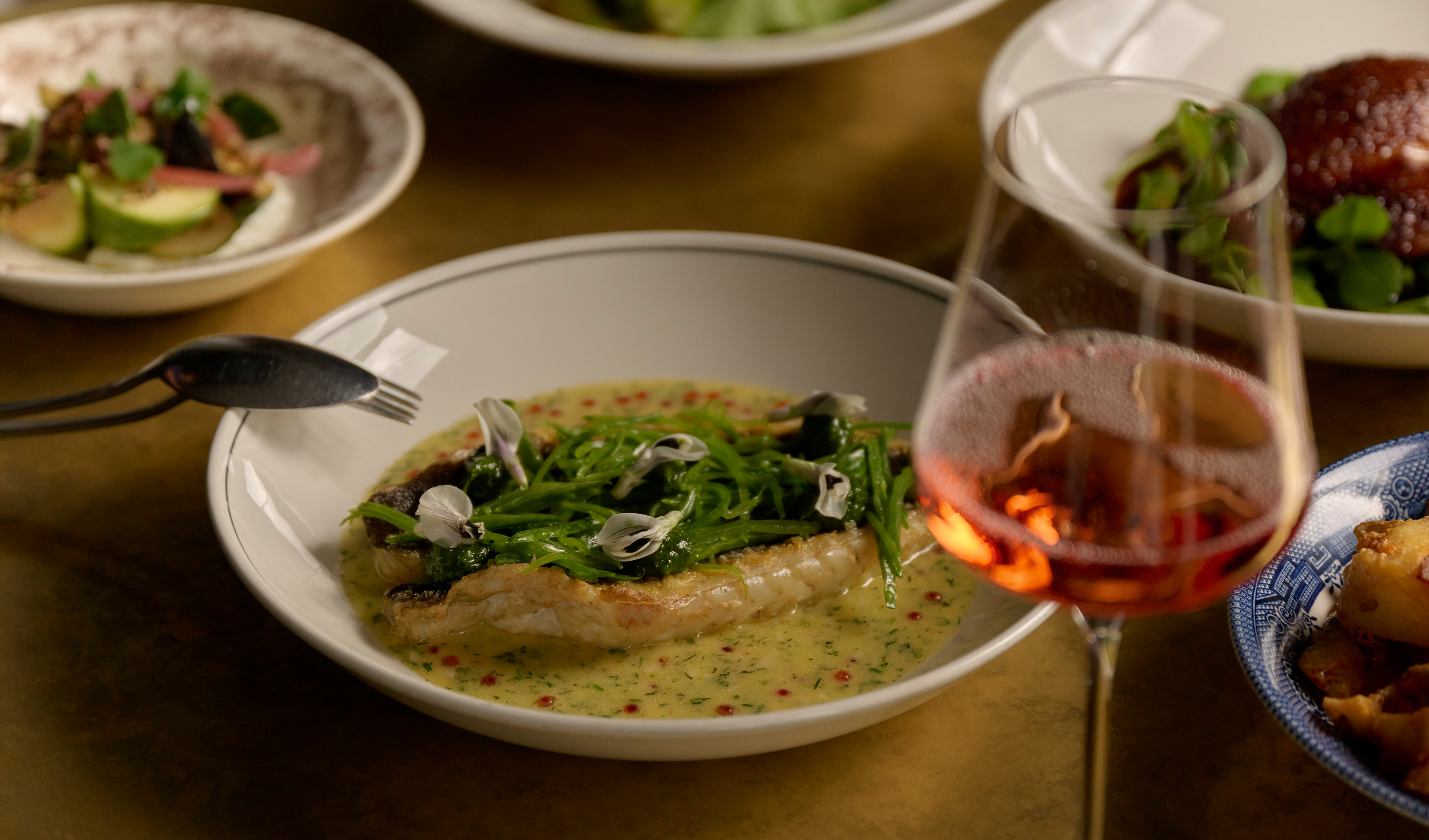
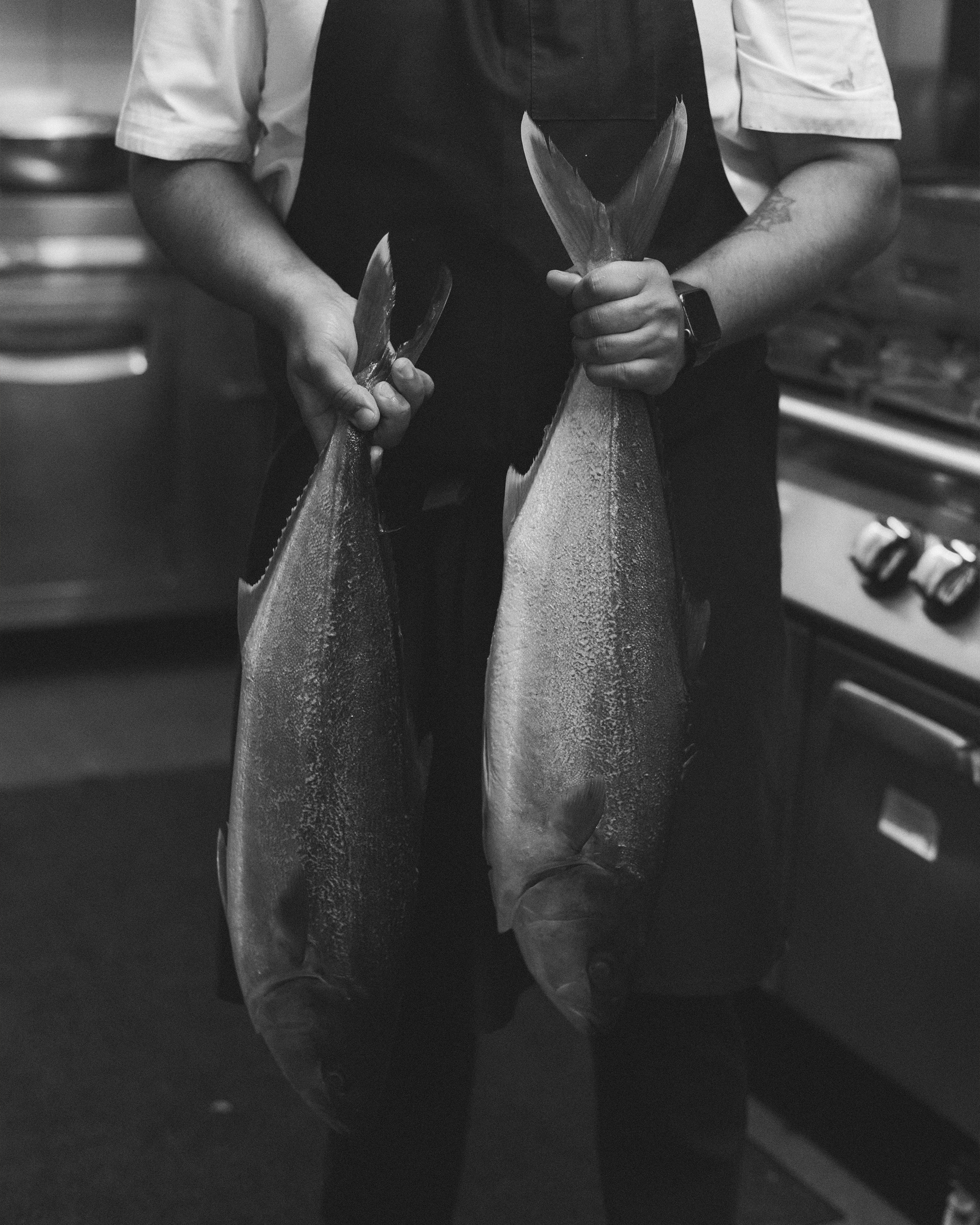
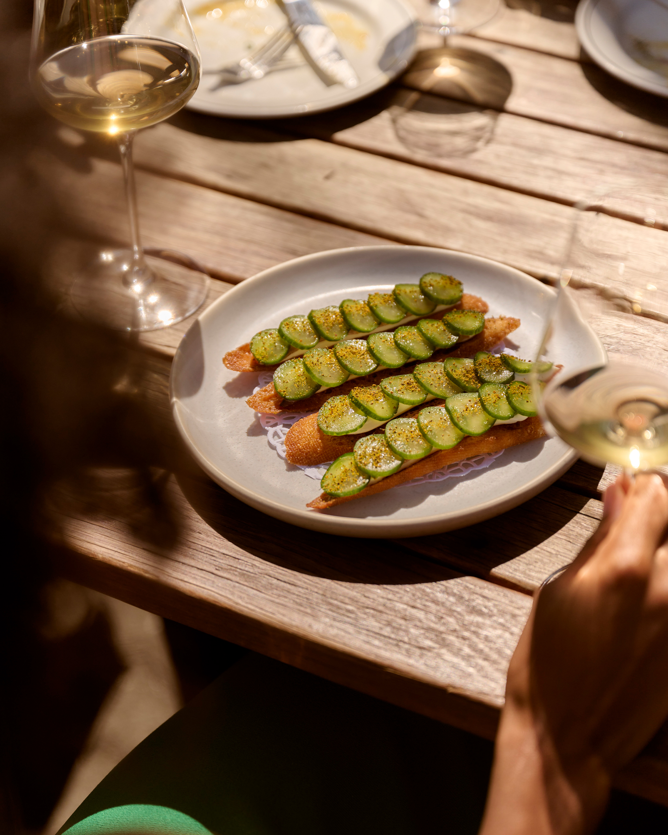
We rolled the identity out across all brand touchpoints. In print, the system was applied rigorously to all guest facing and internal collateral. Online, we translated the same clarity and structure to the web experience. Through art direction, we ensured that photography and styling echoed the same balance of intimacy and refinement. This multichannel approach helped create a brand that feels curated but never cold.