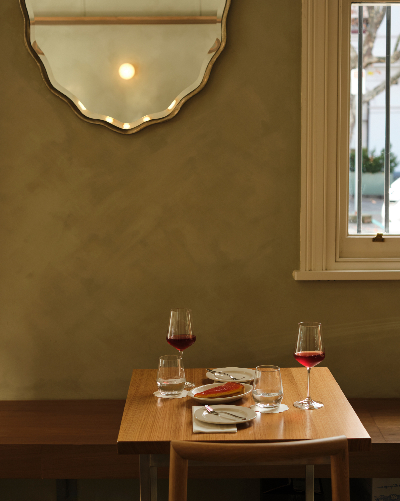
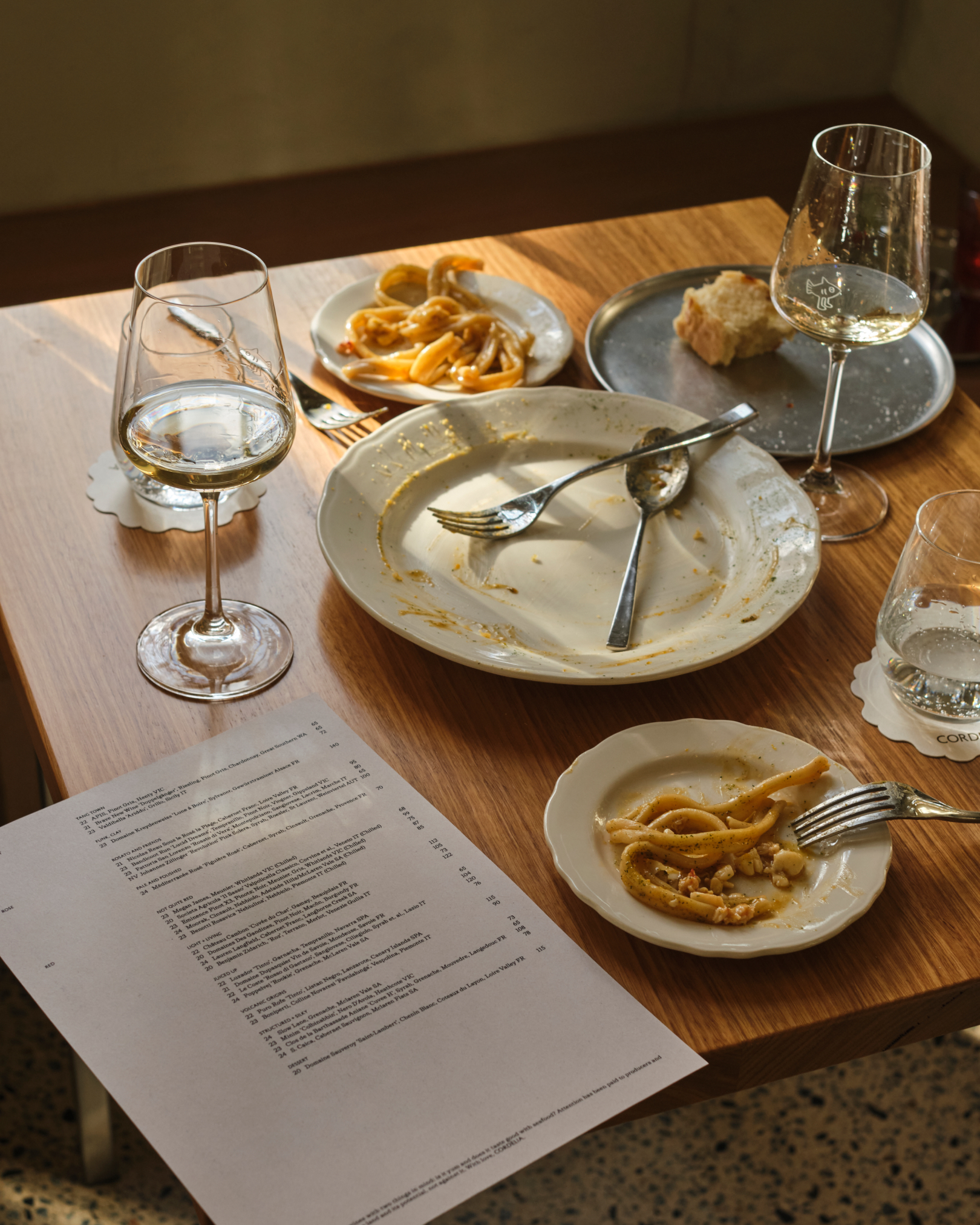
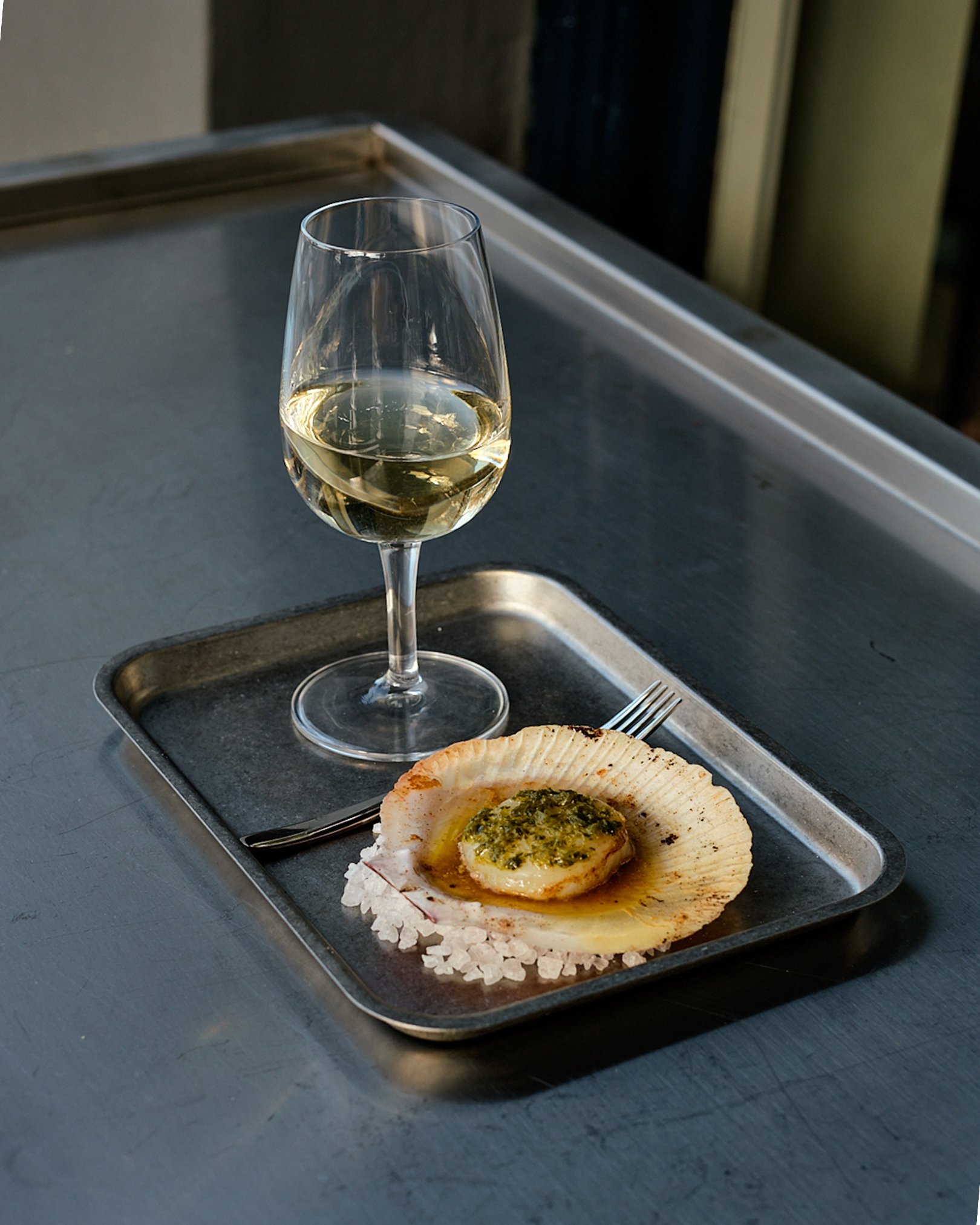
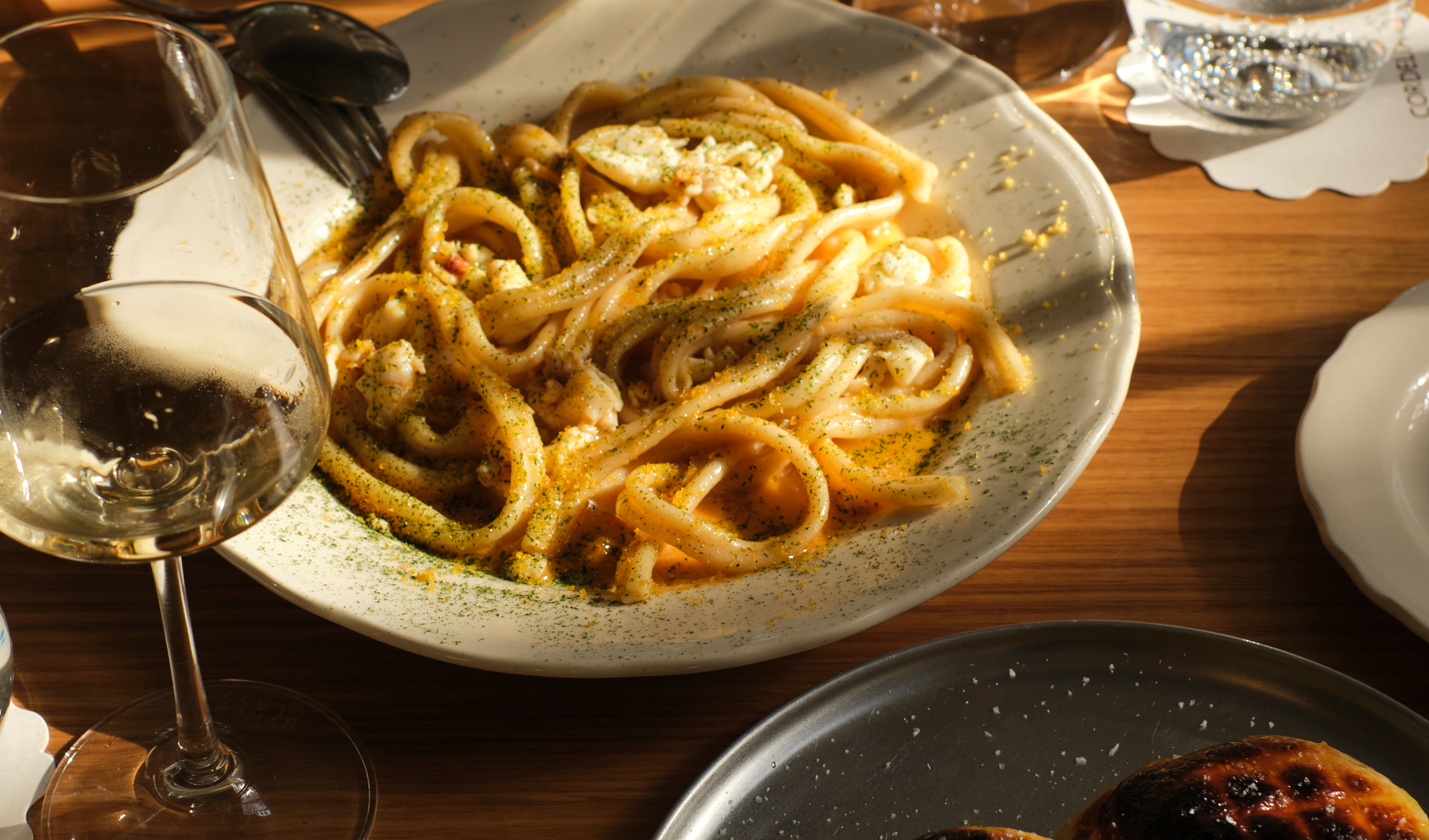
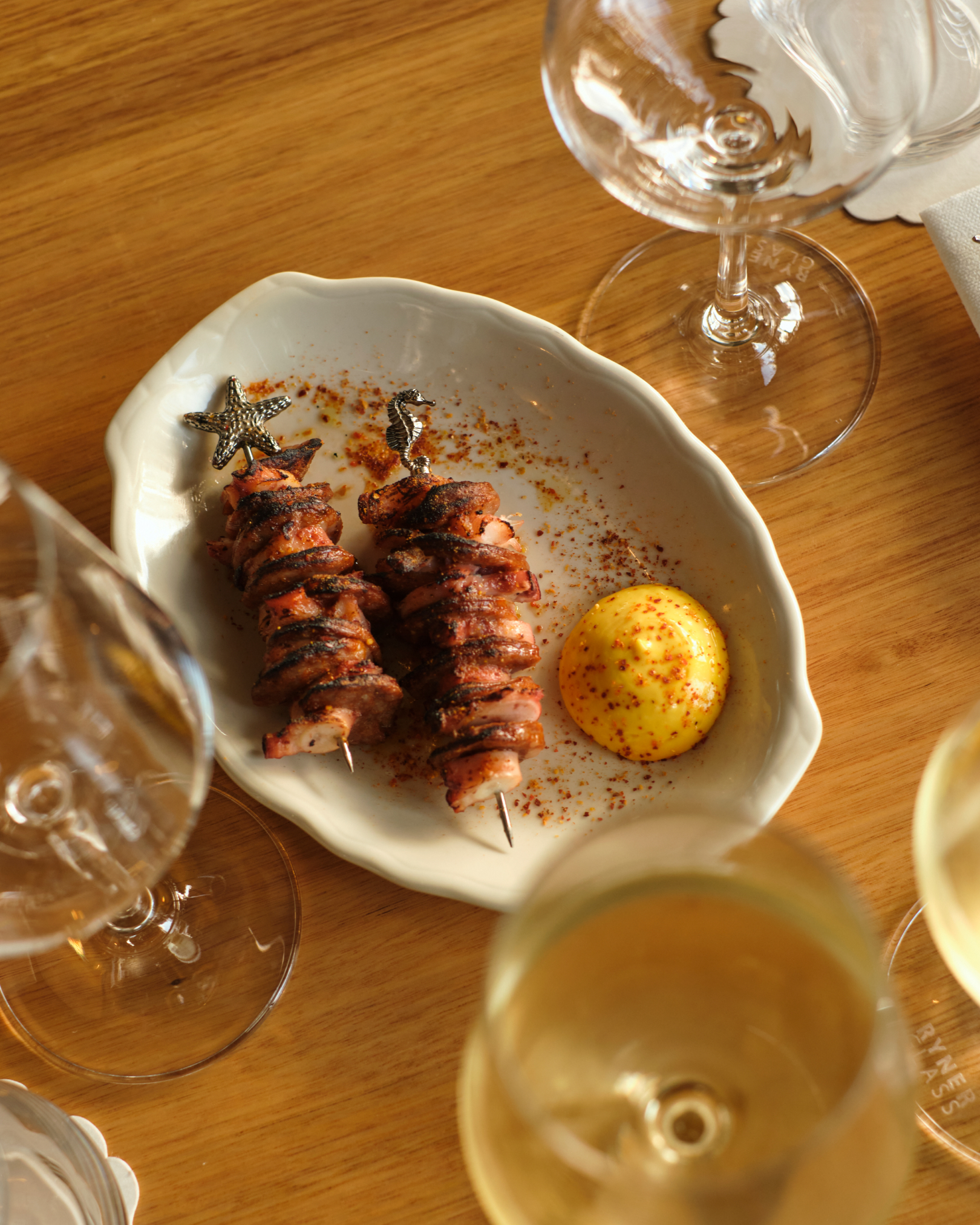
Building on their first wine bar, the Don’s family have opened a second venue: a restaurant grounded in the same serious-but-relaxed ethos. Simple, honest food. Genuine hospitality. All delivered with love.
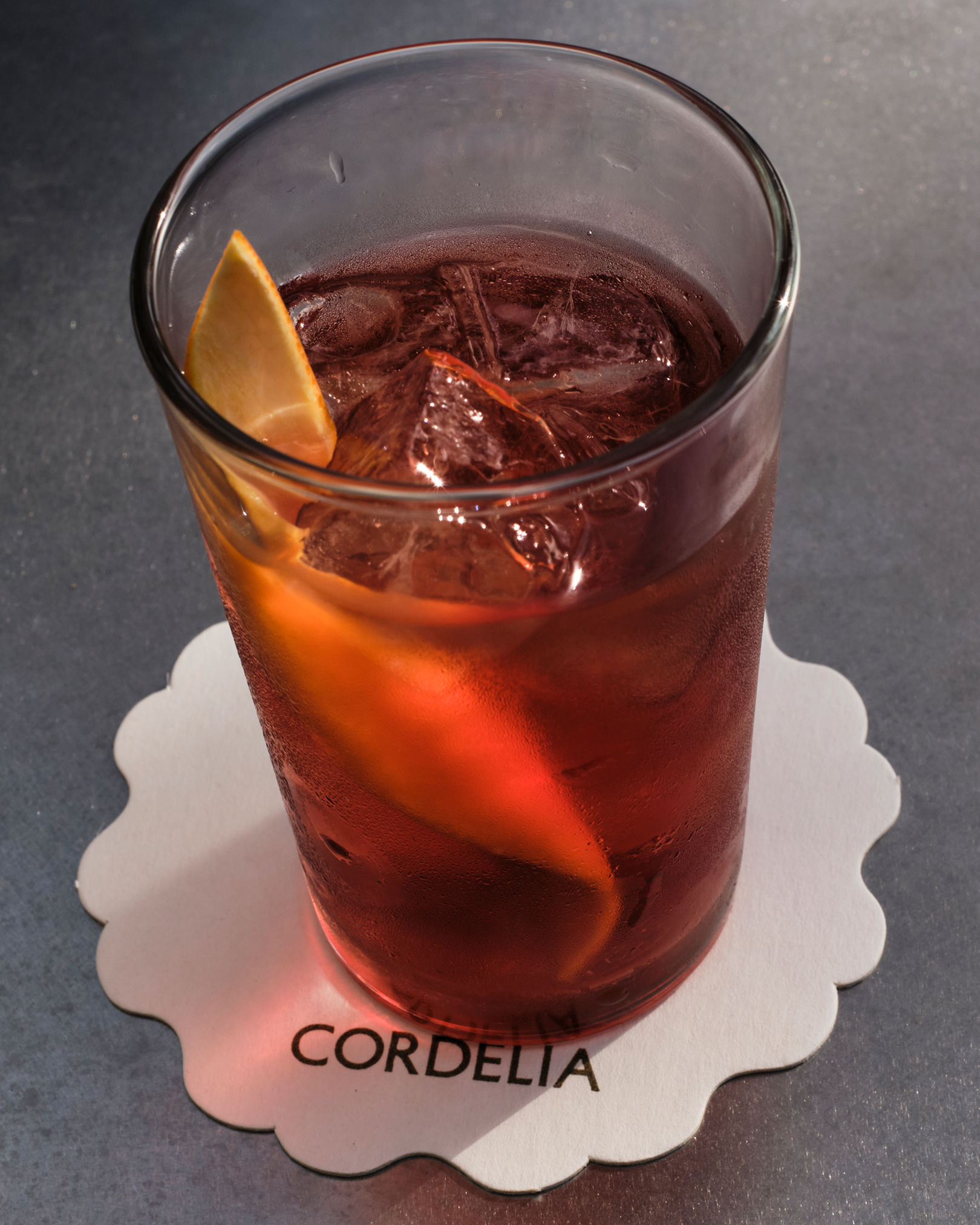
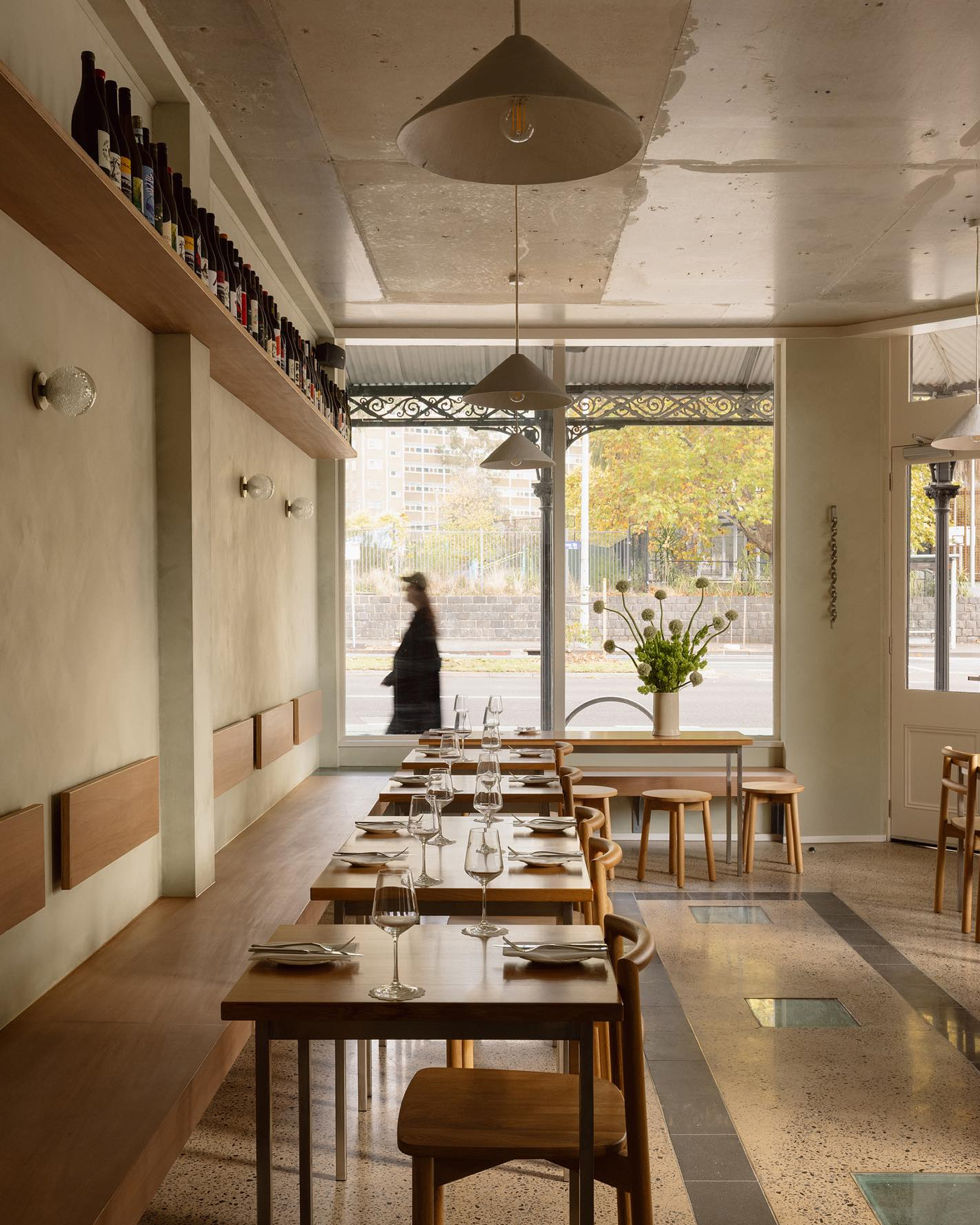
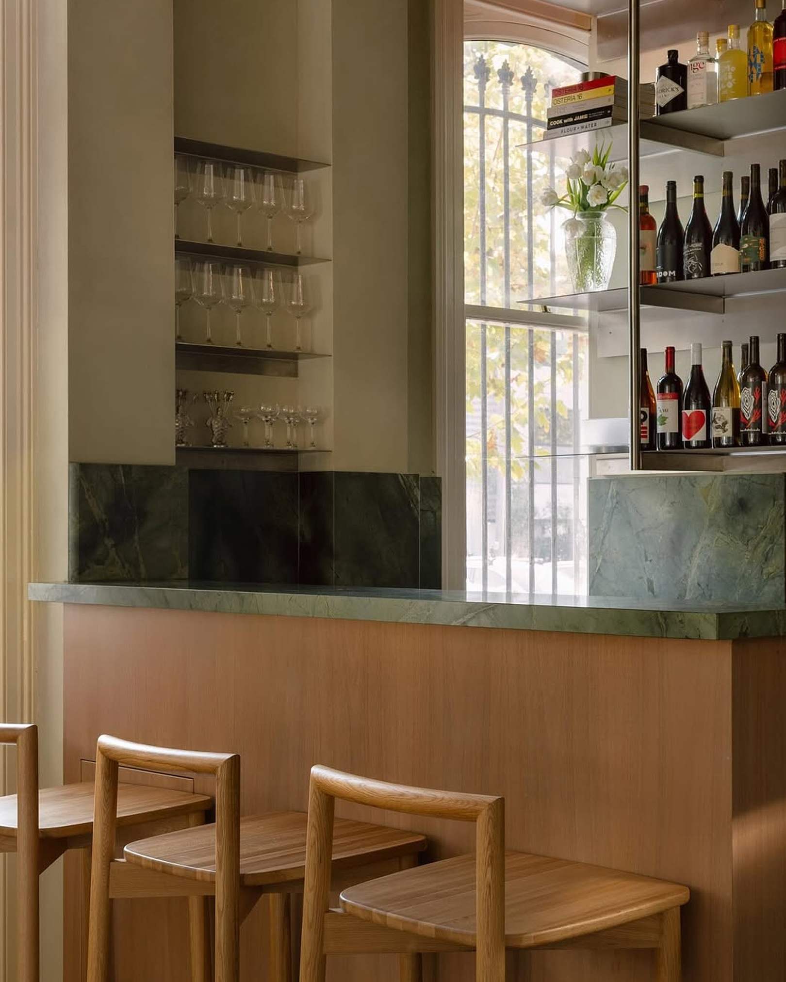
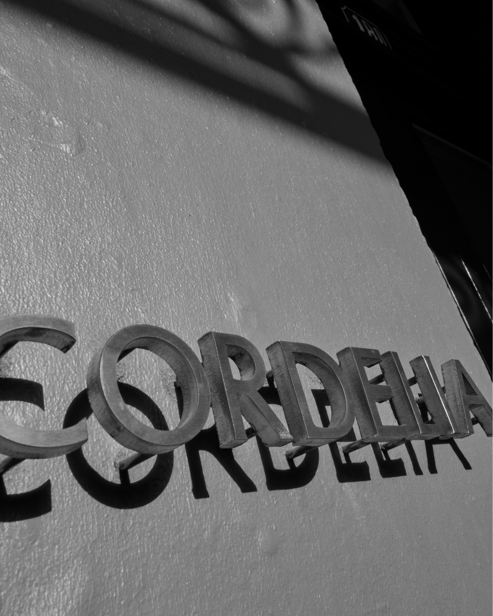
The name Cordelia, meaning “heart of the sea,” speaks to both the seafood-leaning menu and the venue’s emotional undercurrent. Designed by Studio Kae, the venue carries a quiet warmth and understated grace – elegant, but never exclusive. The visual identity mirrors this feeling. The high-contrast forms of the Petit Serif wordmark strike a balance between structure and softness. Bold, yet welcoming.
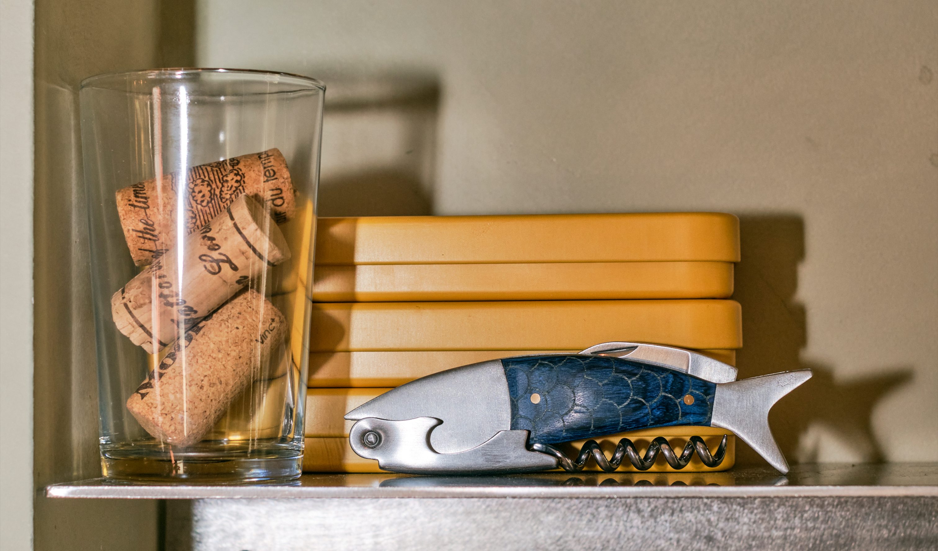
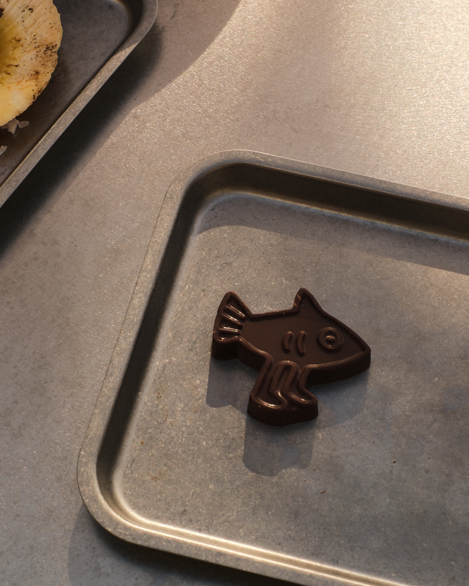
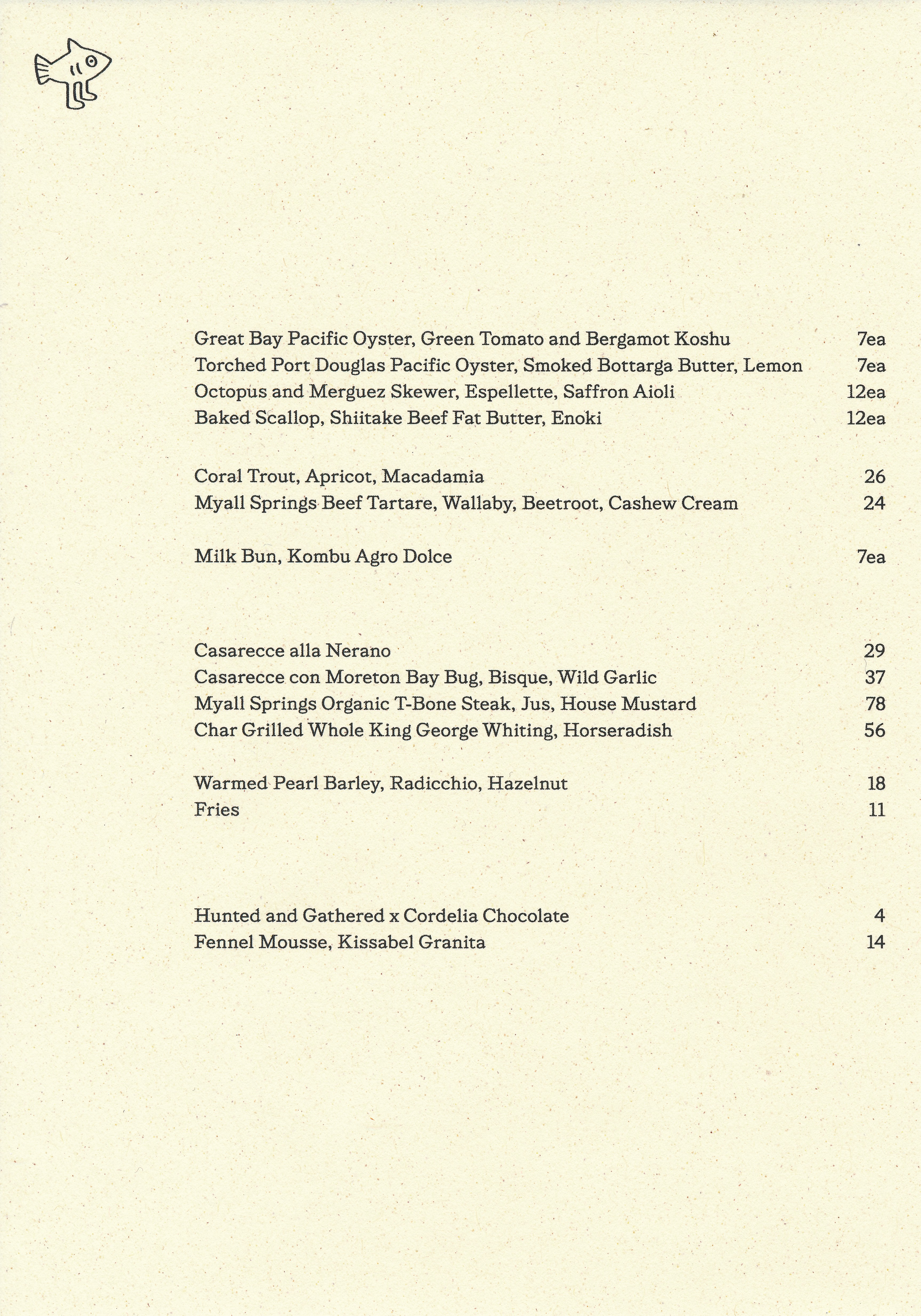
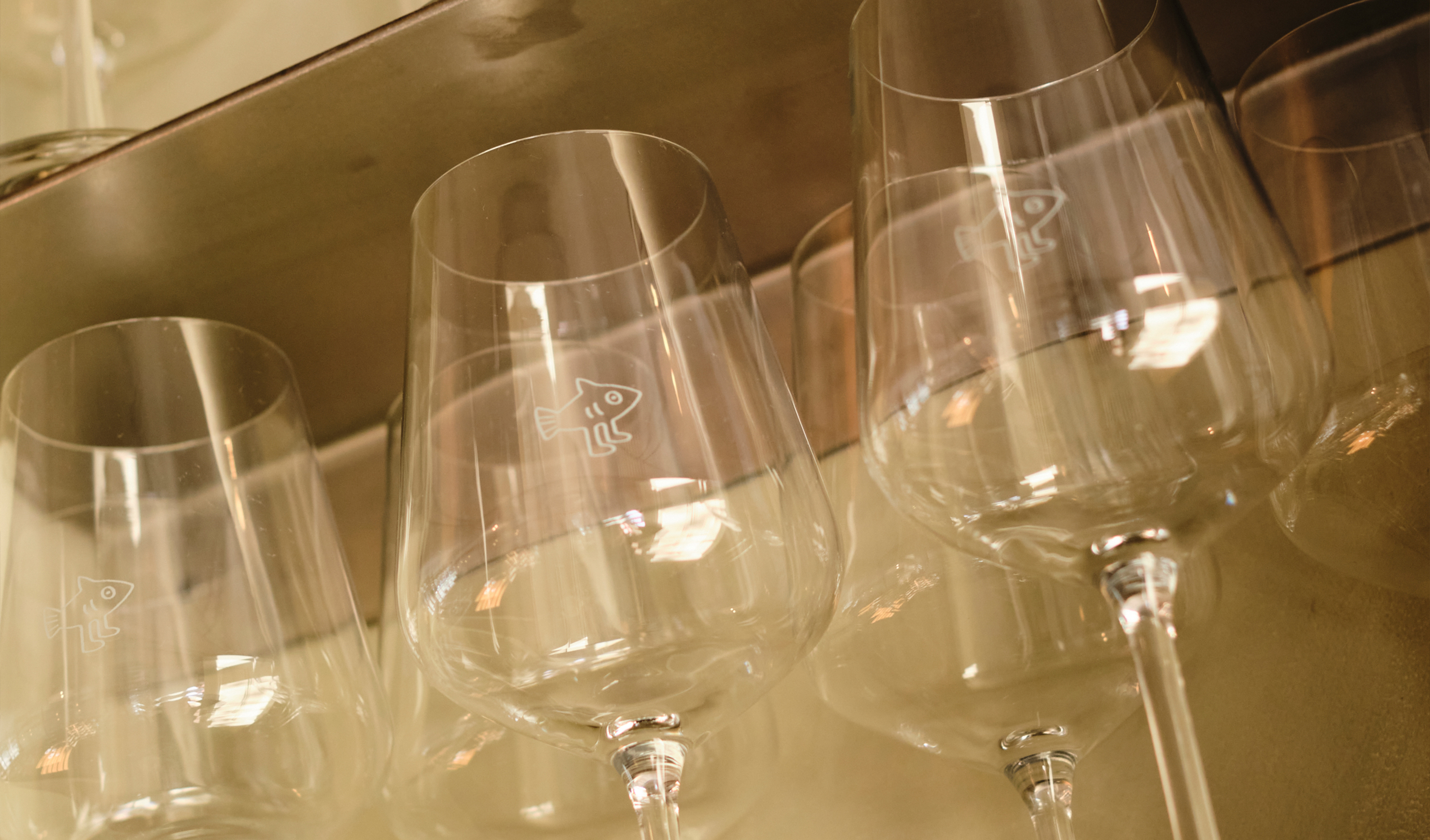
This poise is gently offset by their mascot of sorts: a fish out of water, in the best possible way. Absurd, endearing, and open to interpretation, it captures Cordelia’s charm. A moment of wonder and a reminder that the restaurant doesn’t take itself too seriously.
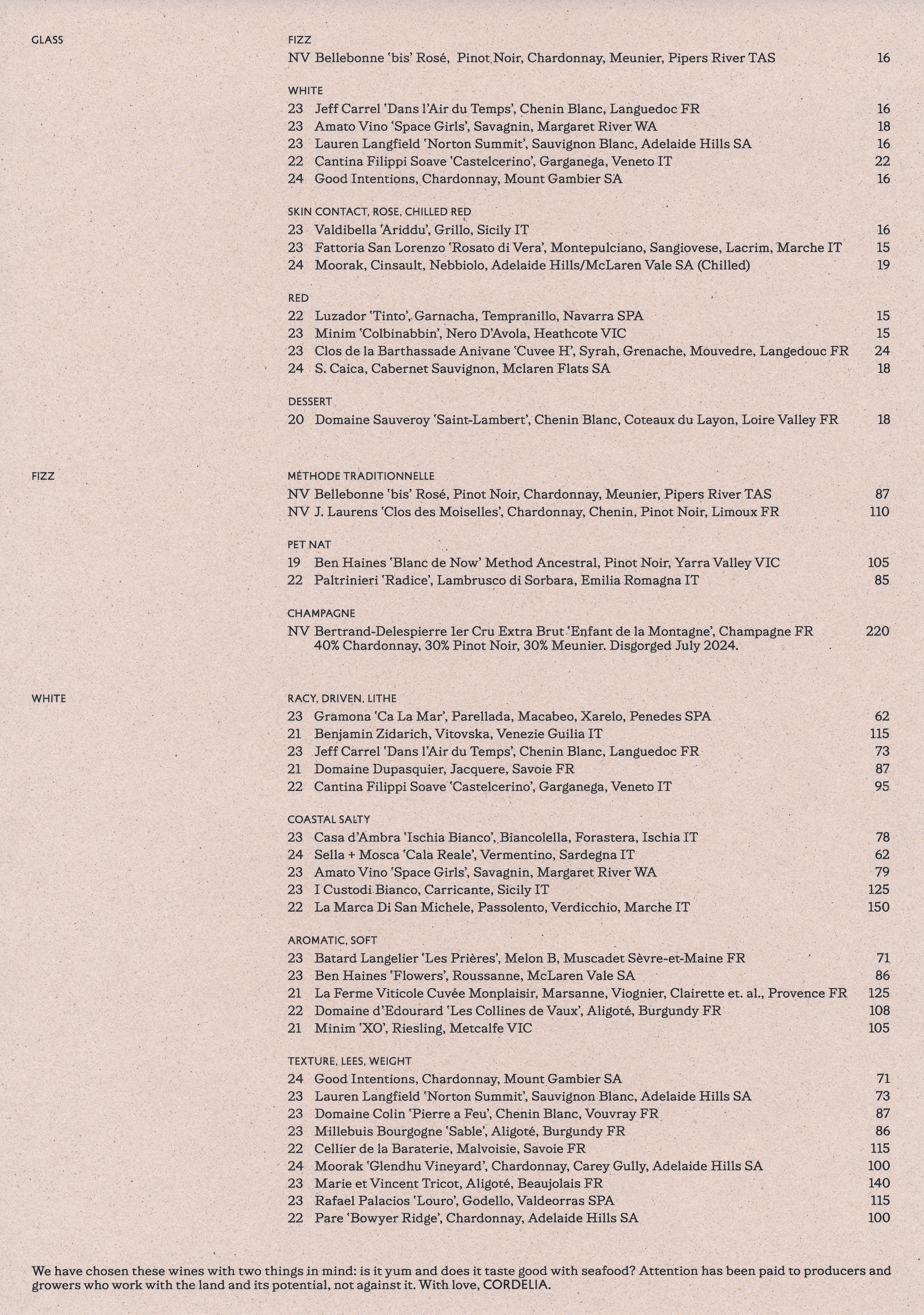
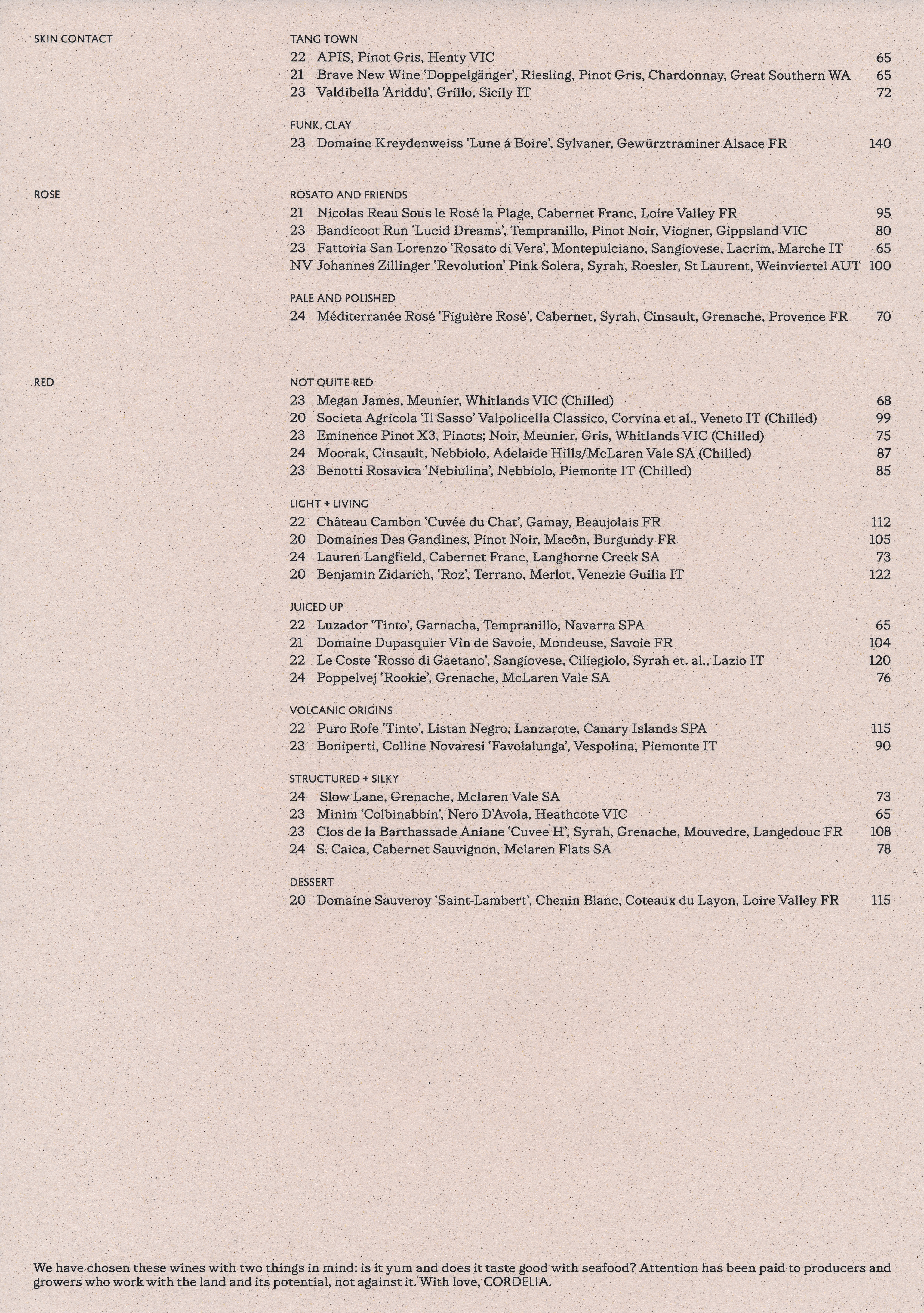
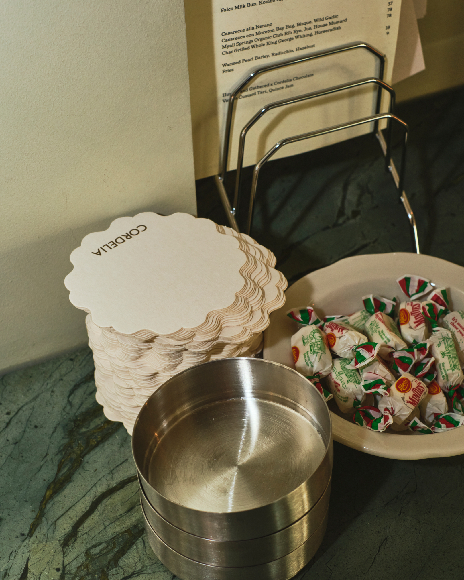
Cohesion and restraint guide the design system. A single typeface, generous negative space, and deliberate pacing allow the identity to sit lightly across menus, signage, and in-venue collateral. Each touchpoint supports the food, the wine, and an atmosphere of calm, understated elegance.