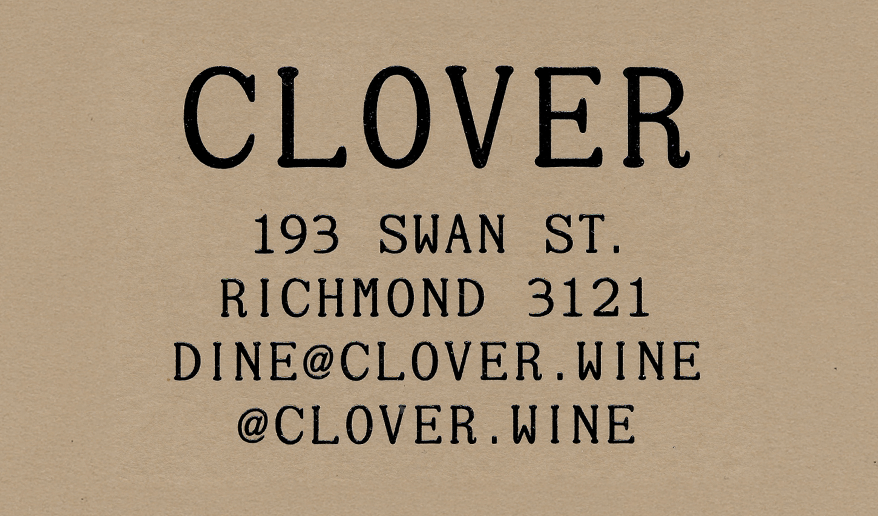
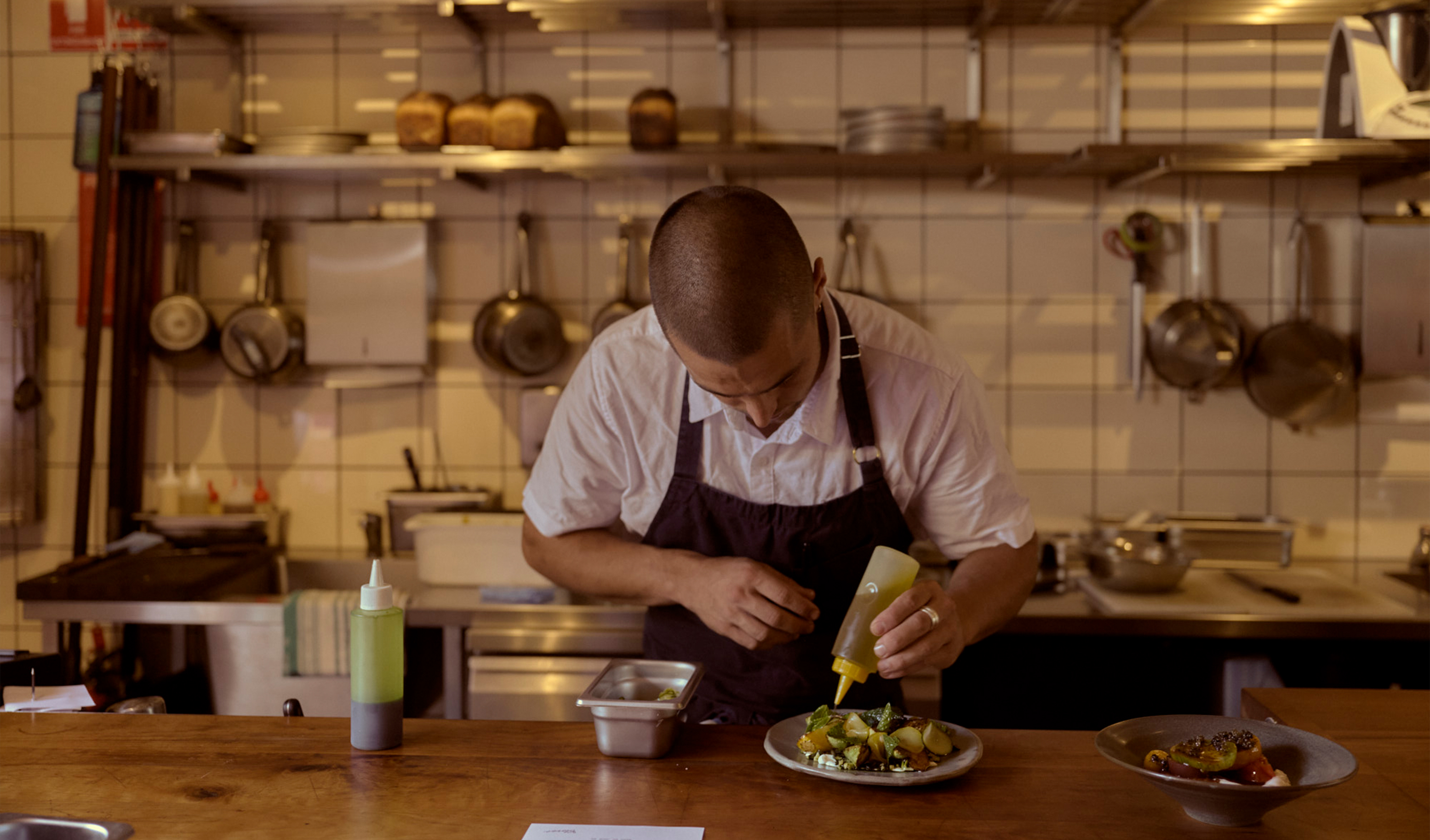
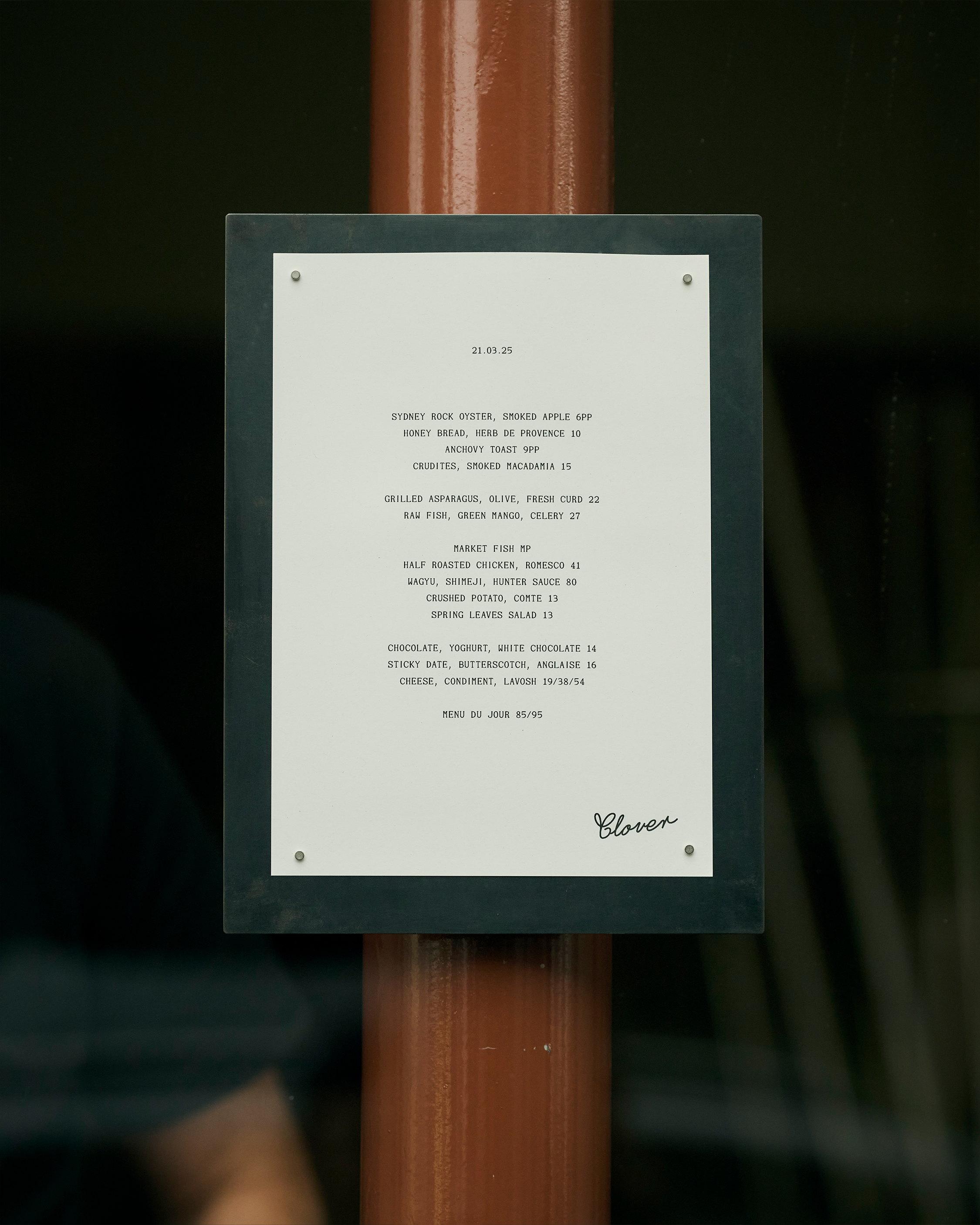
Tucked into the heart of Richmond, Clover is a modern bistro and wine bar celebrating the raw beauty of food cooked solely over fire. The vision was simple: bring an elevated, produce-led offering to the area.
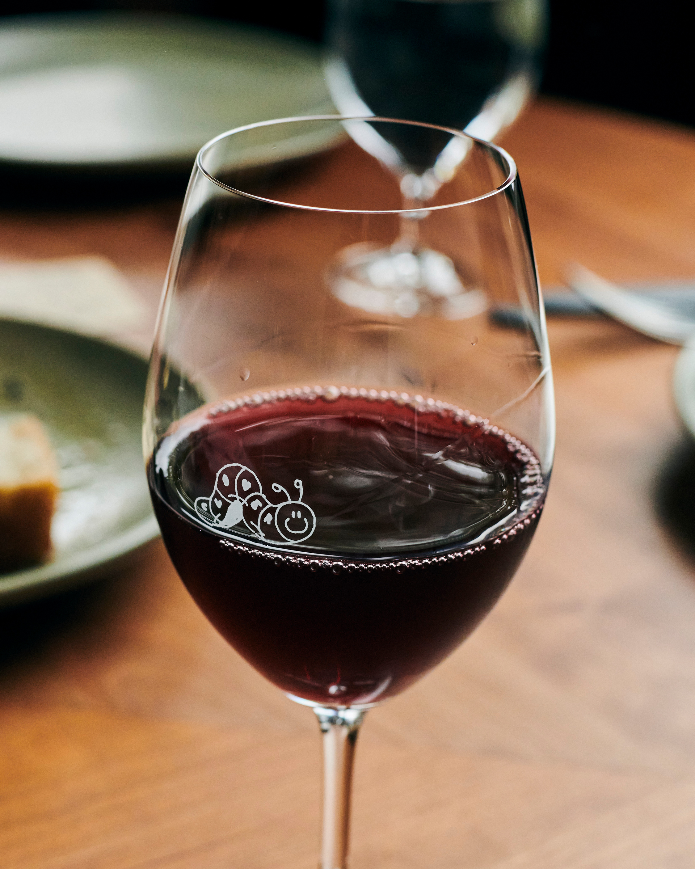
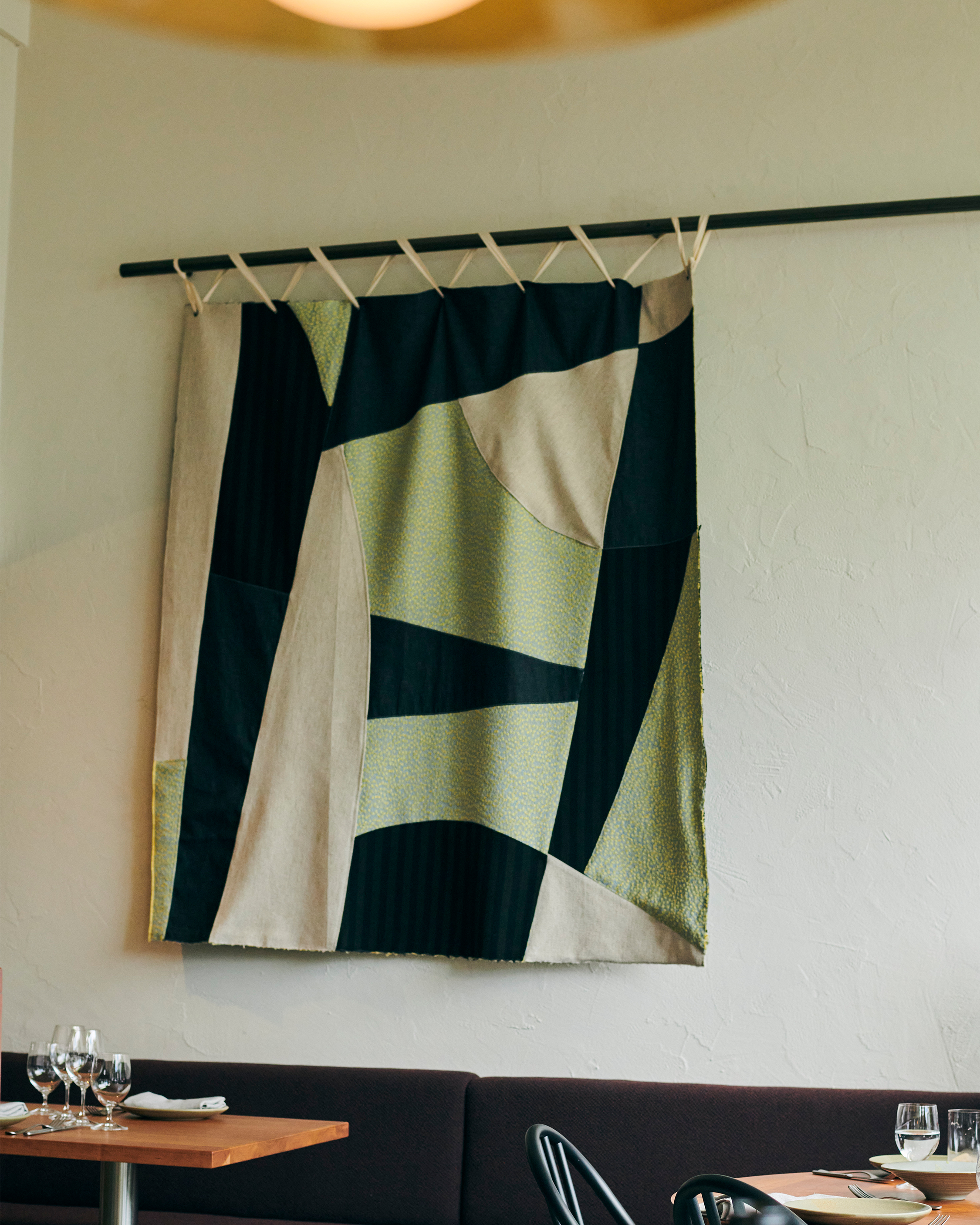
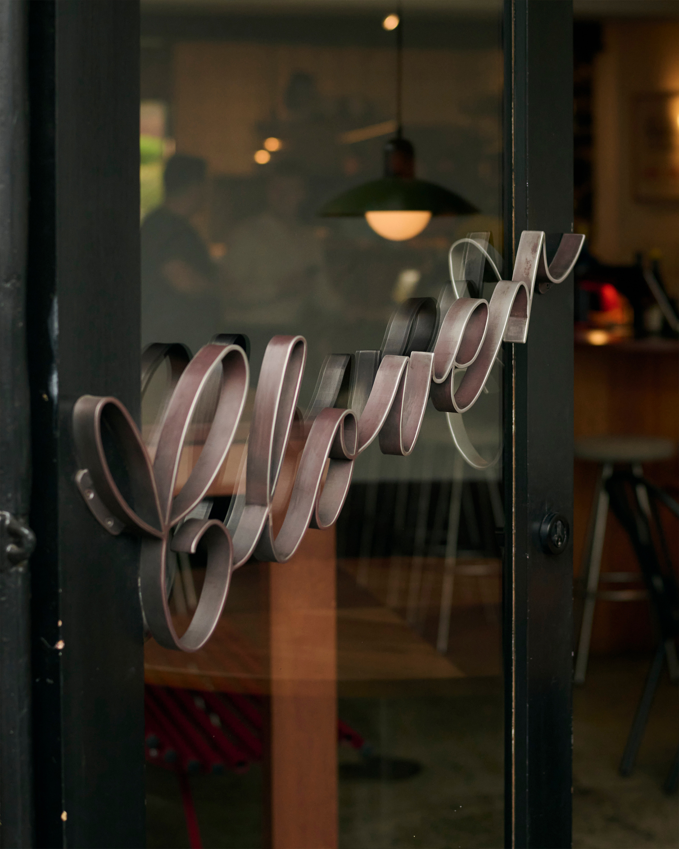
We built an identity that reflects the primitive elegance of the concept. No tricks or polish. Just the fundamentals: flame, smoke, soil and season. At its core is a playful, hand-drawn caterpillar illustration. The Clover caterpillar is a nod to the quality and honesty of the bistro’s ingredients. It speaks to life in balance and organic process, a small gesture that suggests a bigger idea: that good things come from healthy systems.
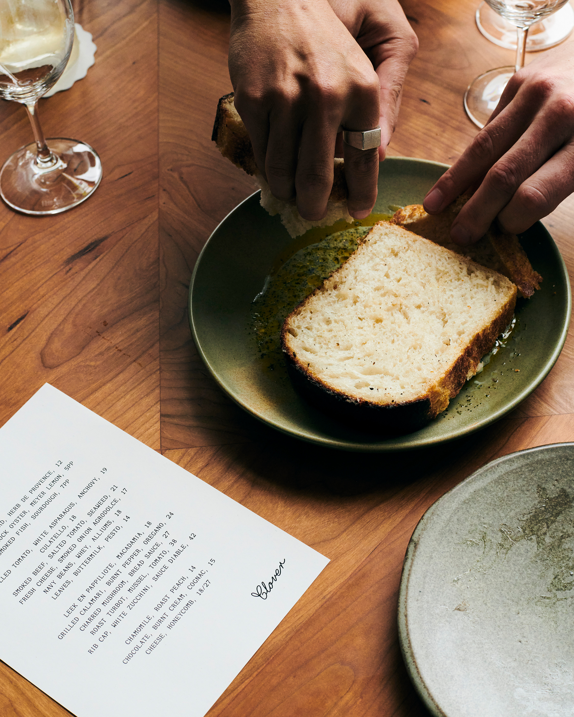
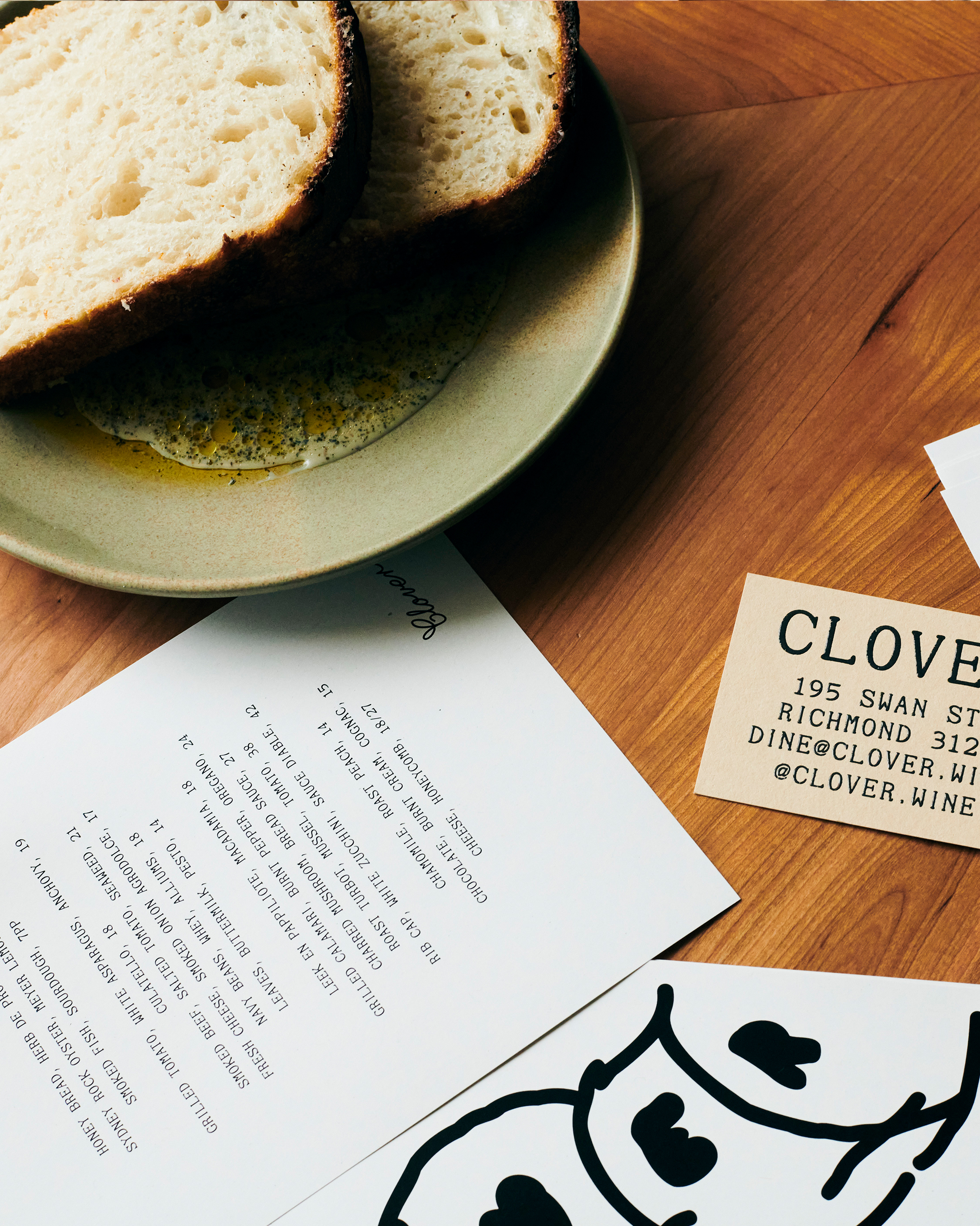
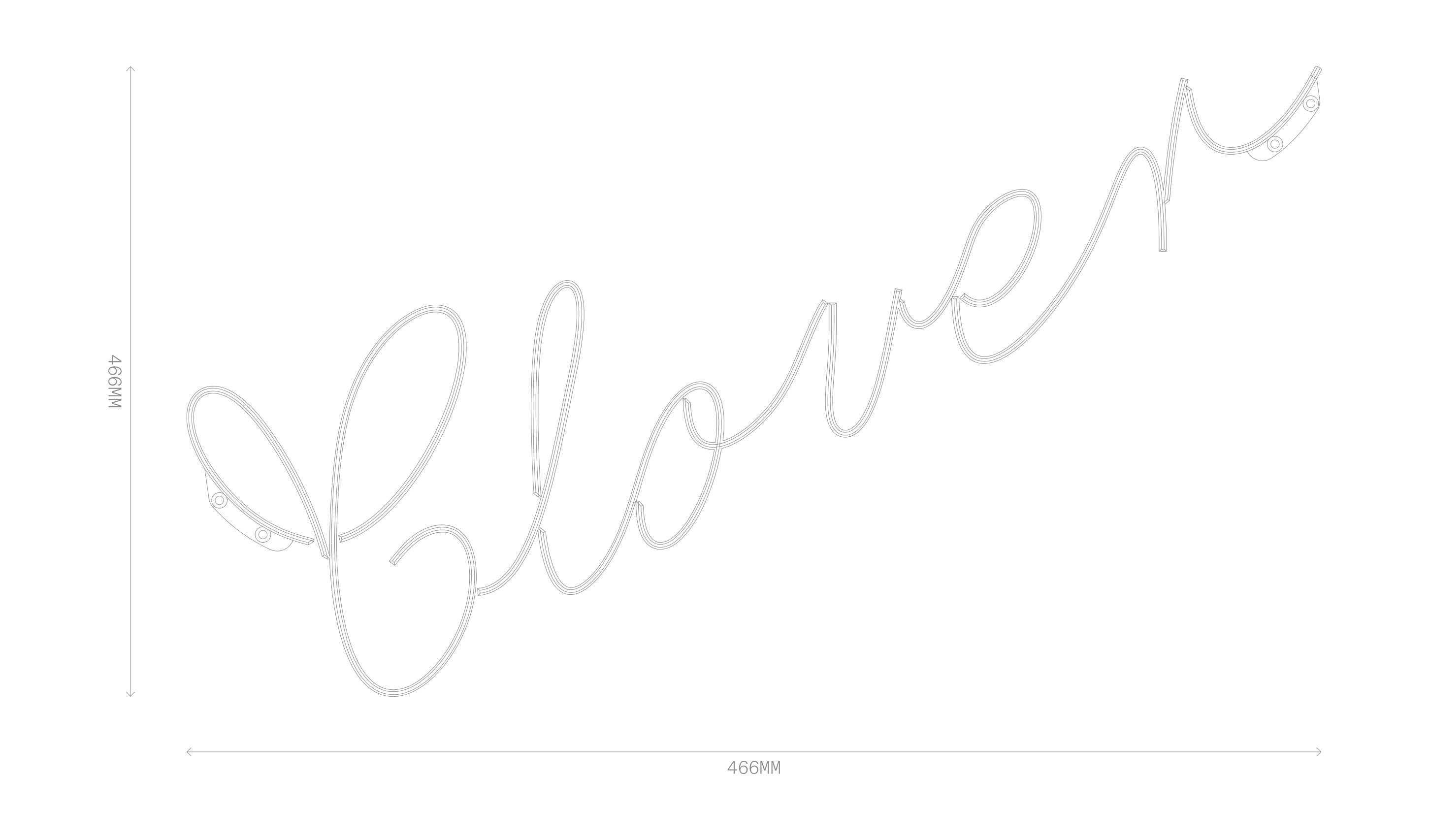
The brandmark features Berton Hasebe’s HB Lossy, chosen for its organic character and natural sense of elegance. Paired with a muted, earthy colour palette, the typographic system is intentionally understated, mirroring the refined simplicity of Clover’s kitchen.
To ensure the brand lived seamlessly across every touchpoint, we worked closely with Therefore Architects aligning on a shared vision that grounded the client’s concept in both spatial and visual expression.
The name Clover is drawn from the old phrase: “While we live, let’s live in clover. For when we’re dead, we’re dead all over.” A light-hearted take on making the most of the now: eating well, drinking deeply, and being present.