Project
Matéo
Collaborators
Services
Matéo was founded by former chef, Olie Ford, with a clear purpose: to create a drink that felt honest and refreshing. Inspired by his travels in South America, Olie was drawn to yerba maté, a revered ingredient with deep cultural roots, yet largely unknown in Australia. Rather than replicate tradition, he sought to reinterpret it and create something grounded, but distinctly new.
Our goal was to define a clear niche, cutting between early competitors who skewed either too rustic and organic, or overly playful and trend-driven.
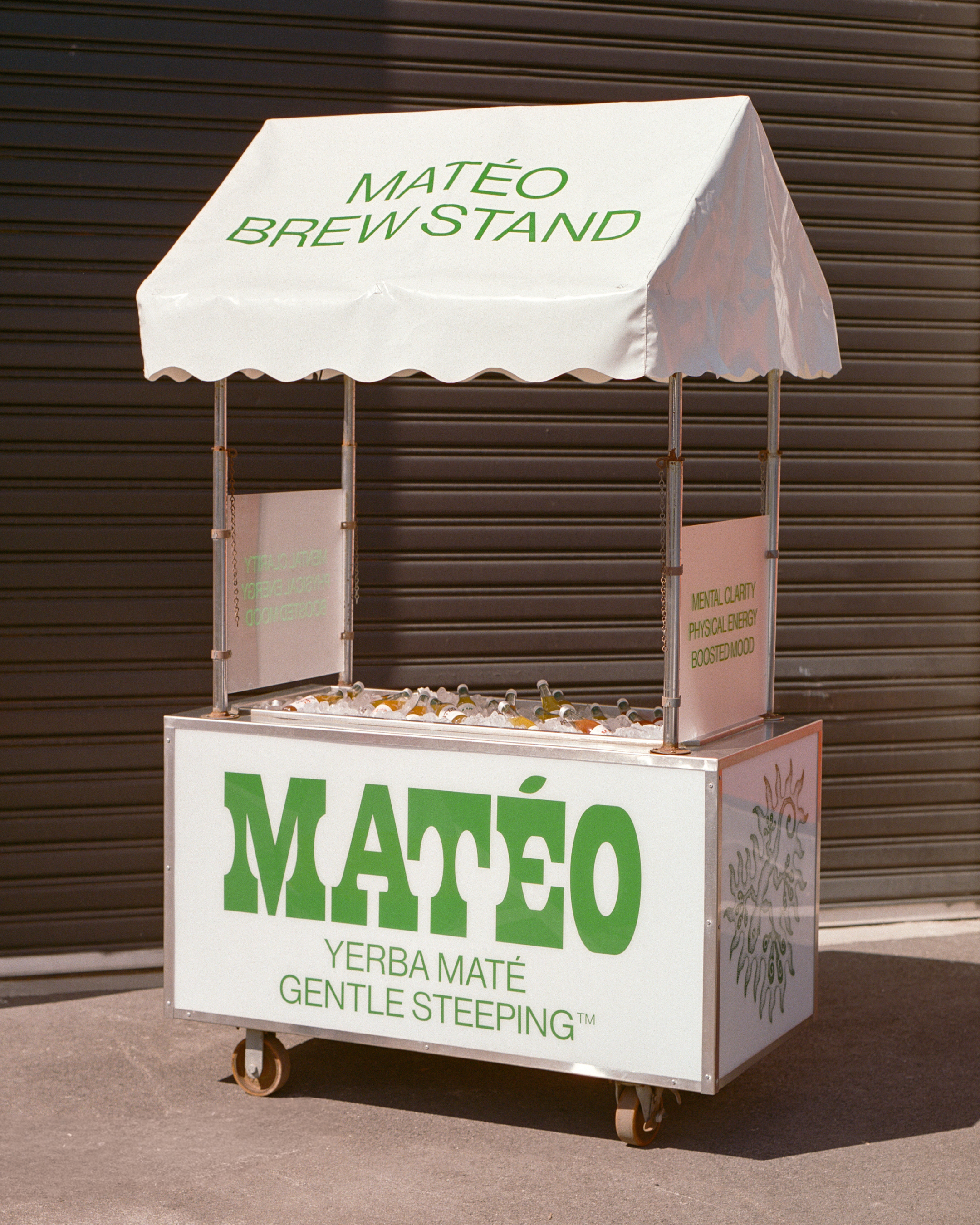
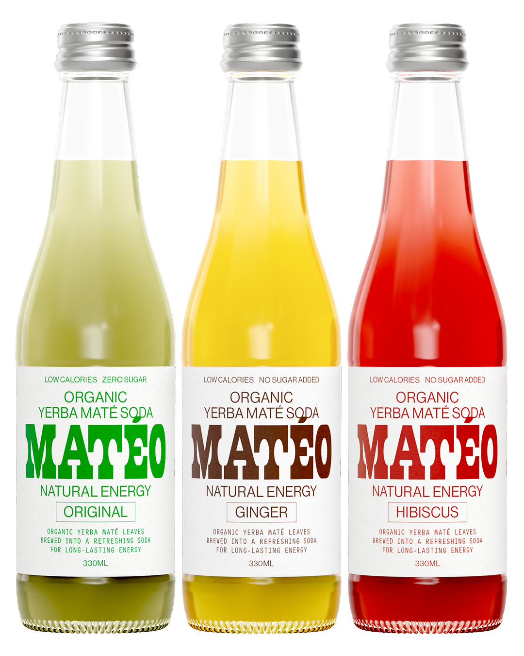
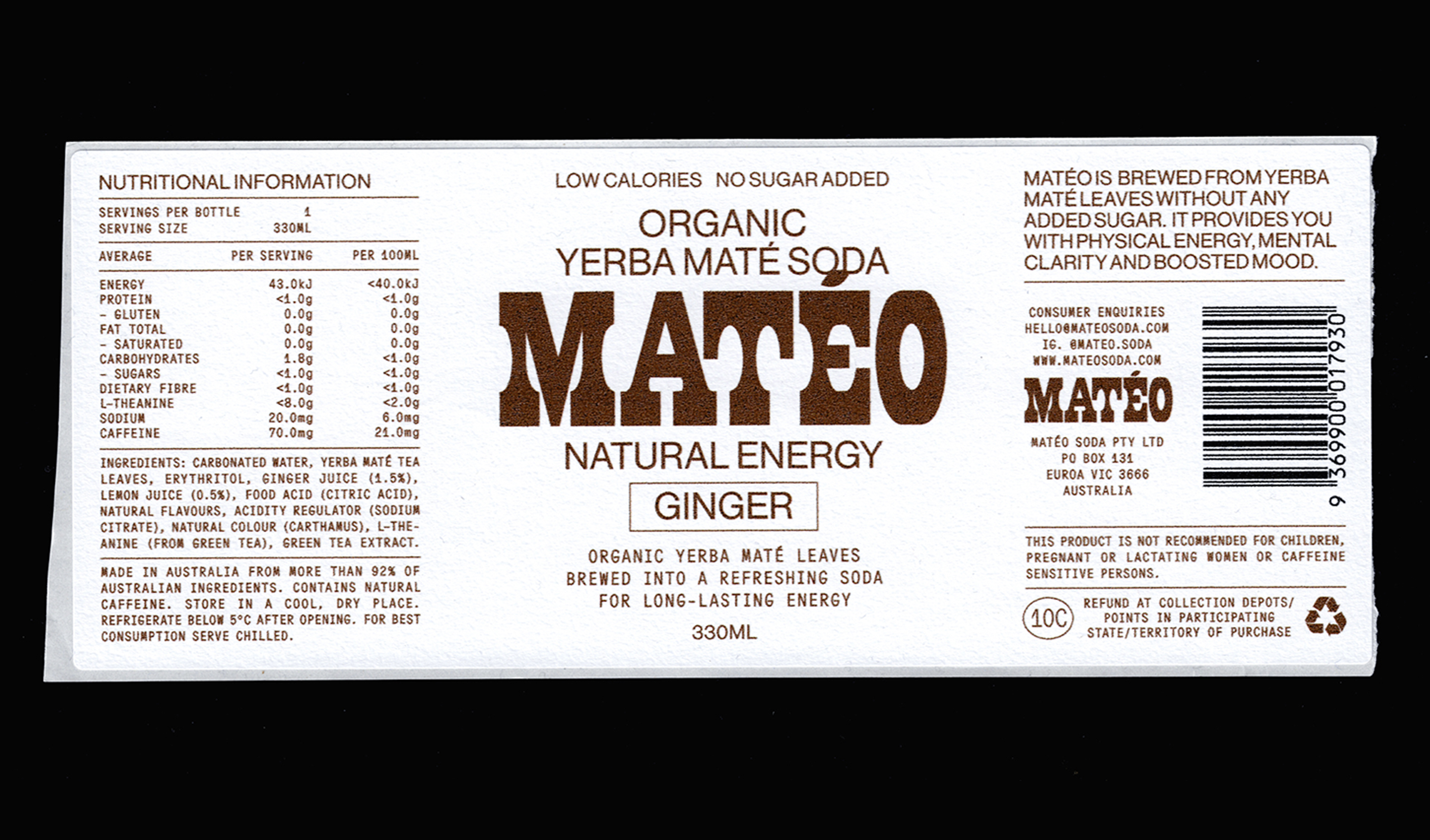
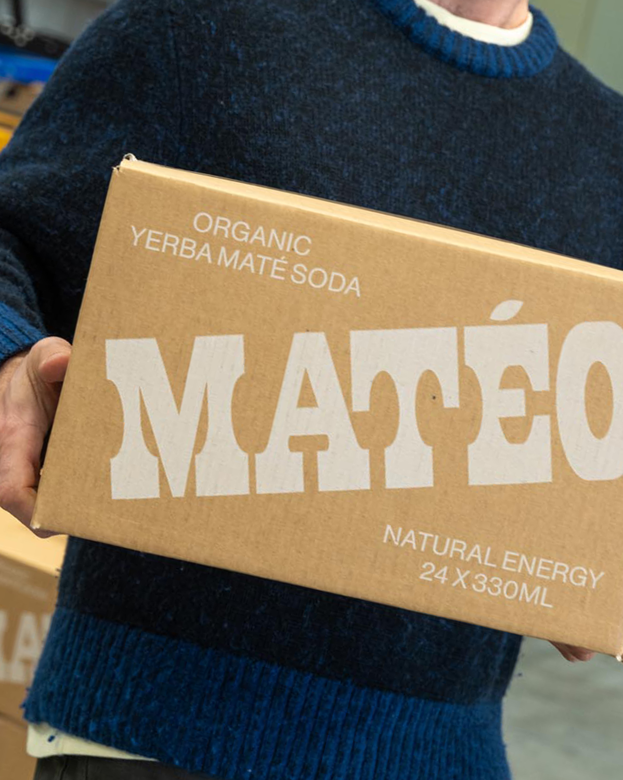
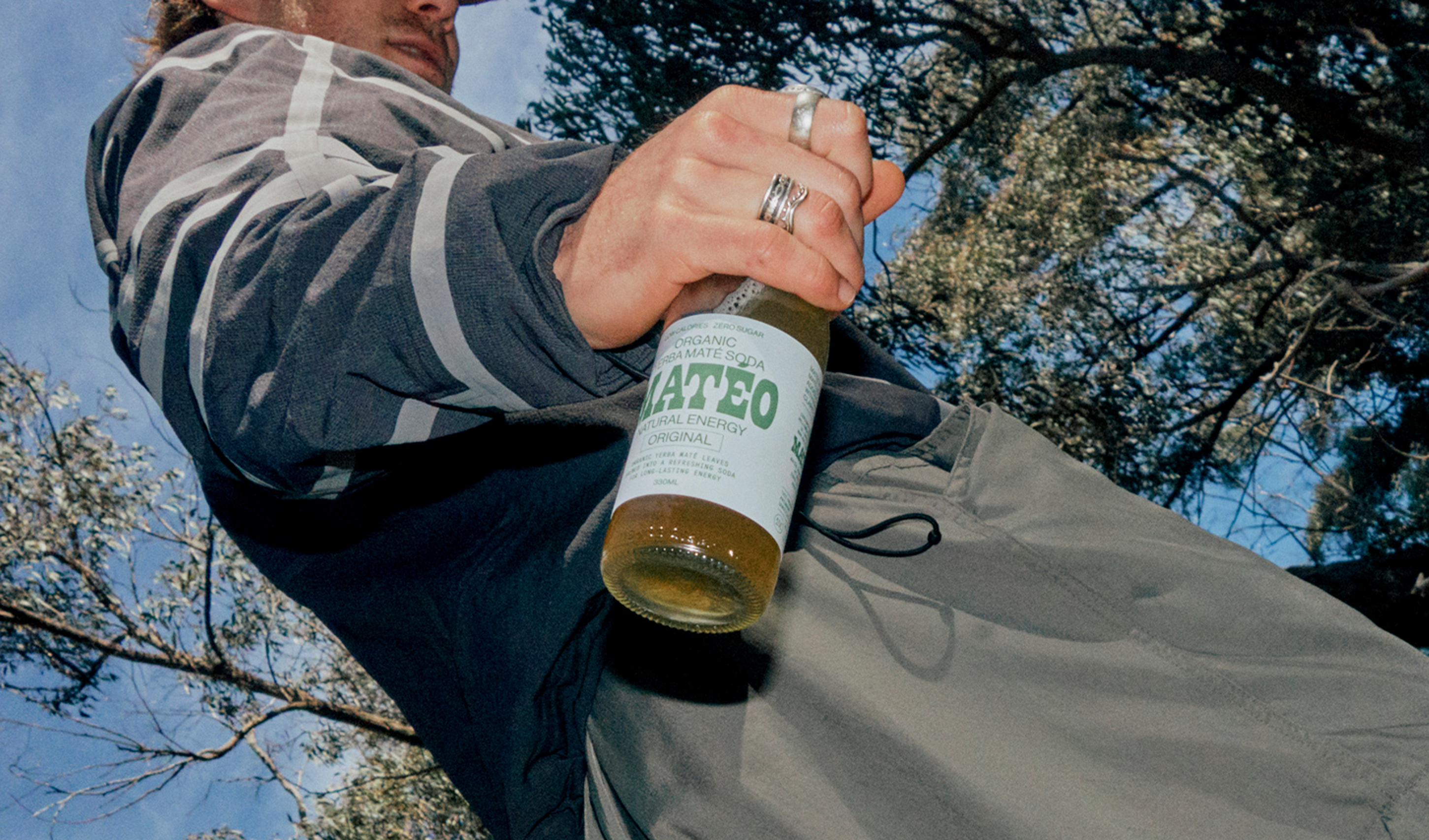
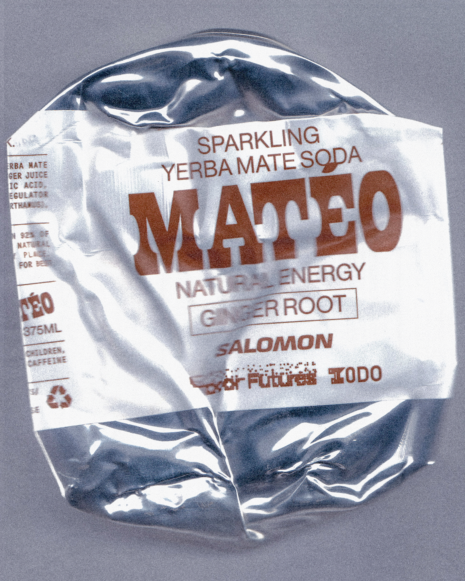
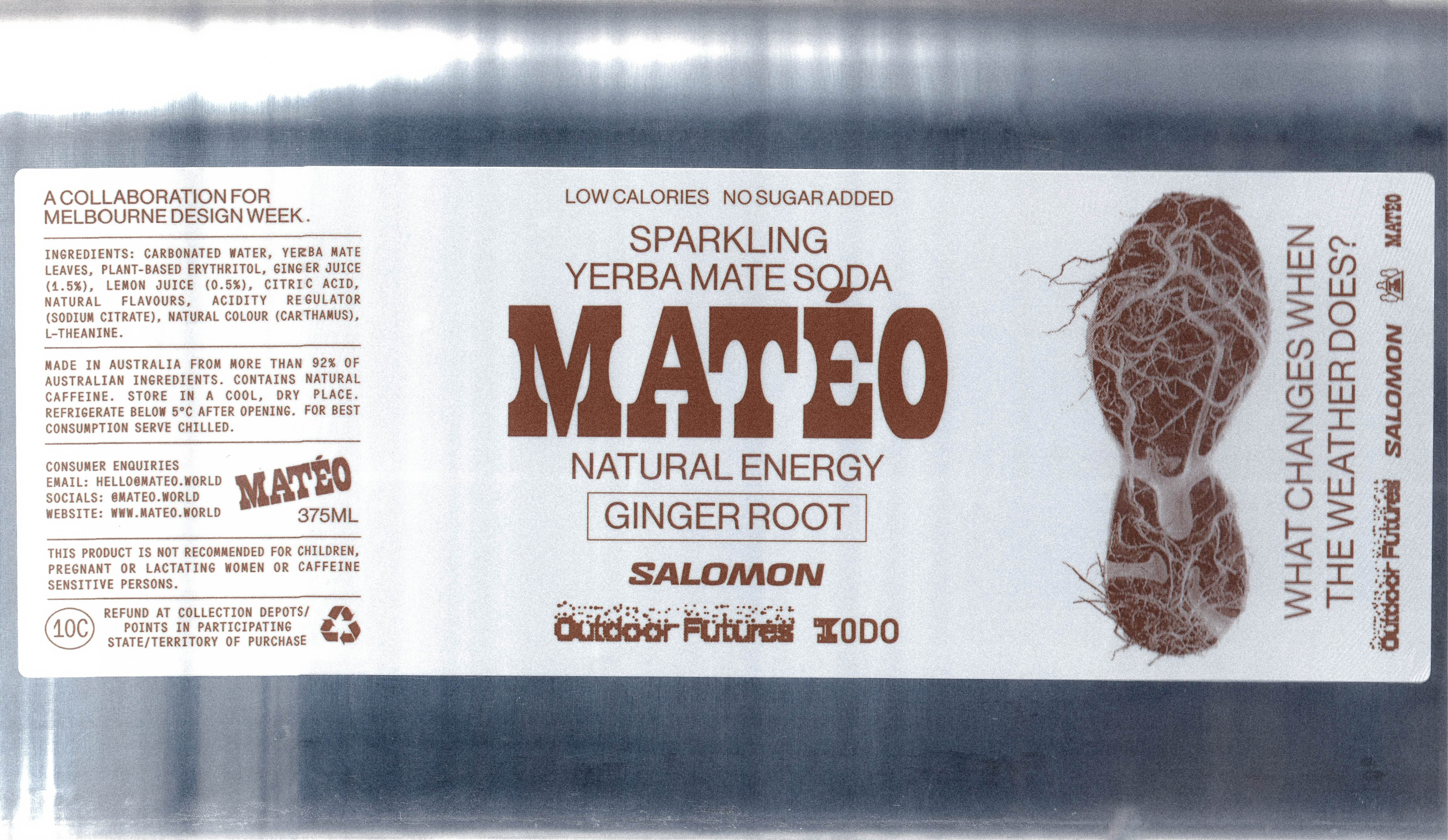
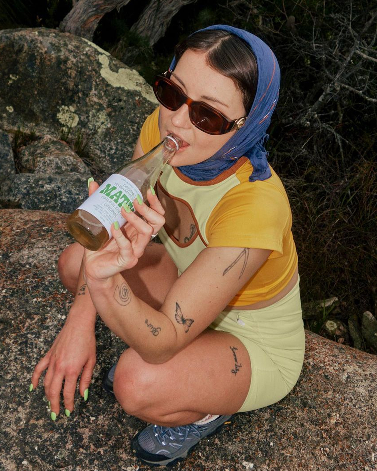
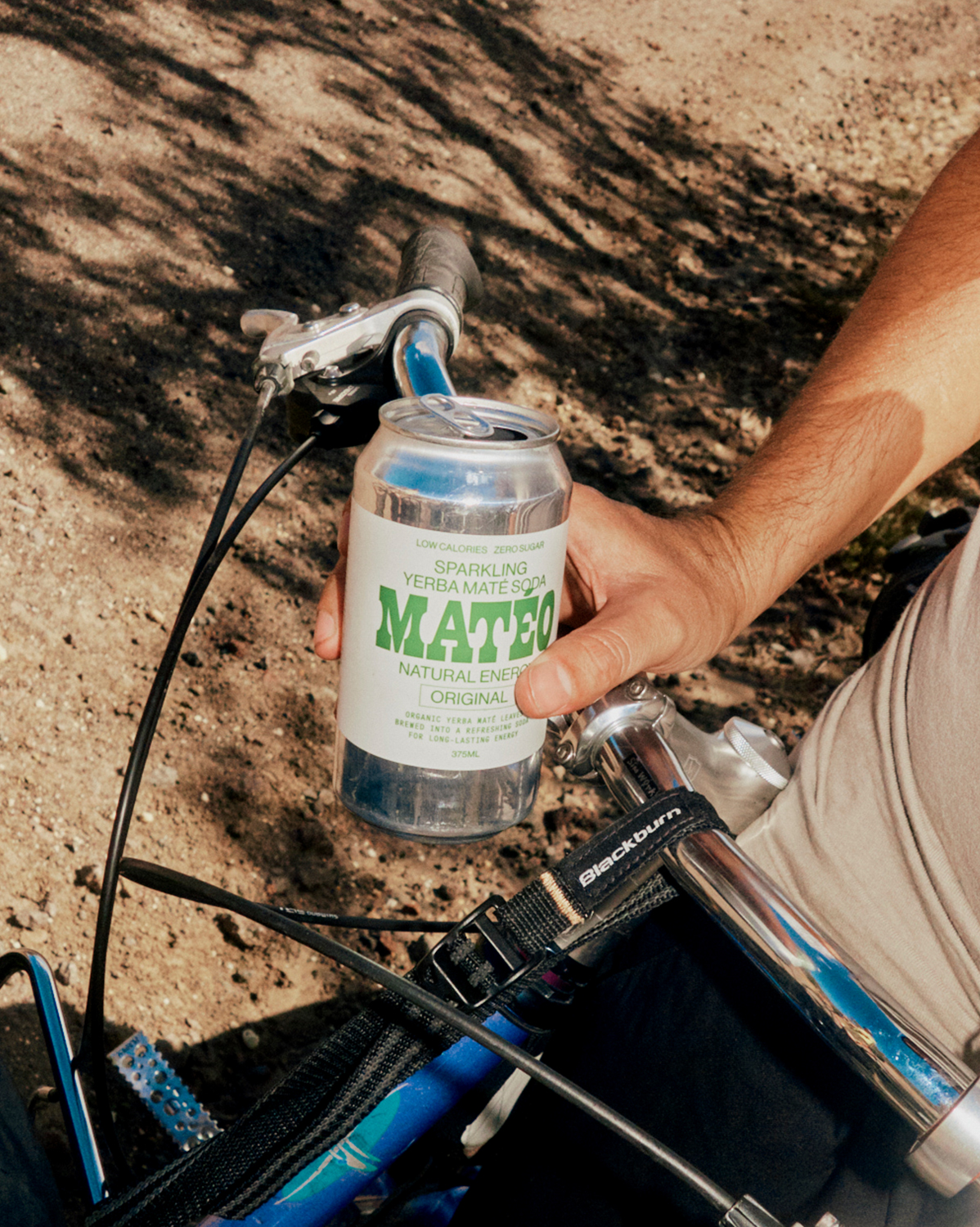
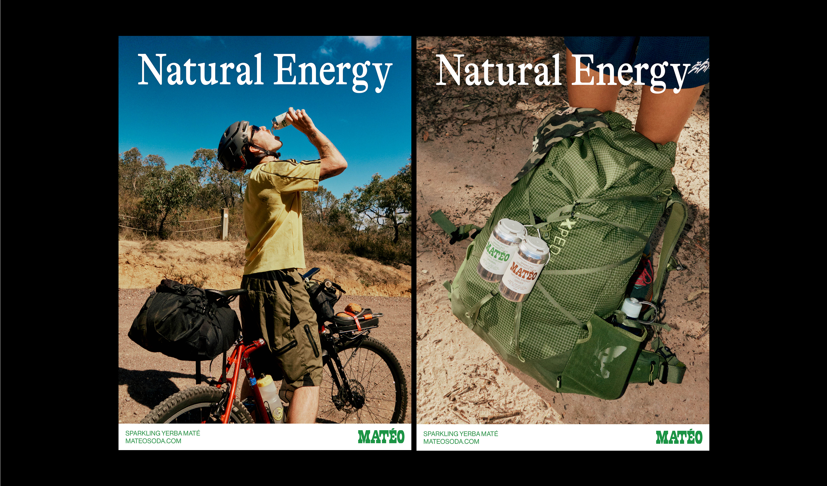
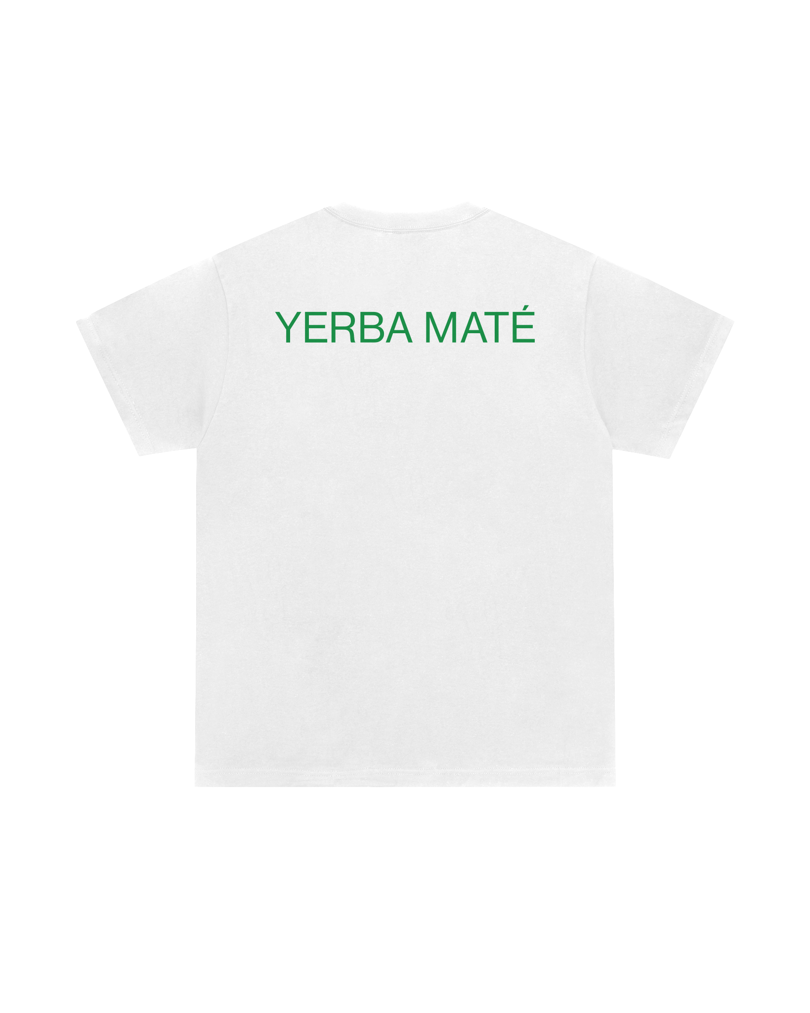
The packaging is led by a stark white label, a stripped-back typographic system, and a bold wordmark that feels both rooted and raw. It nods to maté’s traditional heritage without becoming trapped by it.
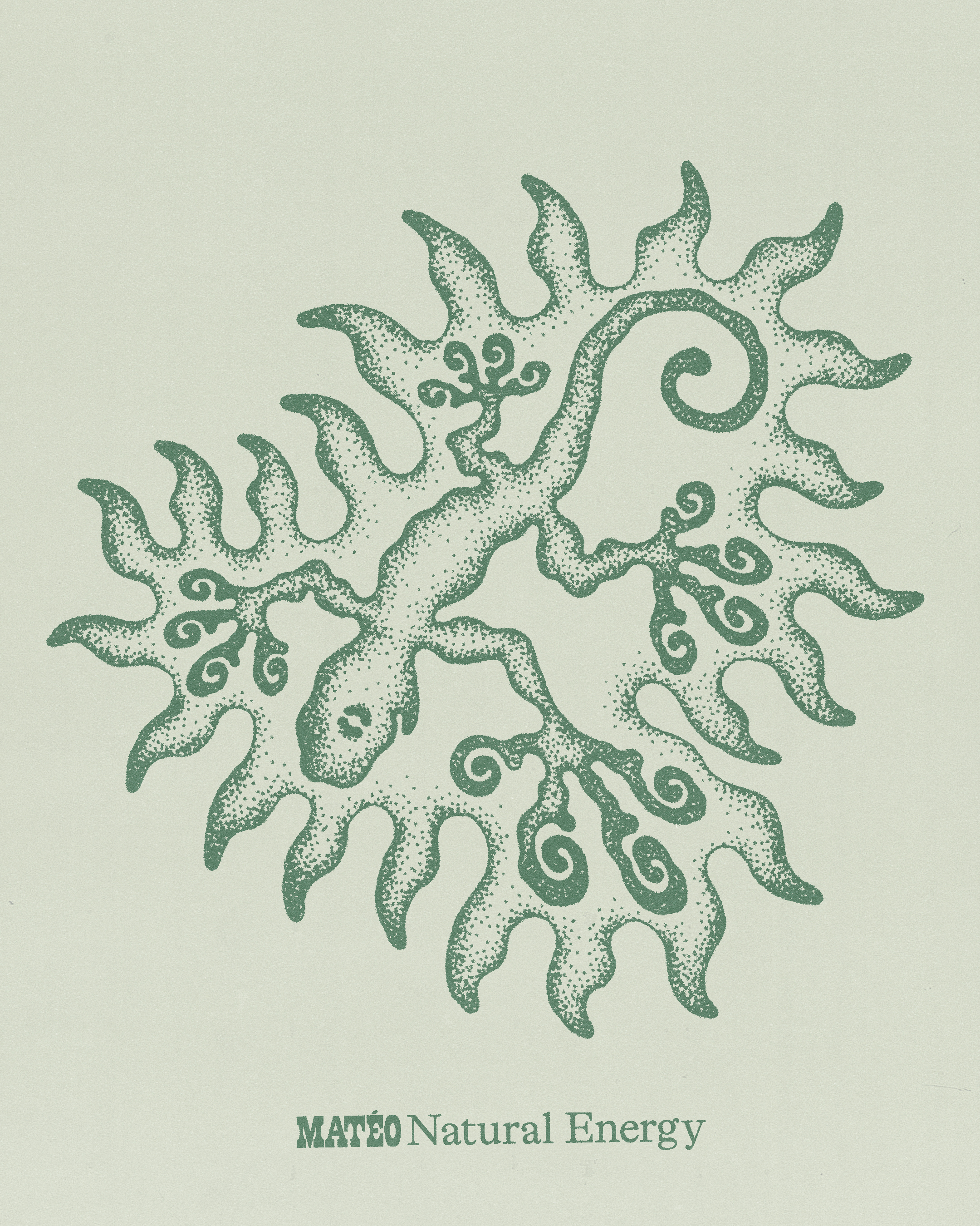
The singular green palette is deliberate. It’s an unmistakable reference to the leaf, the land, and the drink’s natural benefits. This choice is directional rather than ornamental, and a signal of health and intention.
The result is an brand that’s clean, modern, and quietly confident. Matéo is made for daily enjoyment and designed to last.