Project
Green Cup
Collaborators
Services
Green Cup approached us at a moment of growth. The superfood health cafe was expanding locations, evolving their menu, and seeking clarity in their brand story. As a longstanding name in health and wellness, they required a refresh that embraced a new generation of health cafés while staying grounded in whole foods, real knowledge, and community.
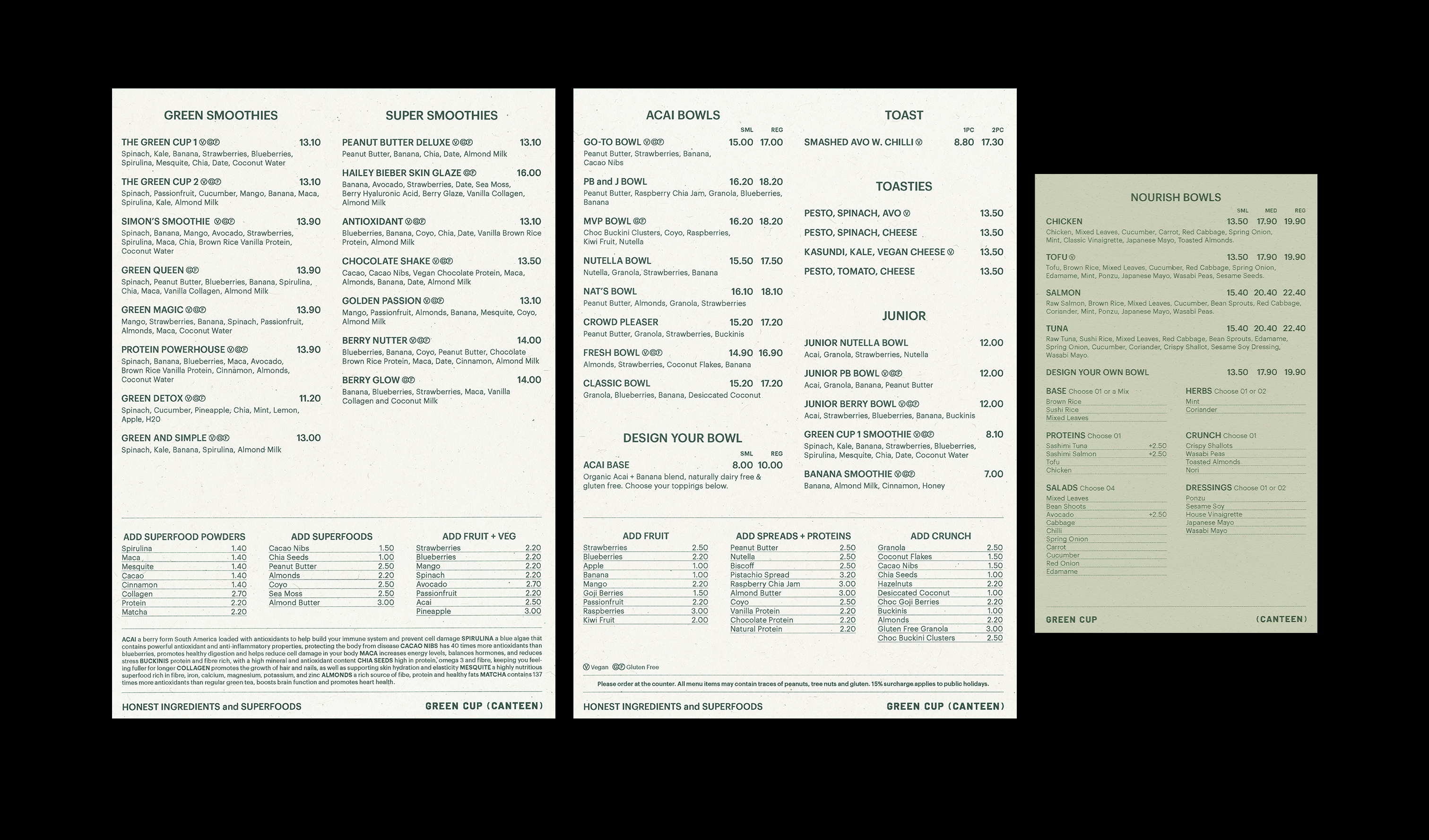
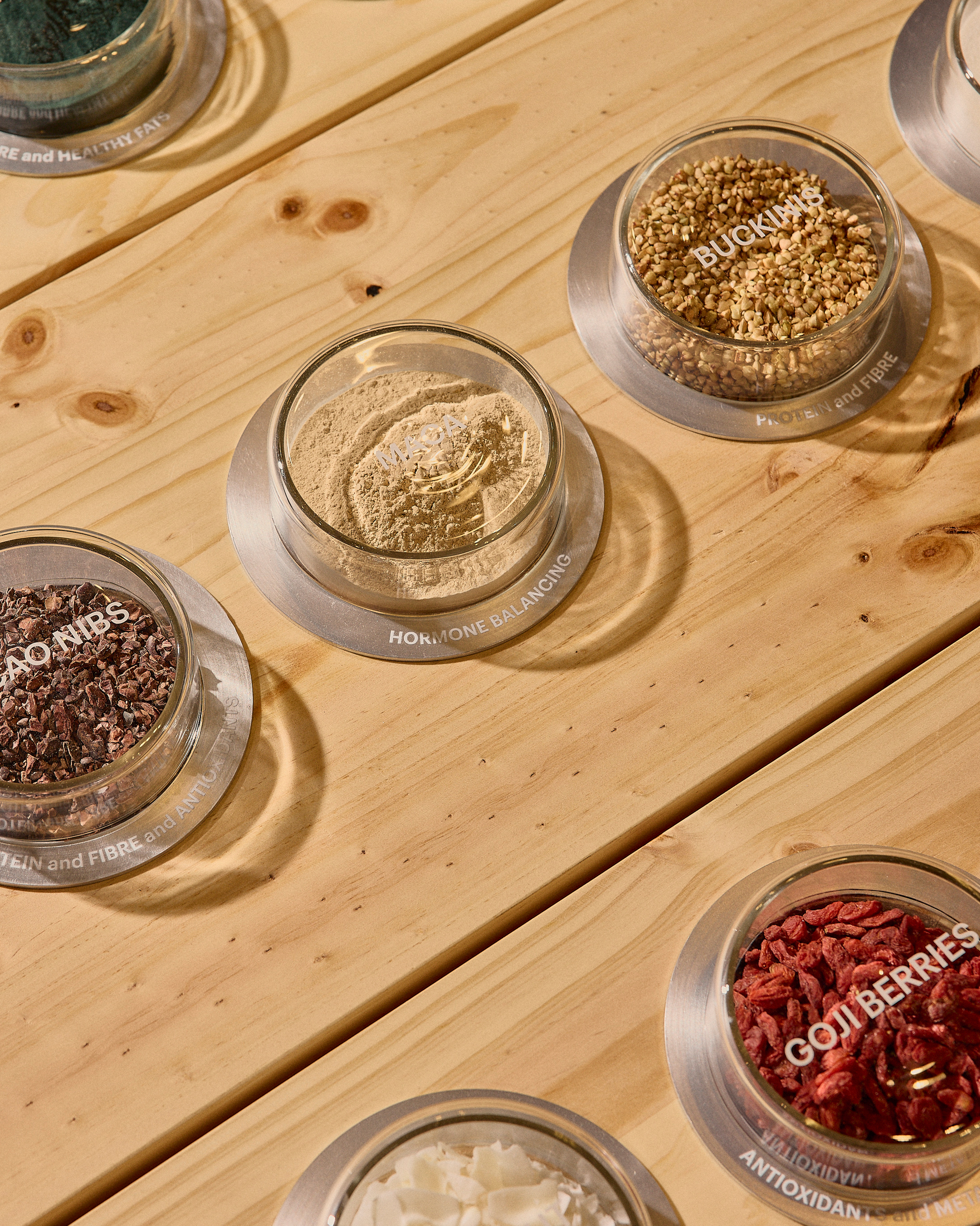
The shift involved a refined visual identity that brought greater transparency to communication and centred storytelling around their core offering: raw ingredients and superfoods. The goal was to feel aspirational and informed, without losing the approachable spirit Green Cup was built on.
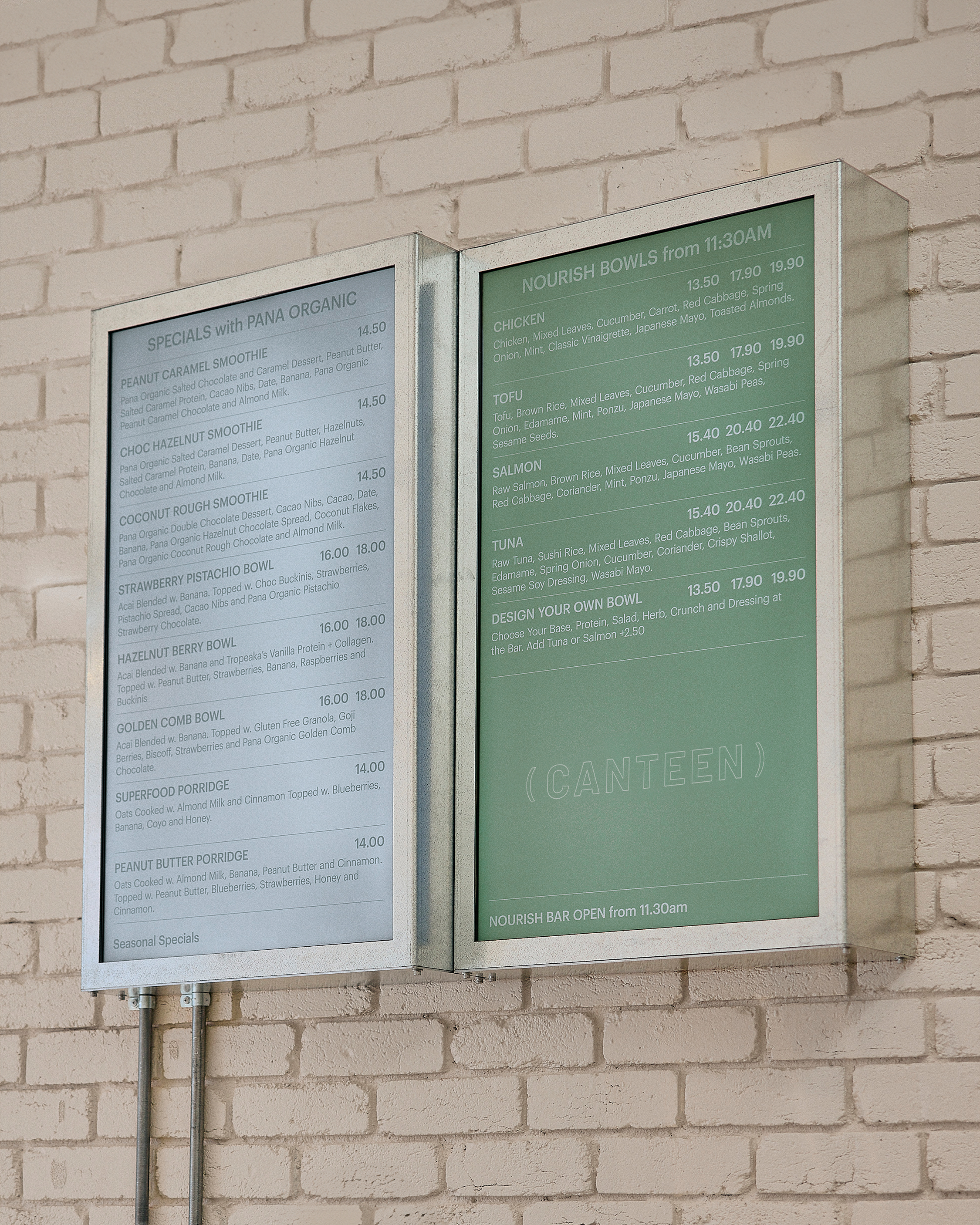
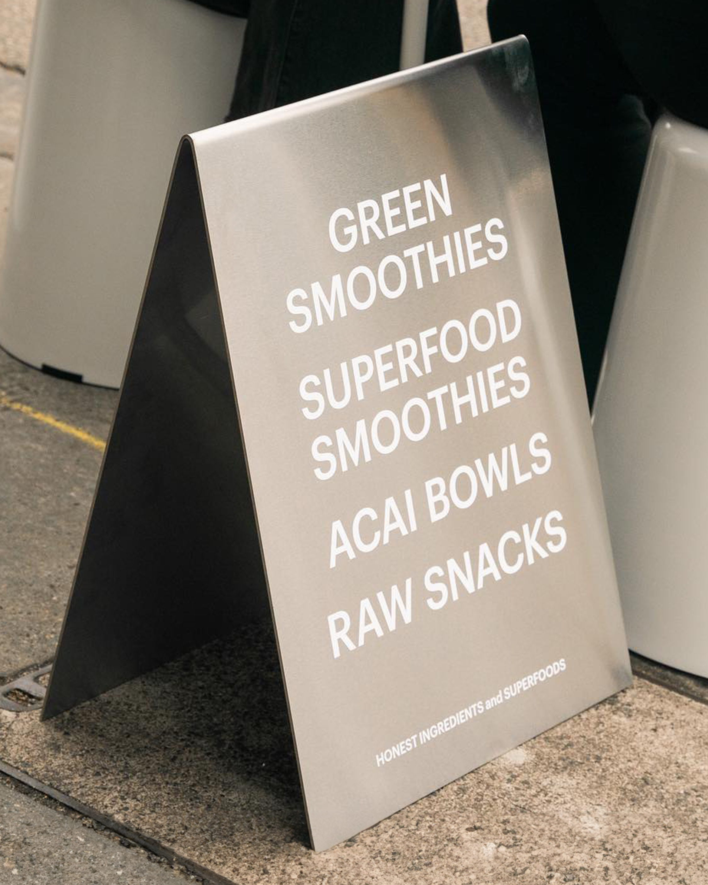
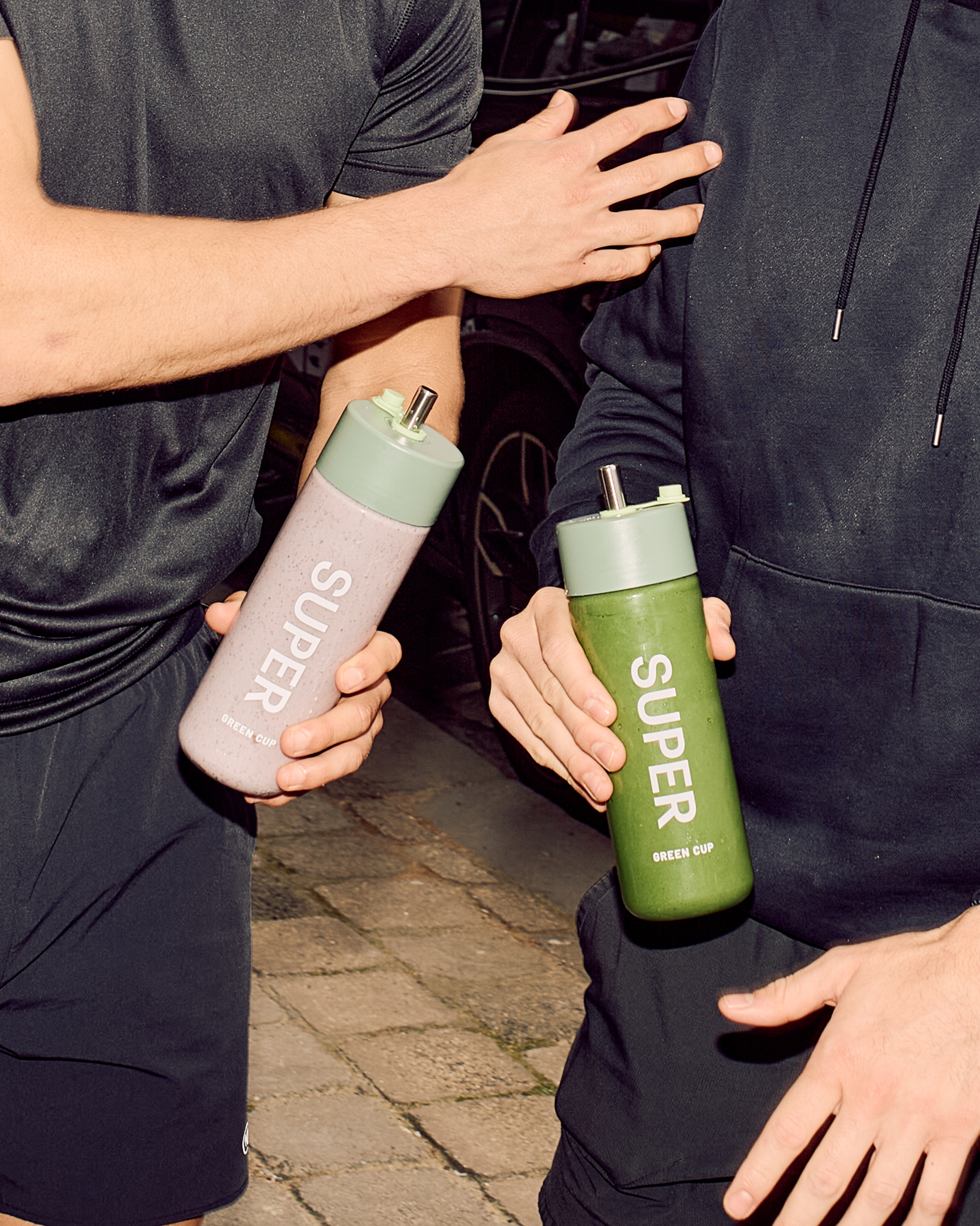
Green Cup’s identity is expressed by a type-led design that is made to feel premium and honest. A reductive approach, paired with intentional capitalization, creates space for what matters most: the ingredients.
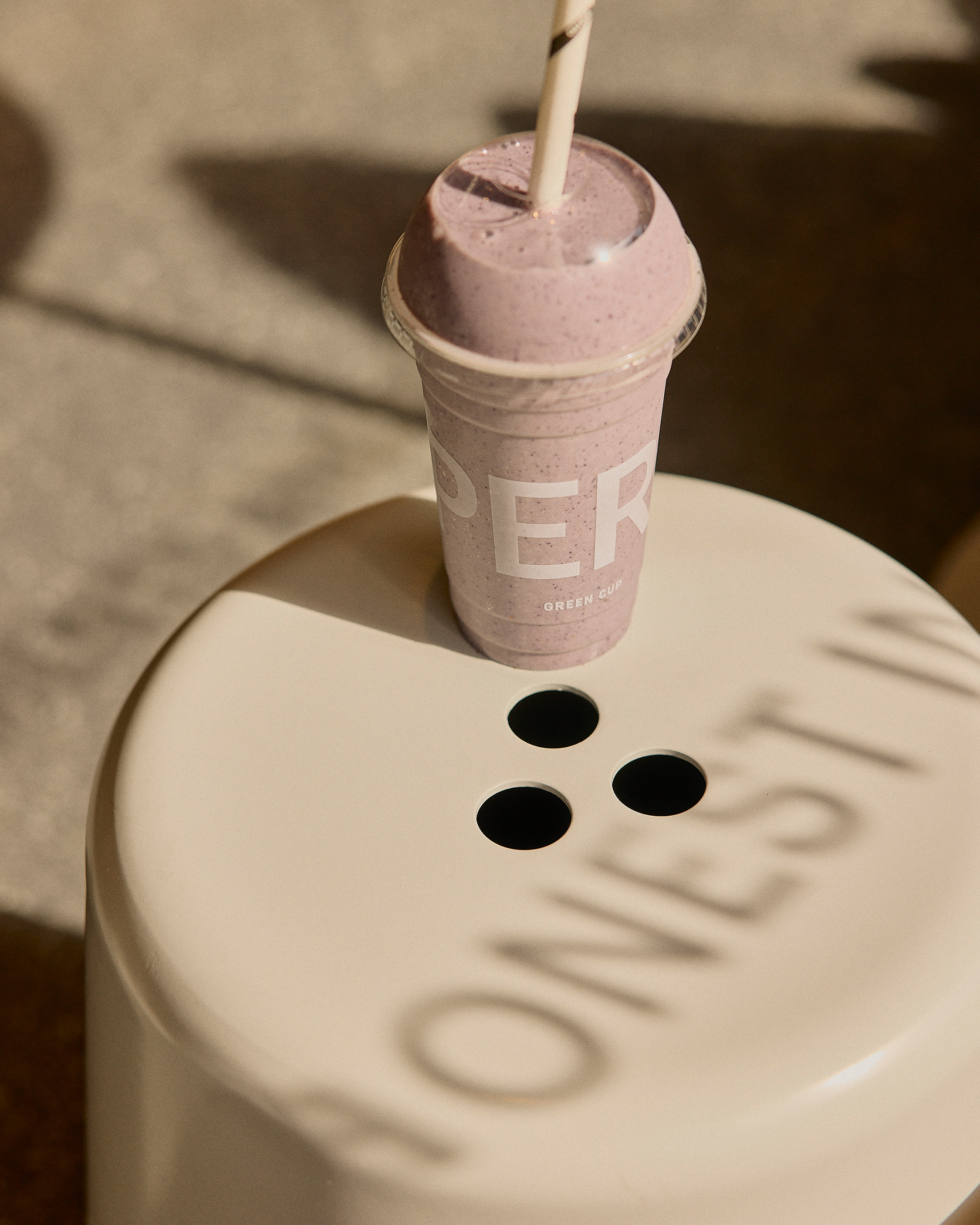
The colour system retains Green Cup’s recognisable green, but introduces a fresh, lighter shade to bring lift and modernity. This is a natural evolution that maintains brand equity while pushing forward.
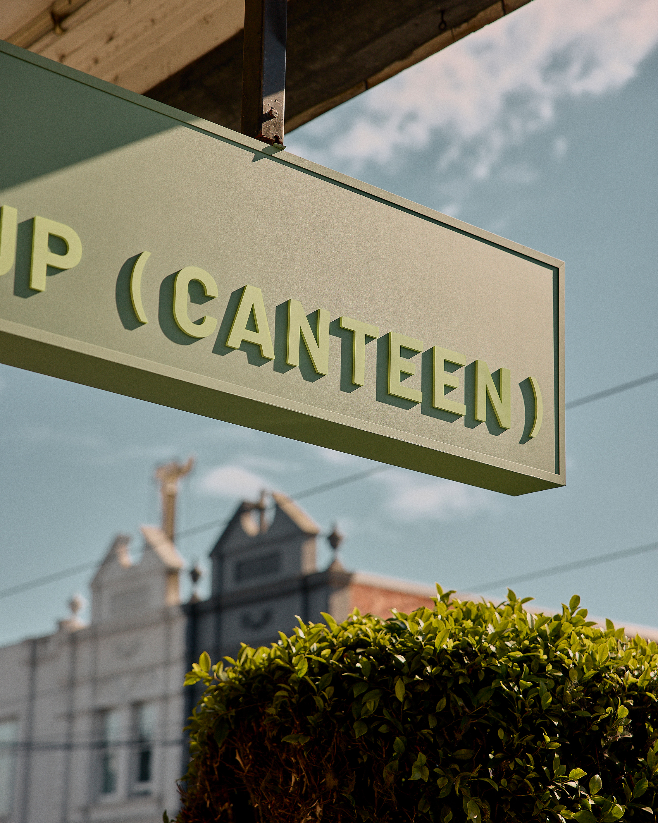
In partnership with Hecker Guthrie, we ensured cohesion across the entire experience. From awnings and signage to custom ingredient displays and in-store communication, the visual and spatial language reflects the care and clarity of the offering itself.
We were also tasked with naming their new concept store: Green Cup Canteen. ‘Canteen’ evokes the convenient, nutrient-rich salad bowl format with a casual, youthful energy.