Project
Sun & Daughter
Collaborators
Photography by Maddie Roux
Photography by Alexandrena Parker
Services
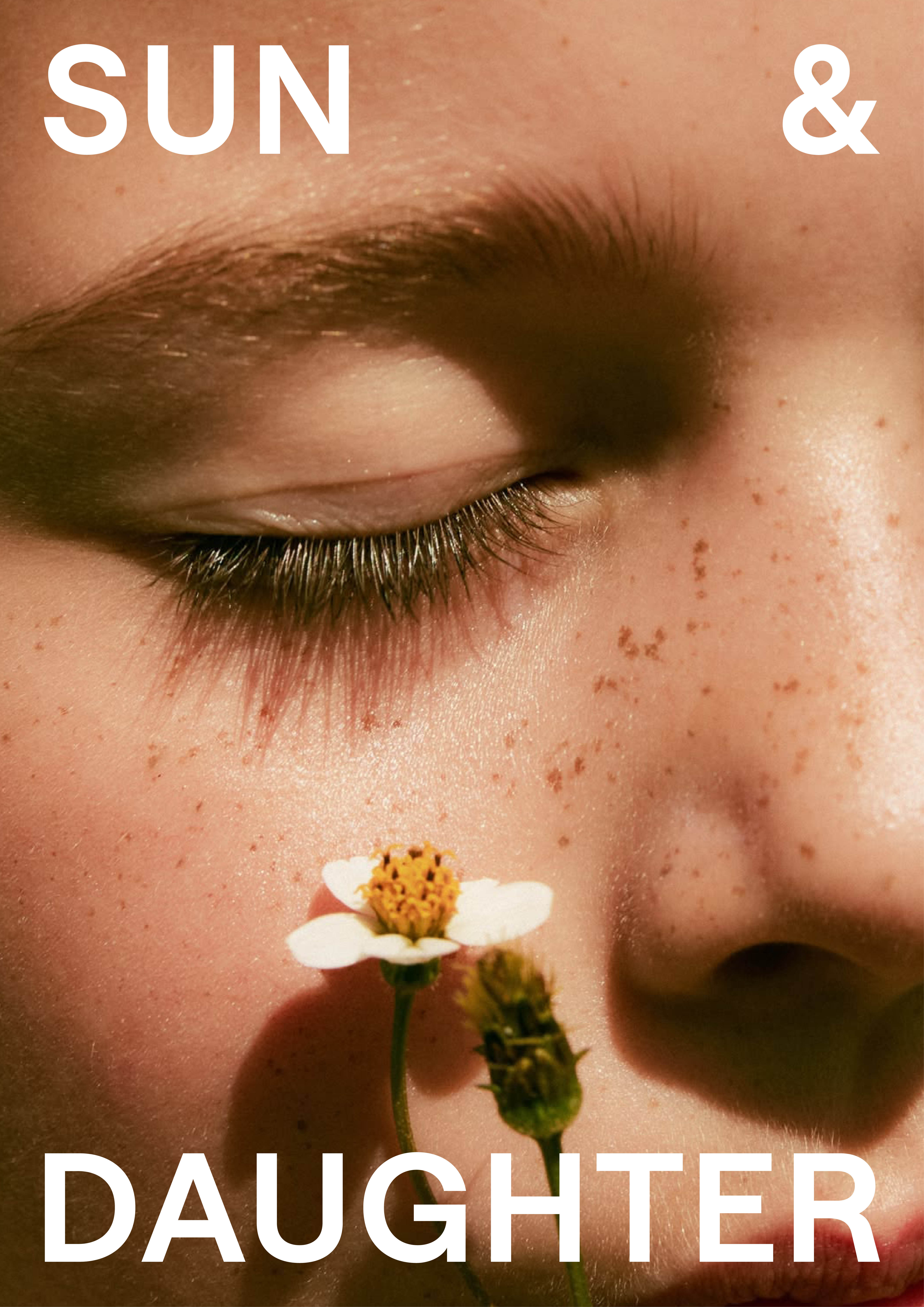
The children’s skincare category often leans into predictable tropes: pastel palettes, character mascots, and cluttered visuals. With Sun & Daughter, we took a deliberate step in the opposite direction, one that respects the intelligence of parents by embracing clarity, restraint, and a contemporary Swiss typographic approach to carve out a distinctive presence on shelf.
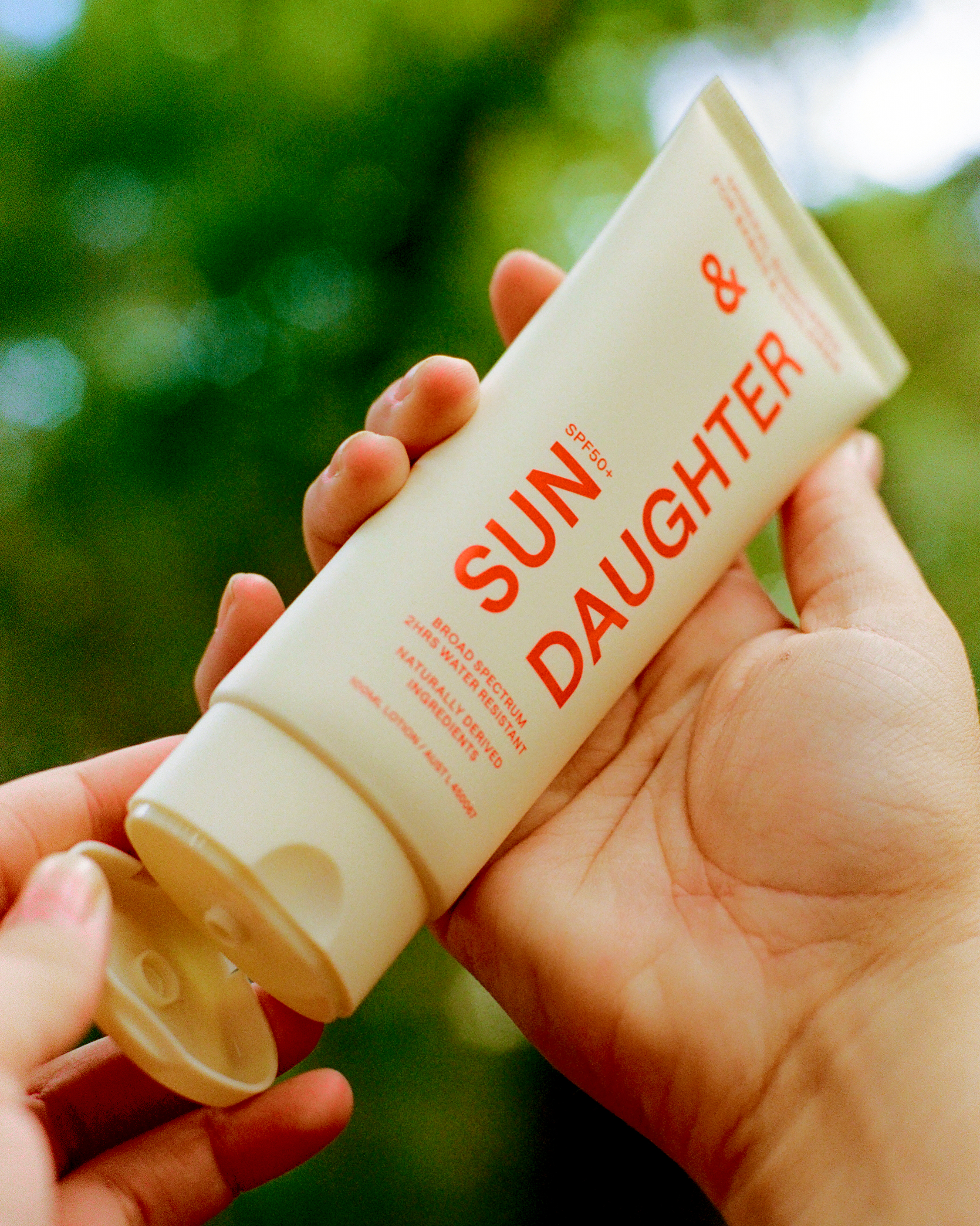
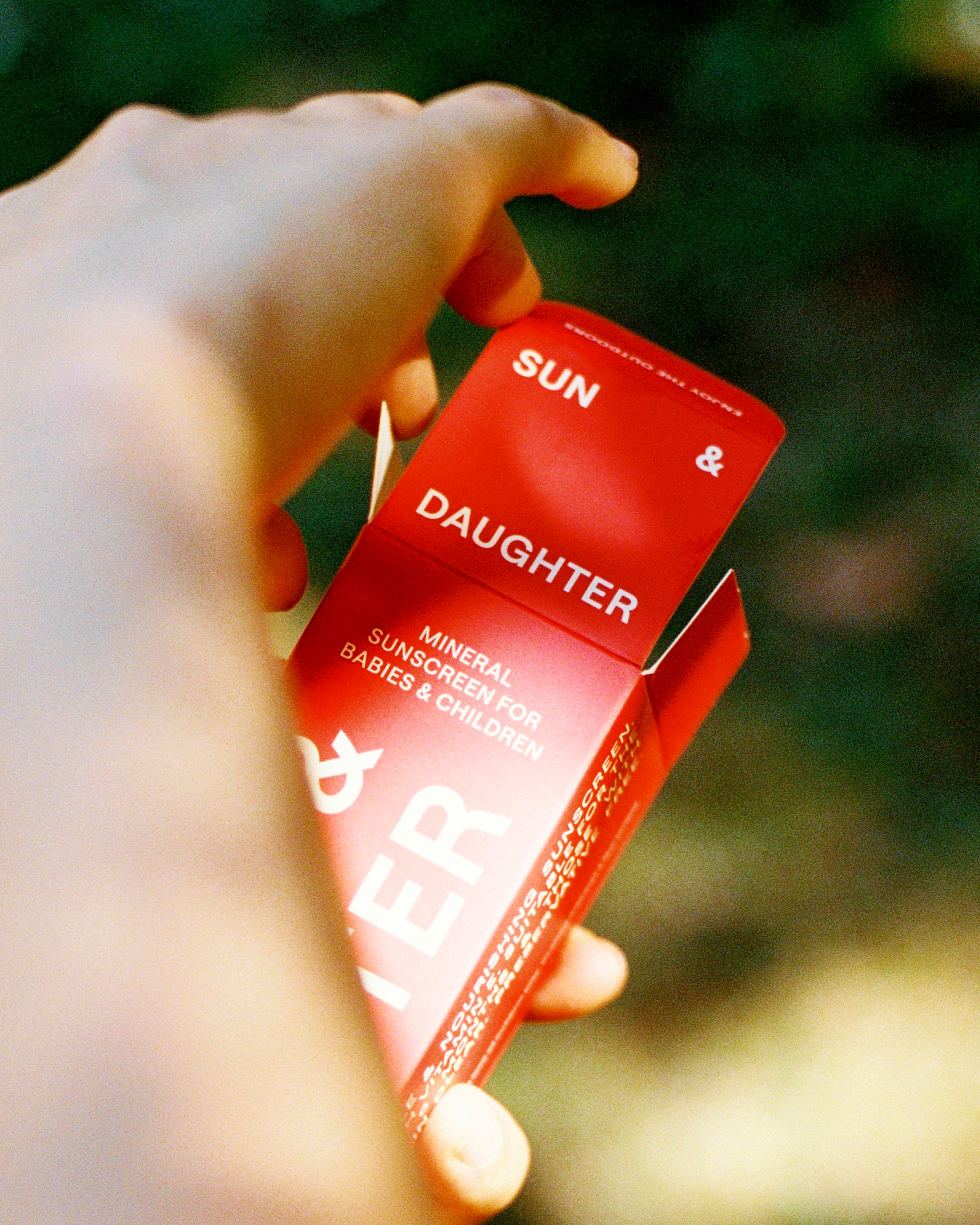
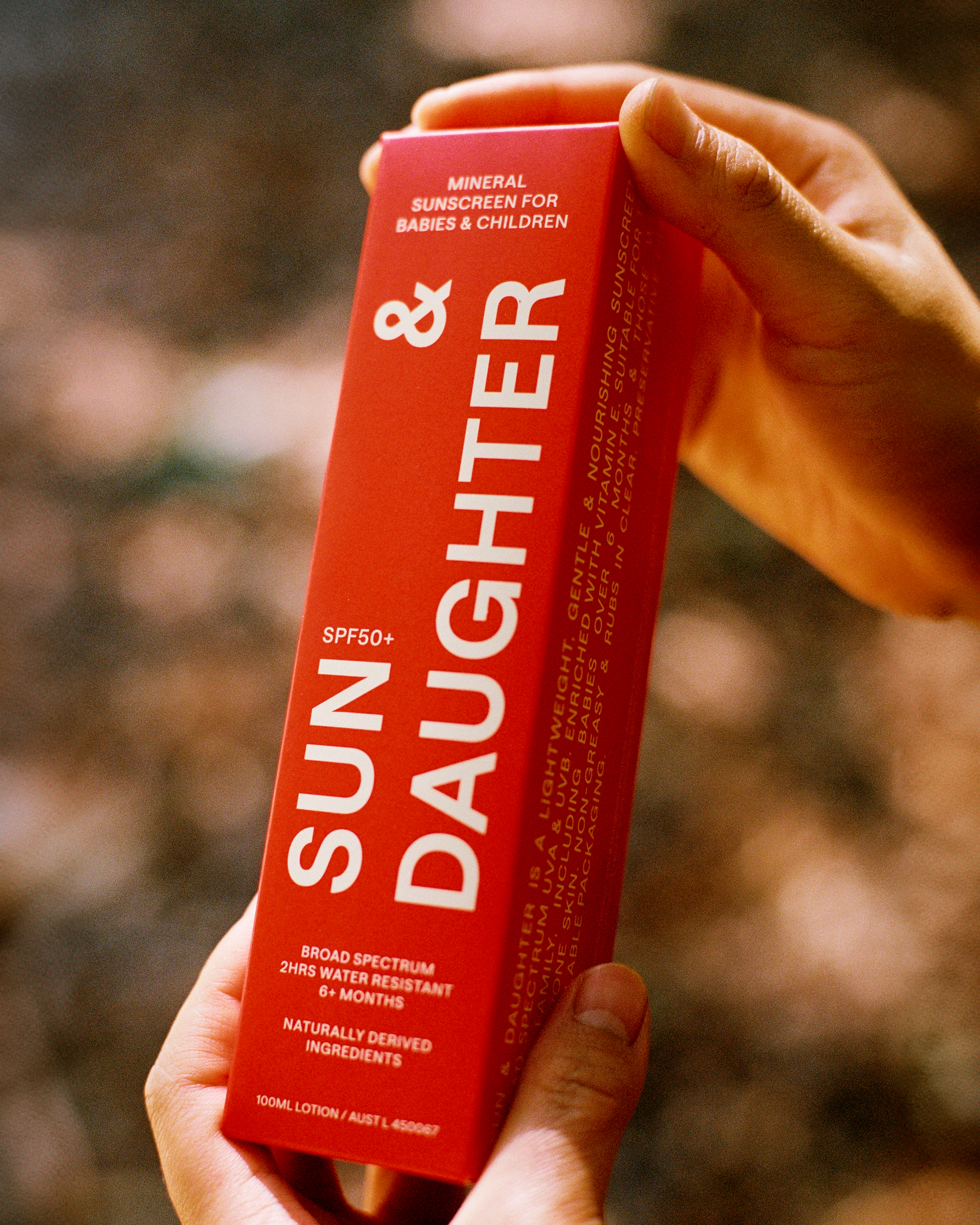
At the heart of the identity is a dynamic lock-up and a robust and flexible system that adapts across applications. The ampersand has been given presence within the lock-up, as a symbol of connection, representing the bond between parent and child, nature and nurture, care and confidence.
A single typeface is used across the entire identity to ensure clarity and lend the brand a modern confidence. By stripping away the visual noise often seen in the category, it allows both product and message to breathe. Each touchpoint is grounded in simplicity and legibility, building trust and confidence from the first glance.
We chose a vibrant red for the packaging, a deliberate departure from the pastel-heavy category. The bold hue evokes warmth while commanding a premium shelf presence.
Our tagline, "For Your Child's Imagination Outdoors", brings emotional depth to the brand. It captures the aspirational spirit of Sun & Daughter: protection that empowers children to roam, explore, and dream.