Project
Volley
Collaborators
Services
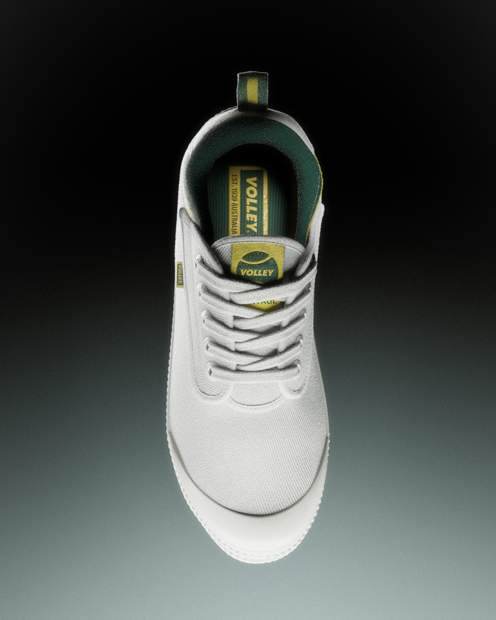
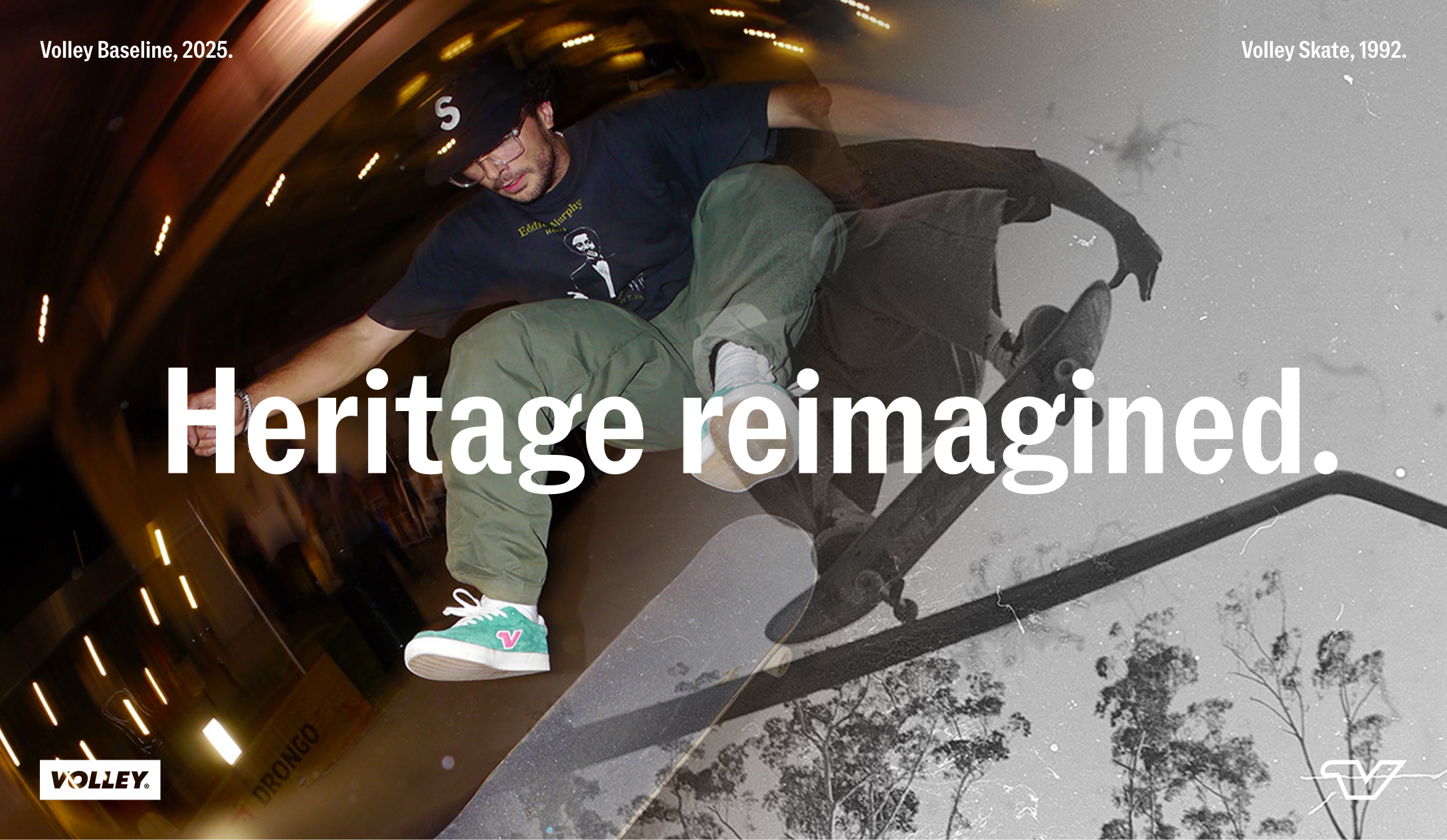
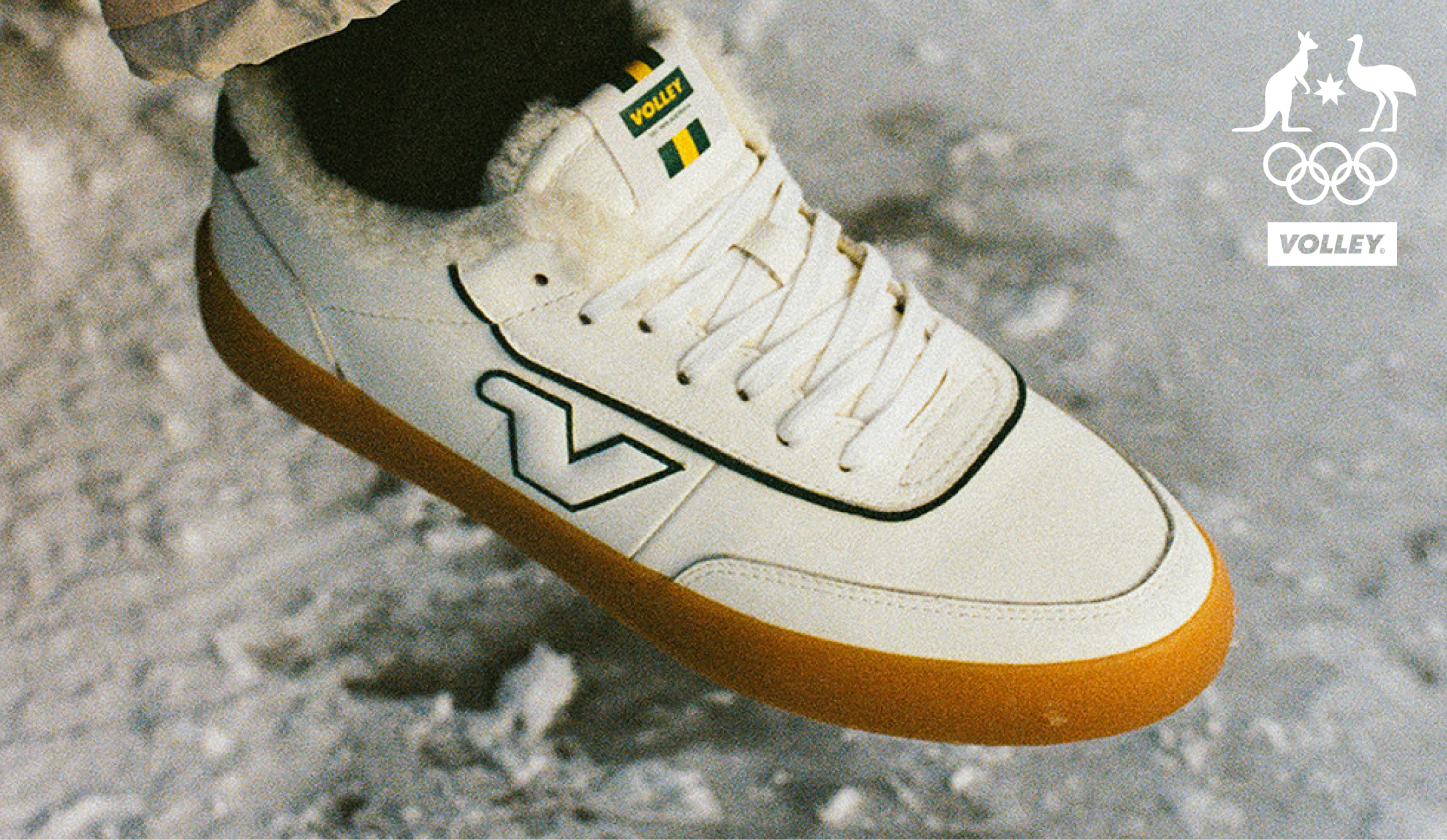
Volley holds a unique place in Australian culture: a brand rooted in the sport of tennis, yet lived far beyond the court. Worn on asphalt, in schoolyards, and across generations, it became embedded in the fabric of everyday Australian life throughout the ’90s, naturally extending into multiple categories along the way. Over time, this expansion led to a fragmented and outdated identity.
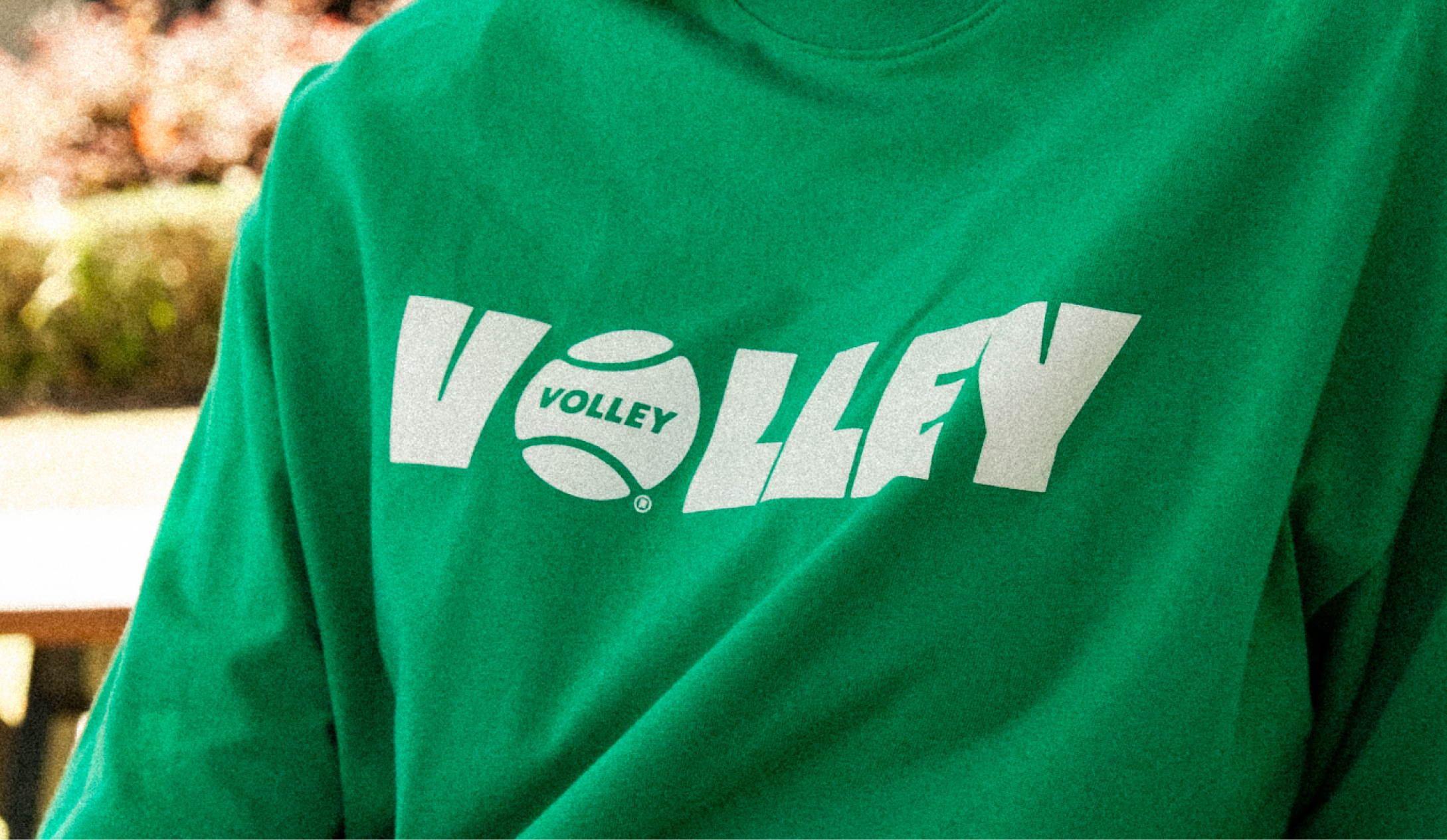
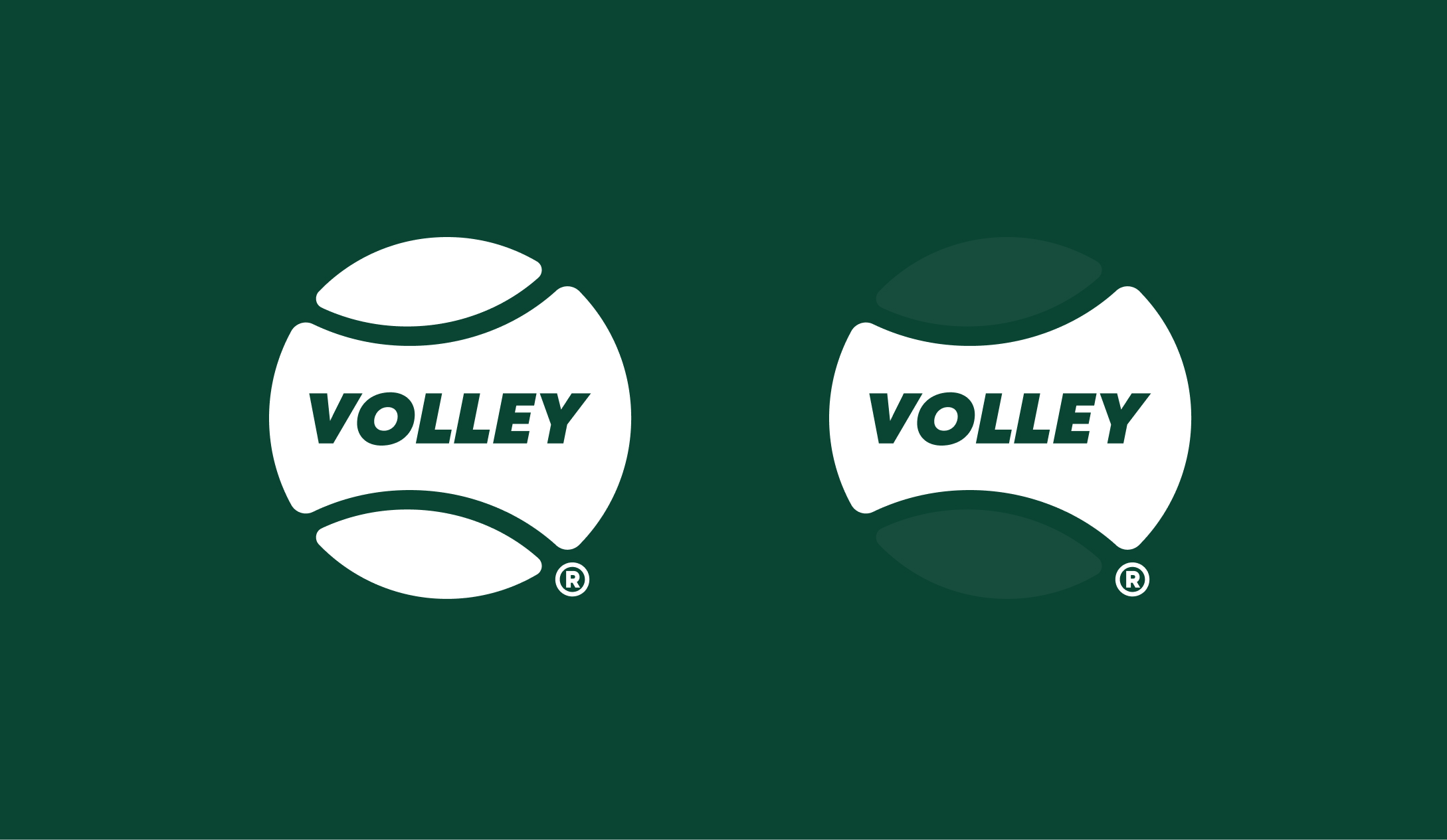
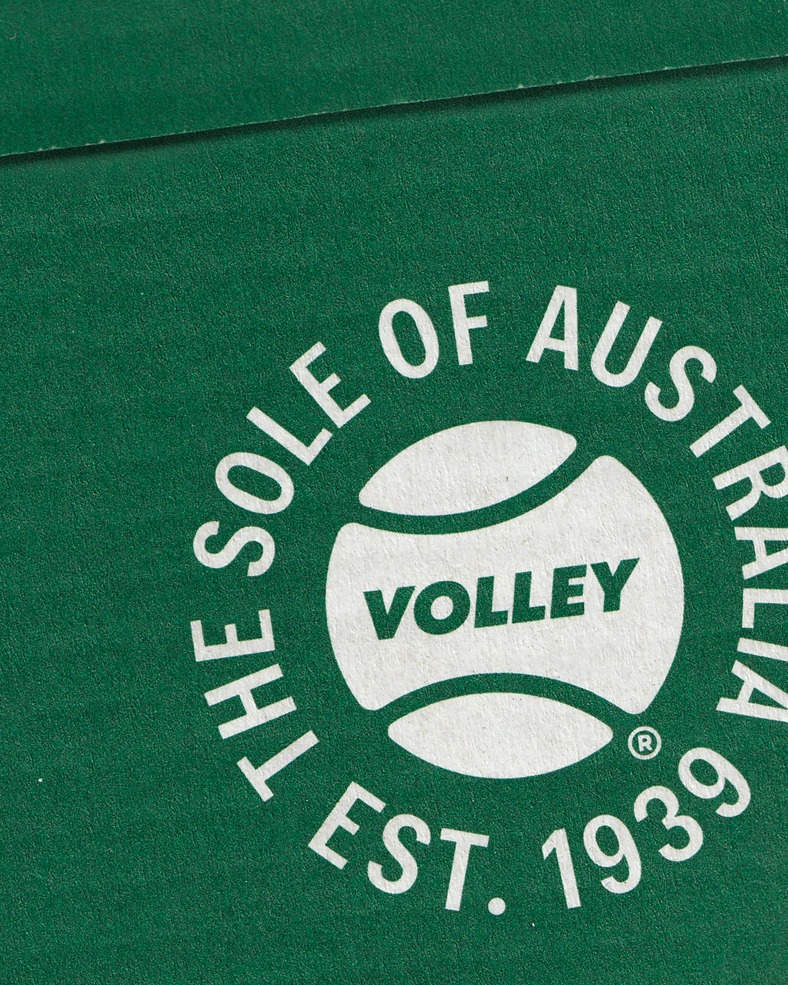
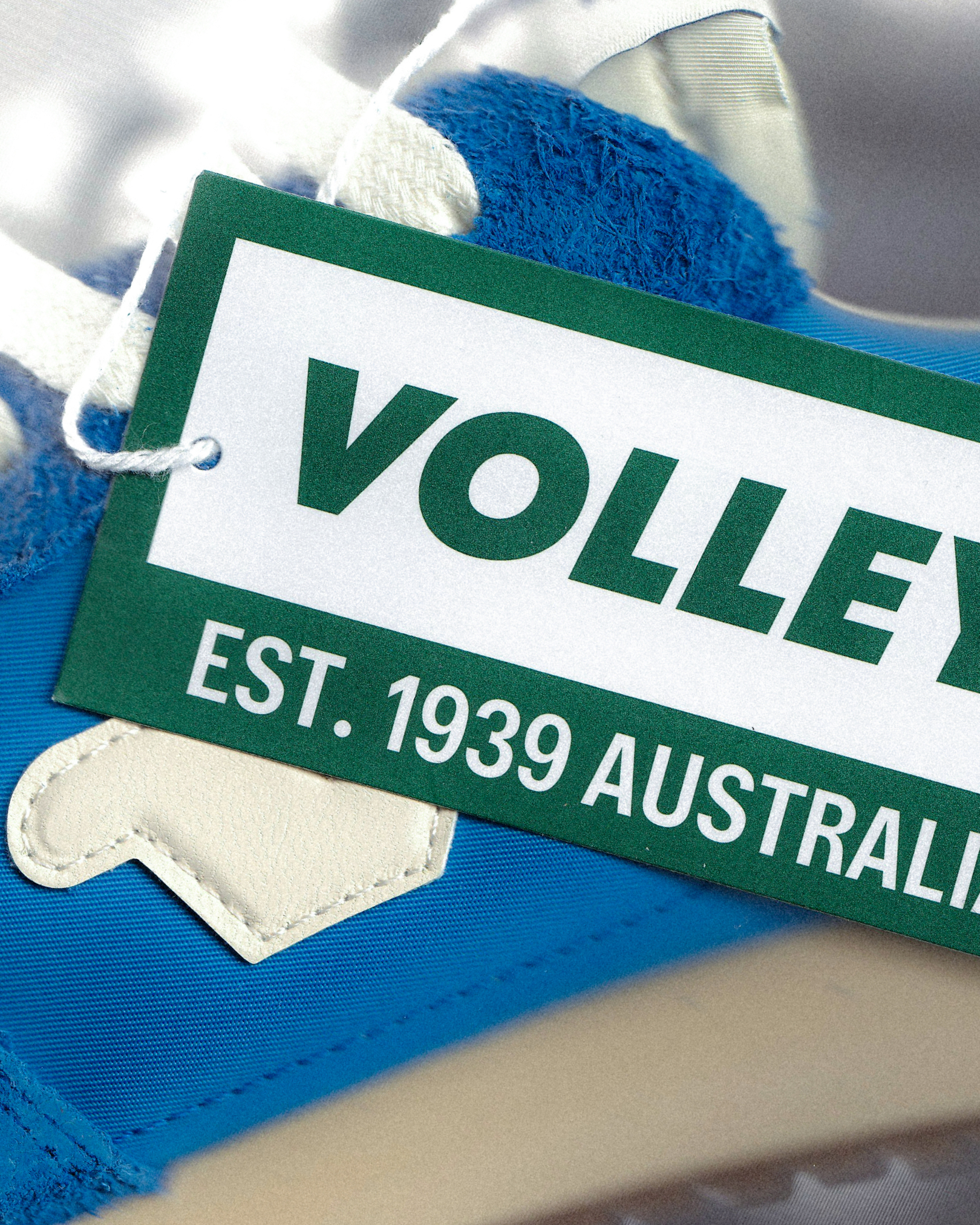
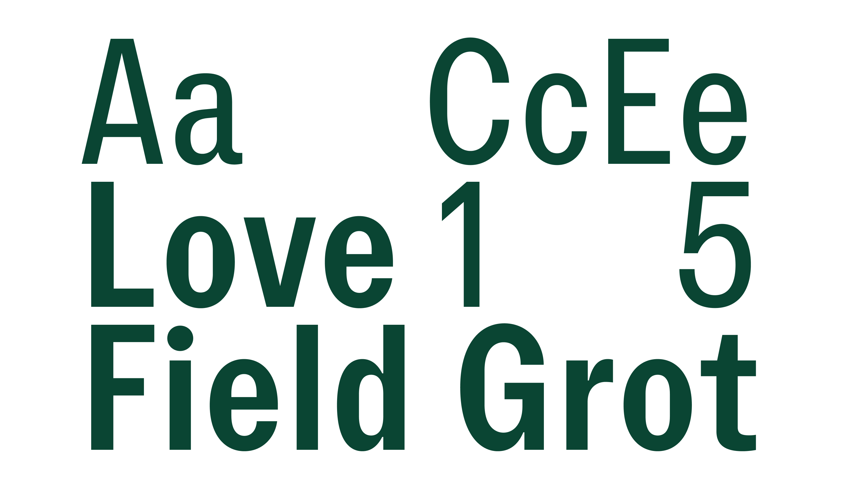
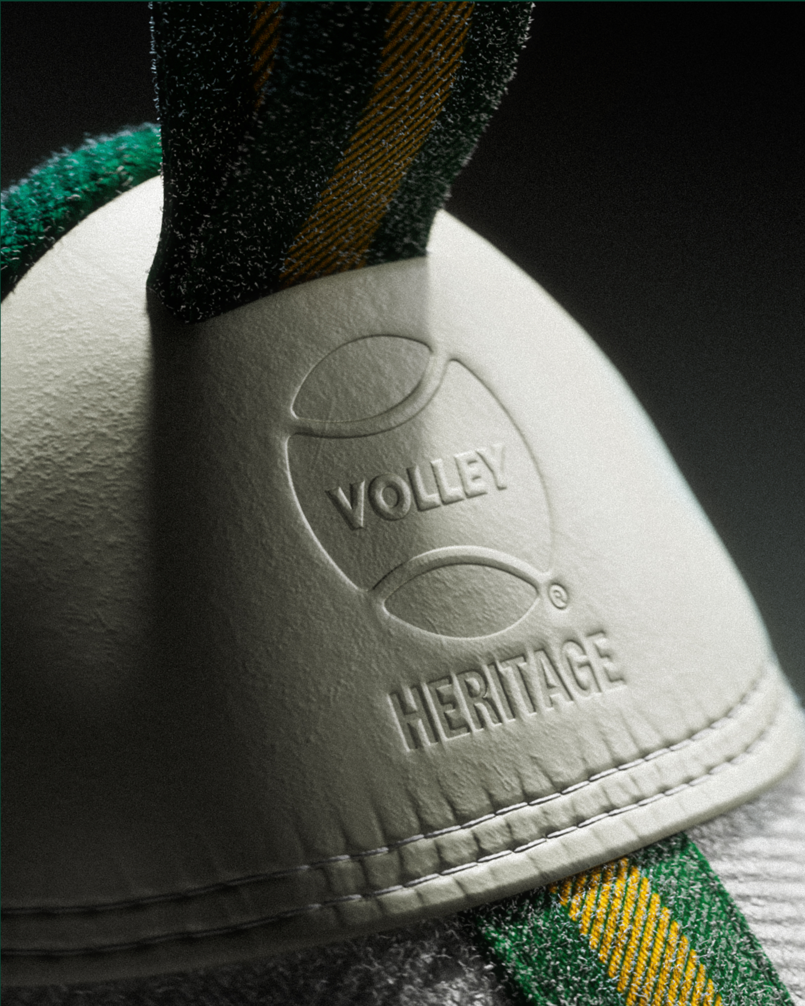
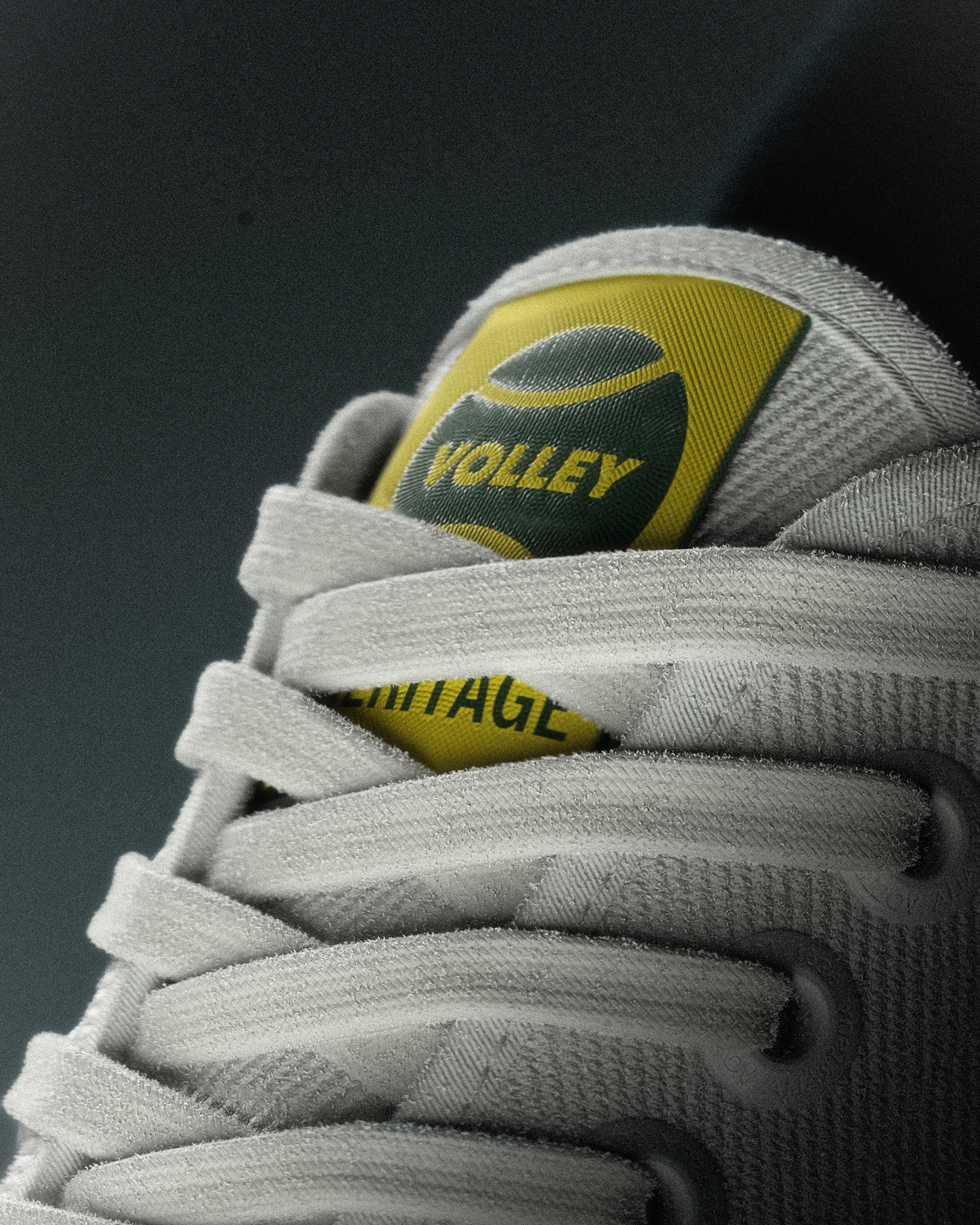
Our refresh was anchored in a simple, powerful idea: heritage. Volley’s story, and its ties to Australian culture, is both unique and ownable. At the centre of the identity is a typographic system built around a custom cut by local type designer Vincent Chan (Matter of Sorts*) – an expression that balances familiarity with a renewed sense of clarity and energy.
The visual language is designed to be dynamic and responsive, flexing across categories while maintaining a clear and unified voice. Typography scales, shifts, and activates across touchpoints and allows the brand to move fluidly between sport, lifestyle, and culture. The result is a refreshed identity that feels both familiar and new, grounded in legacy, and shaped for a new generation.