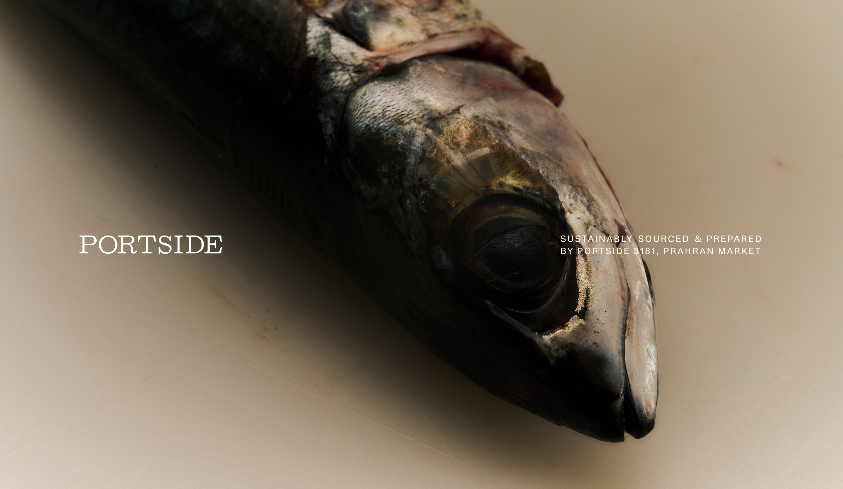
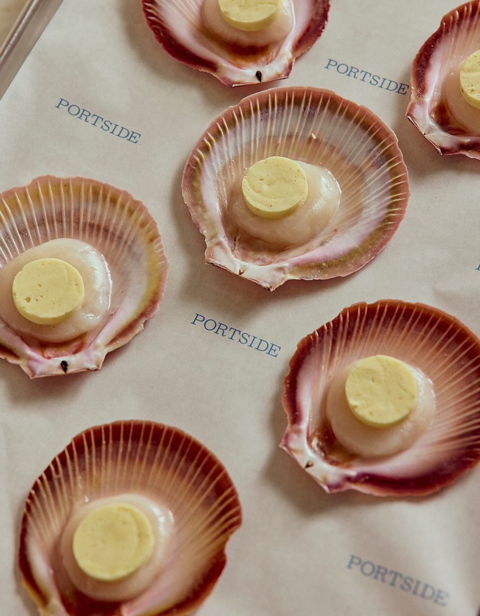
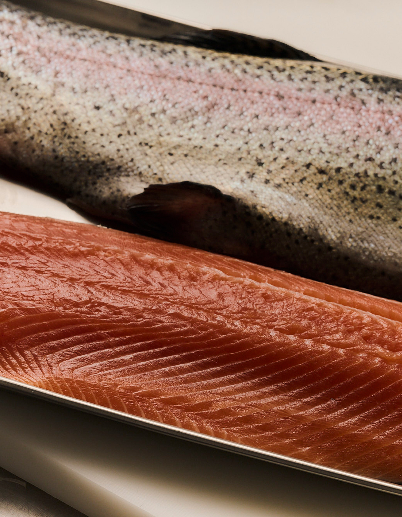
Portside is a contemporary fishmonger sourcing directly from trusted fishermen and producers across Australia. Drawing on years of experience in professional kitchens, the brand applies a chef-led understanding of quality, seasonality and handling to retail.
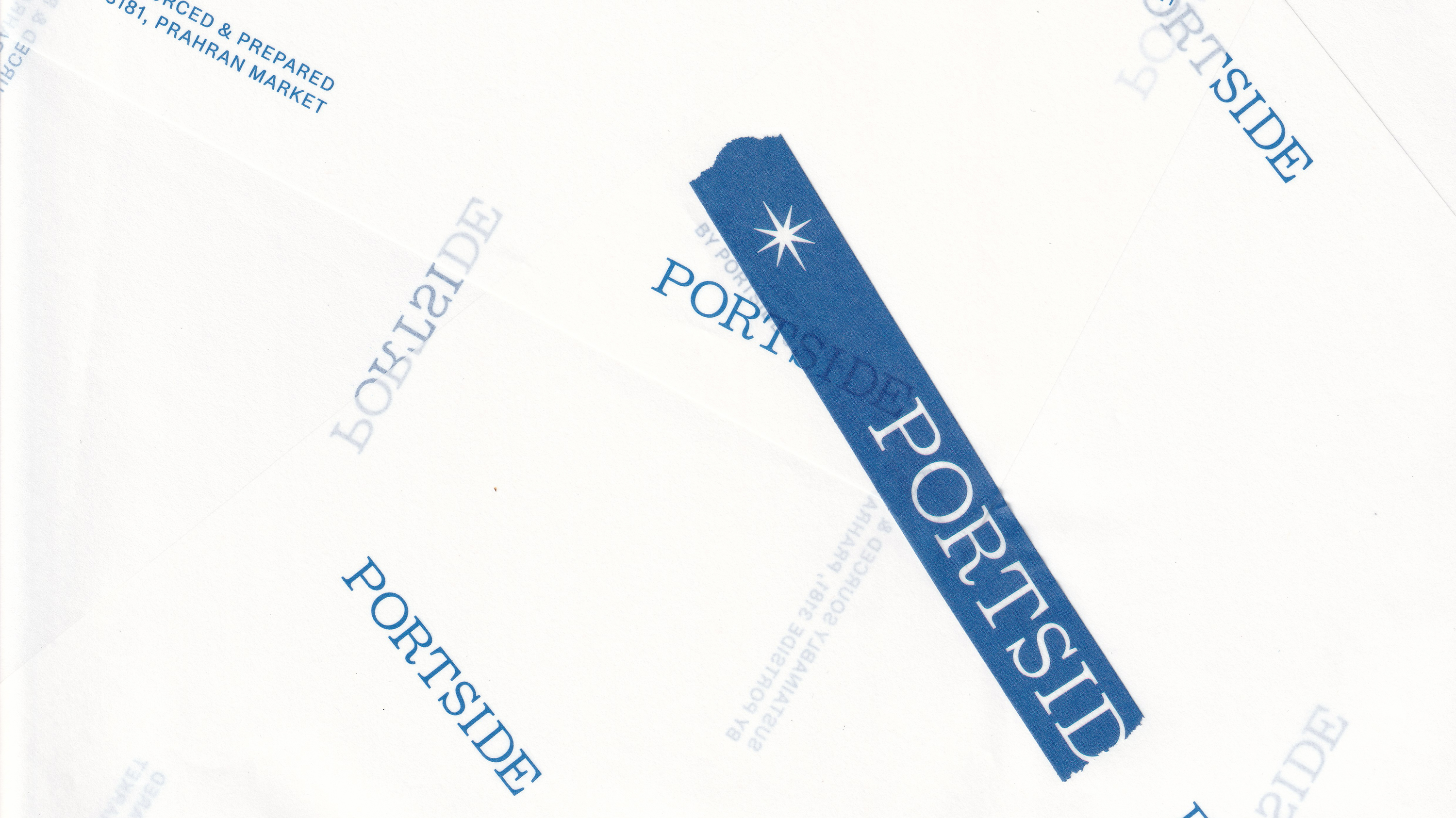
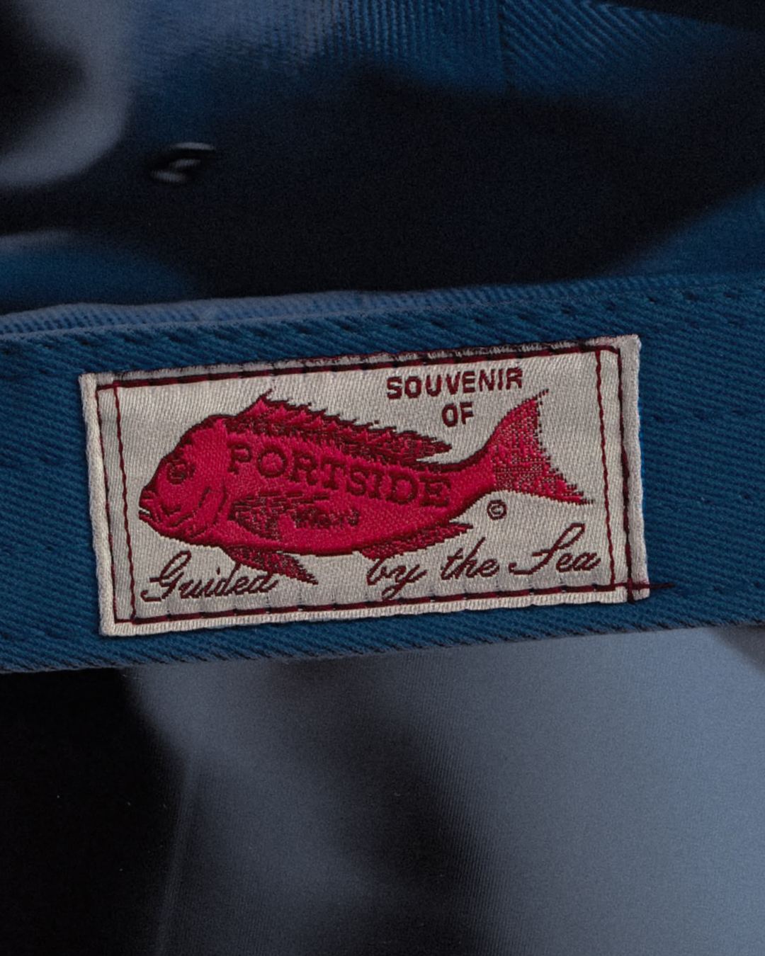
Our role was to translate this respect for the sea into an identity that feels considered and craft-led, yet approachable. Dewey Decimal by Monokrom Skriftforlag was selected for its human, editorial character that balances education and warmth. Subtle details within the wordmark quietly reference the world of fishing: barbed serif-like terminals and a gentle flick on the leg of the ‘R’ nod to hooks without becoming literal.
A defining horizon line anchors the flexible identity, extending seamlessly across packaging and communications. One disciplined principle governs the system: the Portside mark always sits to the left – a subtle but intentional nod to its namesake.
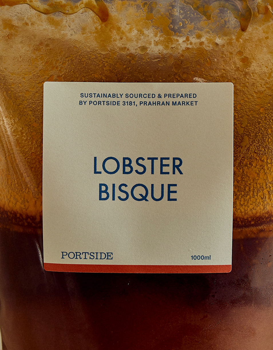
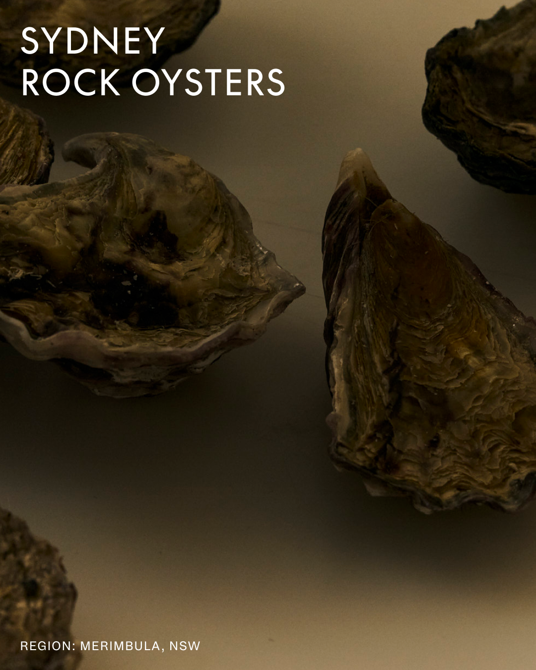
Rather than subverting category codes, the palette embraces the language of the sea, a primary pairing of deep blue and off-white, supported by an extended range used within the labelling system to denote key ingredients and seasonal variation.