Long-time friend and collaborator Alex Gavioli came to us with a clear ambition: to create a soft drink that defied the modern fixation on functional, health-first beverages. In a category dominated by reformulations and restraint, Joy stands for something different. Joy is a return to flavour, feeling, and full-bodied enjoyment.
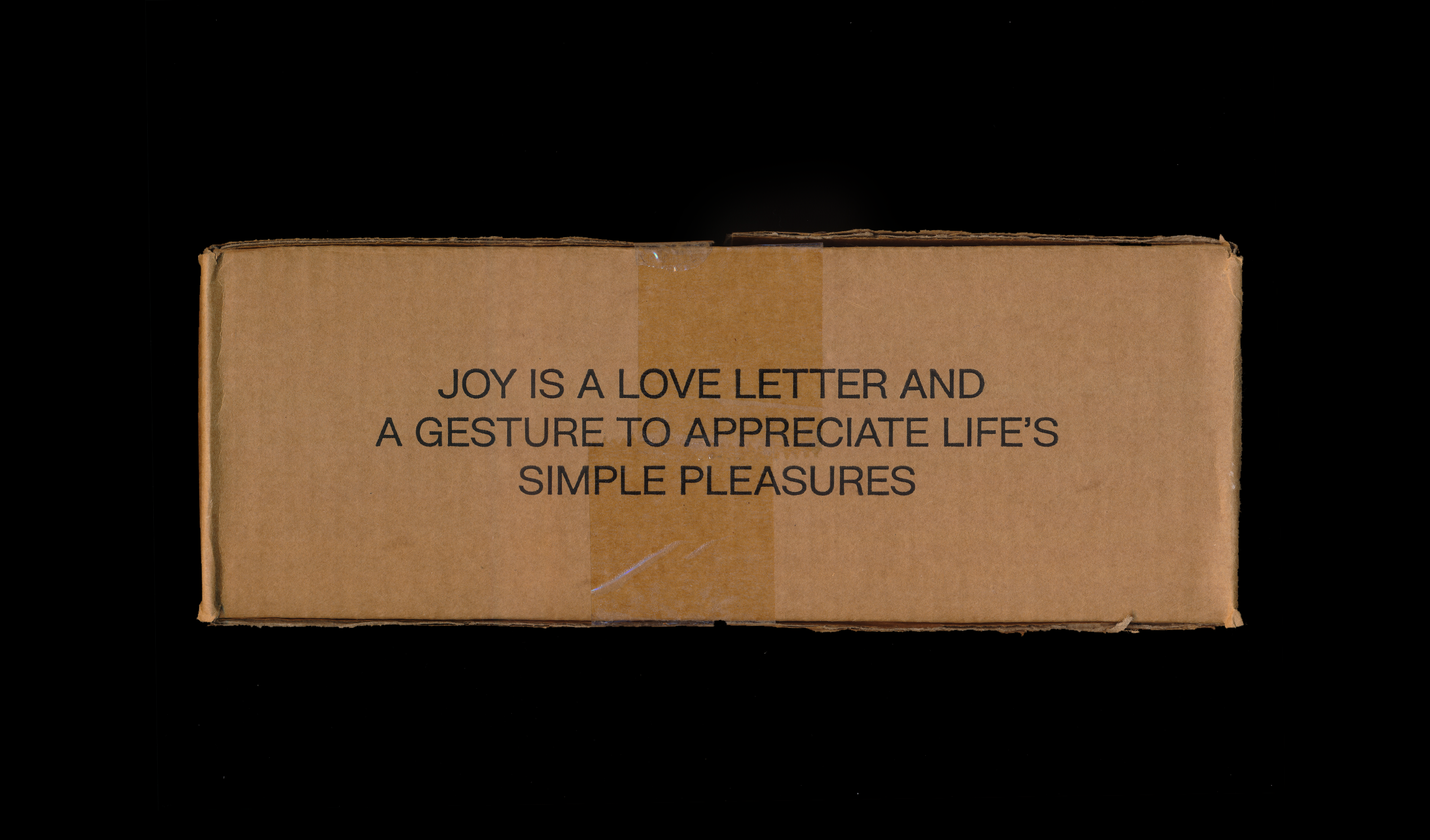
For the brand name, we wanted a word that was uplifting and uncomplicated. Joy captured the brand’s essence perfectly. It’s a love letter to the simple pleasures of life. A celebration of taste, nostalgia, and unapologetic indulgence.
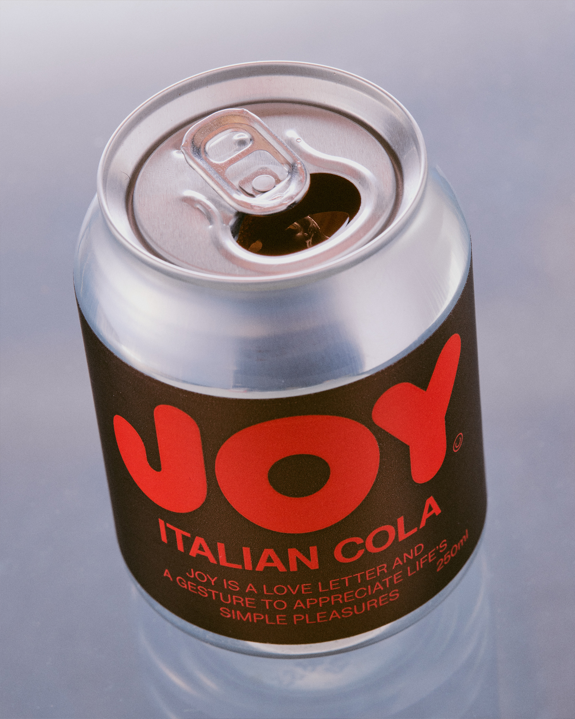
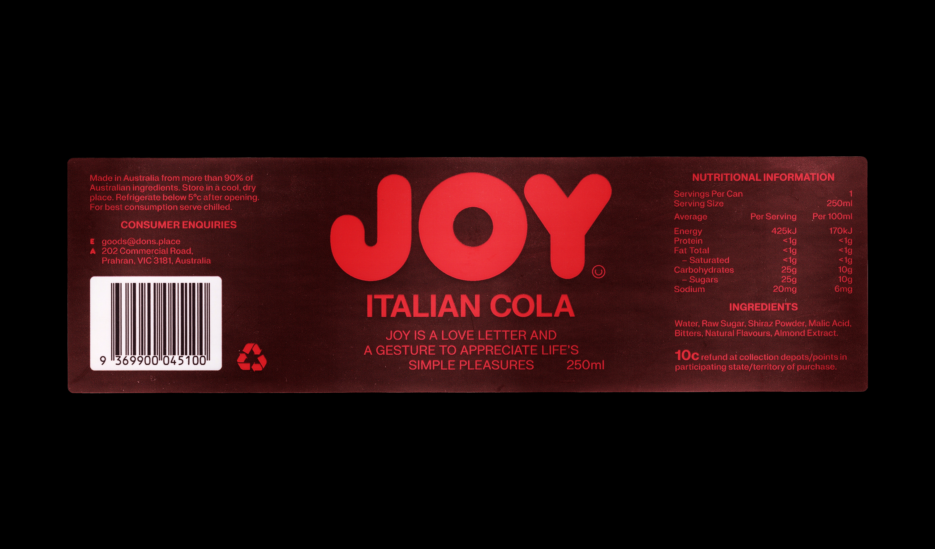
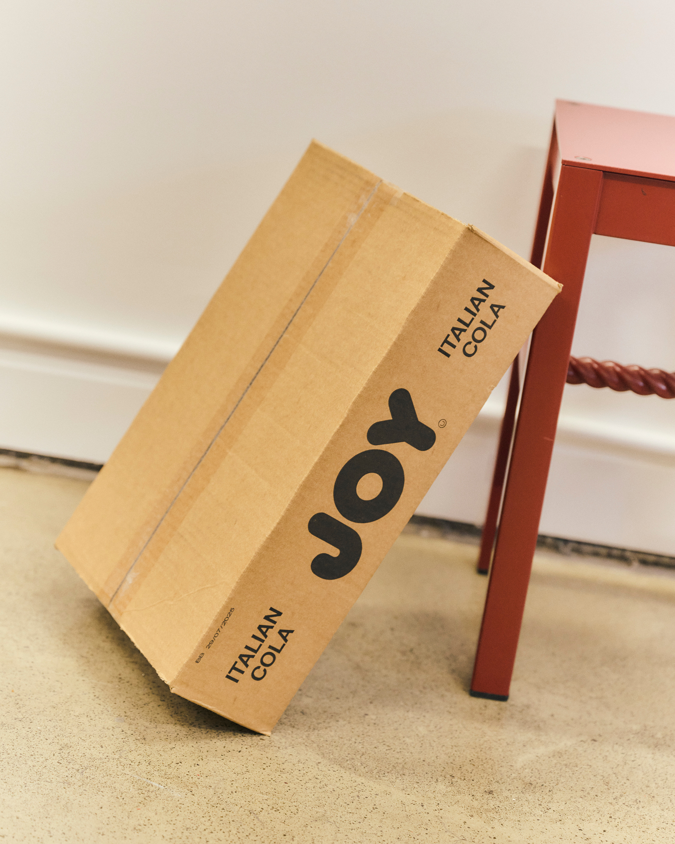
The identity is a bold contemporary take on a classic format. At its centre is Frankfurter, a typeface chosen for its big energy and timeless form. It evokes the warmth of Italian charm, a typographic nod to Alex’s cultural heritage, reimagined for today.
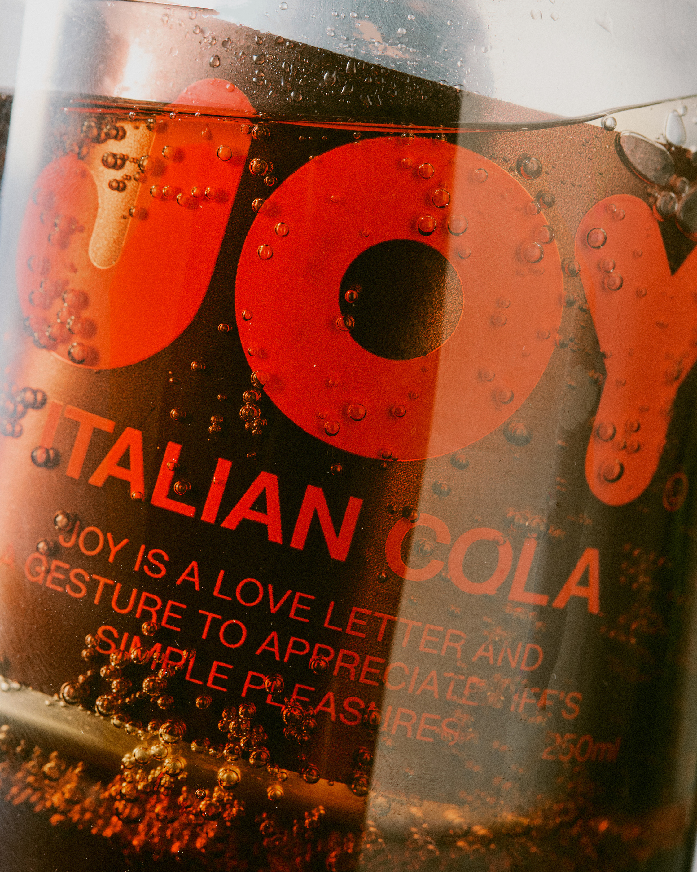
Packaging centres on a stubby 250ml can, a deliberate choice to break convention. Reflecting the brand’s concise nomenclature, its bold, compact form delivers immediate impact. A rich brown and red colour palette grounds the product in its core ingredient, cola, with tones that feel natural, warm, and unmistakably flavour-forward.
Full of sugar. Full of flavour. And full of intent. Because some things were just meant to be enjoyed.