Project
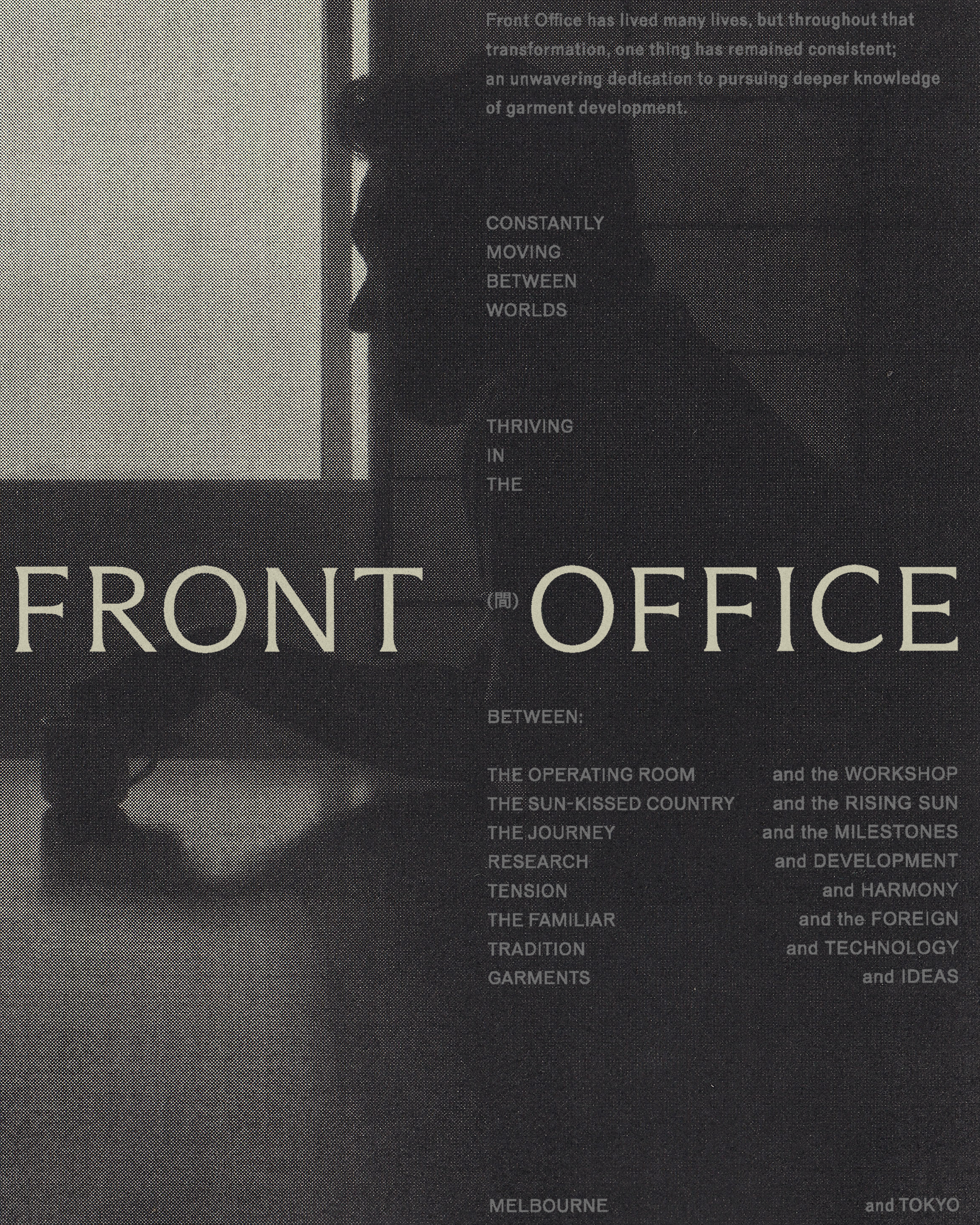
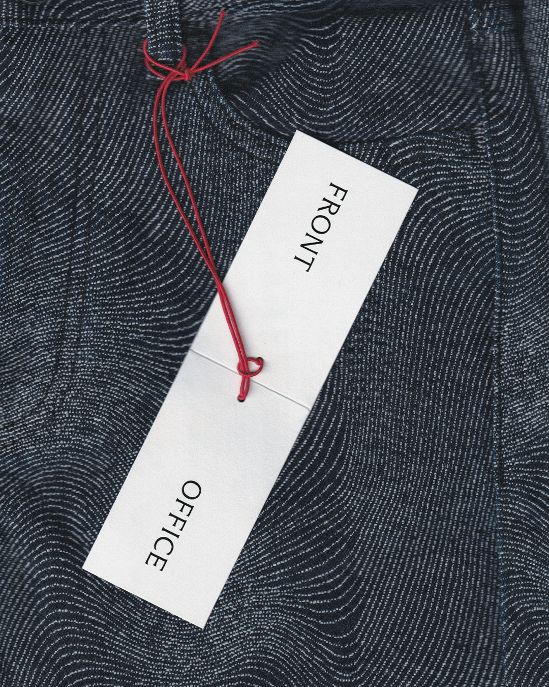
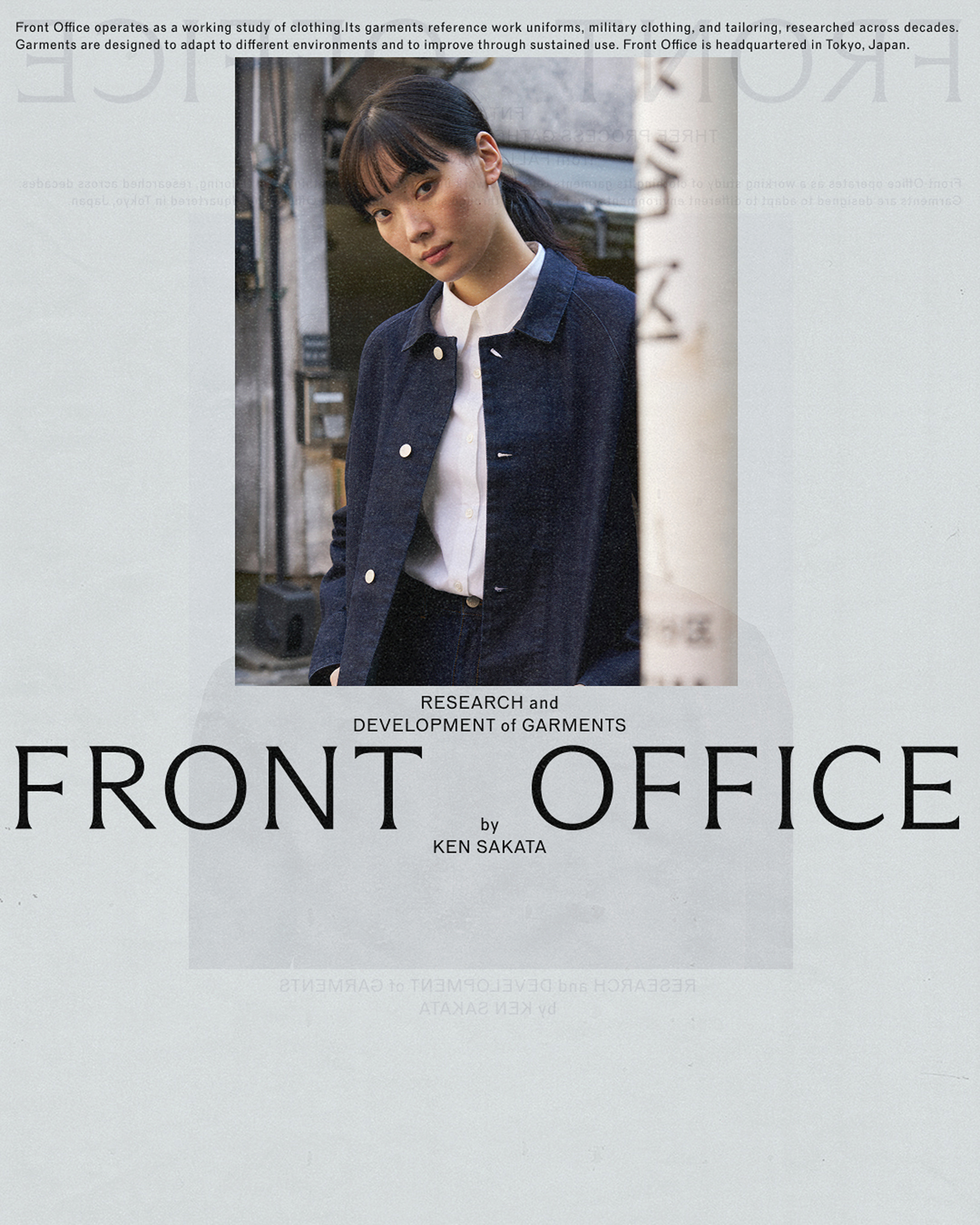
Front Office
Collaborators
Arizona Flare by @abcdinamo
Reform Grotesk by @forgotten_shapes
With @m.souvanthalisith
Services
Front Office was founded by Ken Sakata, a doctor turned fashion documentarian, designer, and a trusted voice on sartorial culture. Since producing meticulously researched content on all things fashion, Ken has built a dedicated, cult-like following. What began as a personal fascination has evolved into a distinct voice and recognised presence within the online fashion community — leading to conversations with the Errolson Hugh of Acronym, the creative director of Uniqlo to digging through the archives of C.P. Company with Lorenzo Osti.
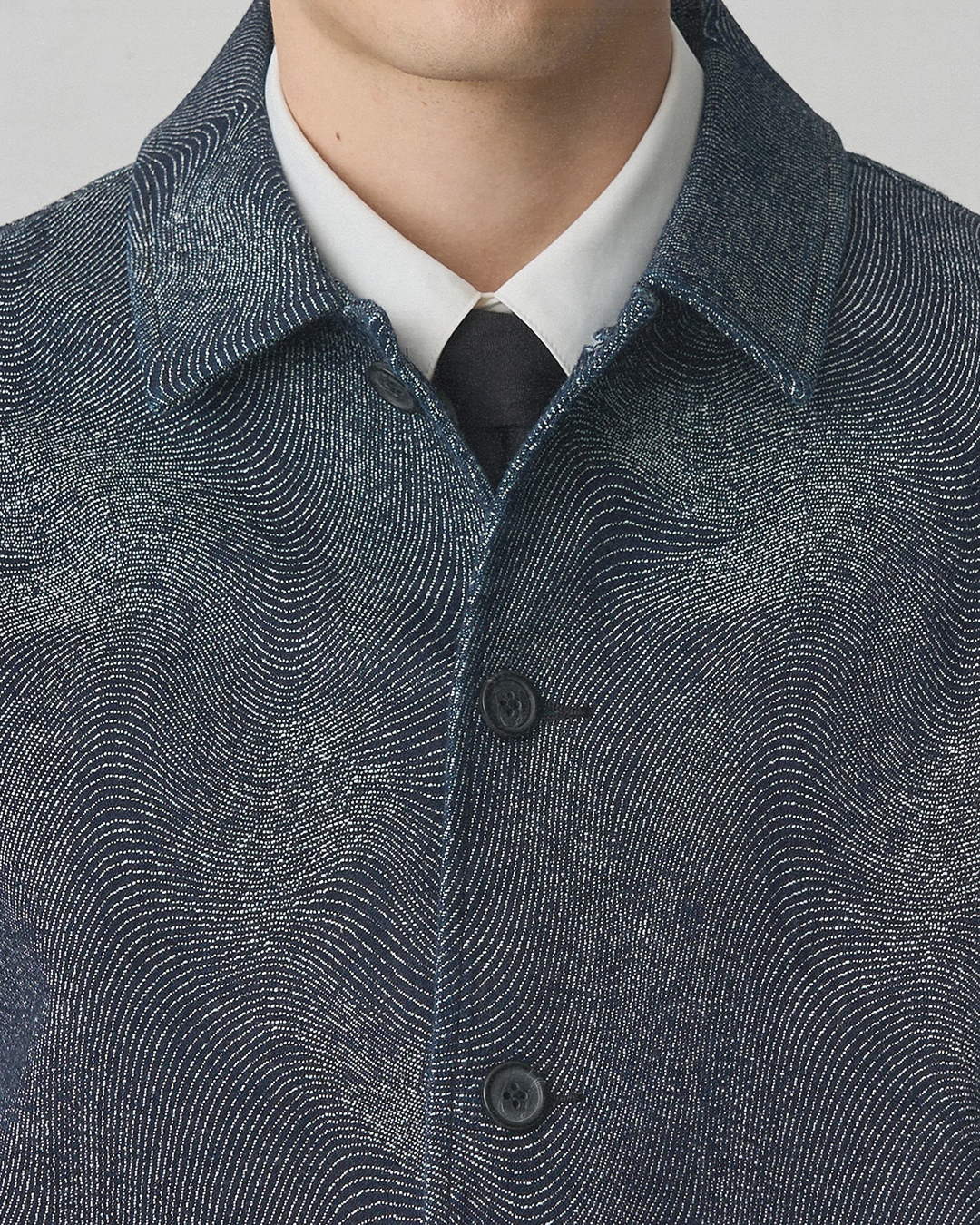
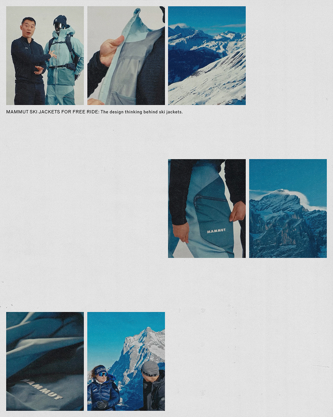
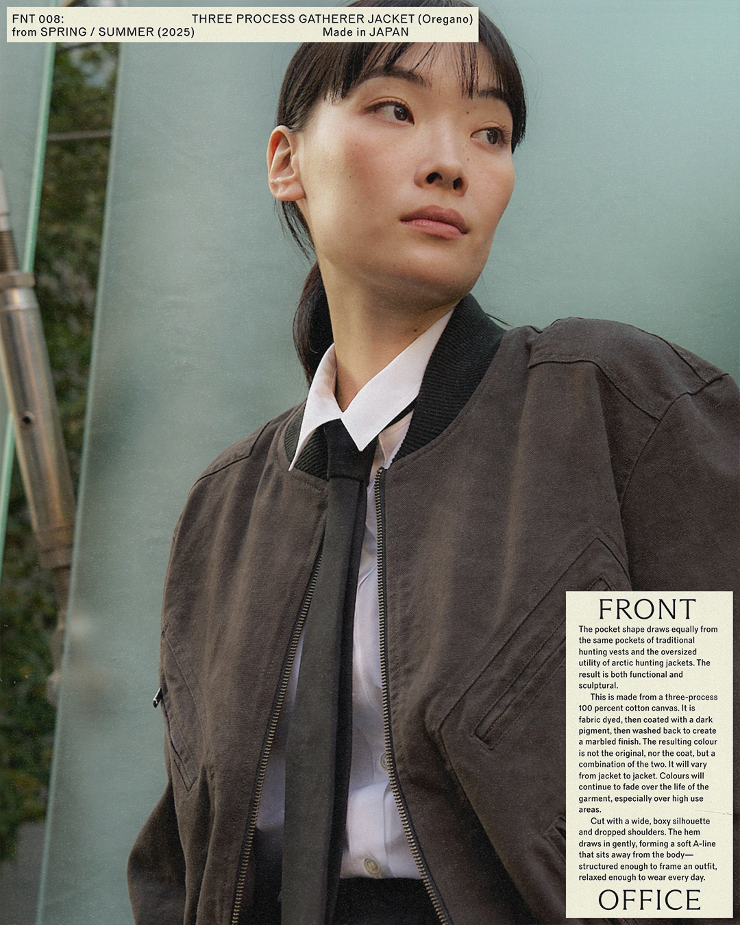
The label is a natural extension of Ken: a practice grounded in deep knowledge, rigorous research, and an enduring commitment to craft. From considered fabric selection to the recontextualisation of archival garments, Front Office exists as both study and expression. In only a short three years since the inception of the brand, Ken has collaborated with the likes of C.P. Company, The Woolmark Company, and Mammut, among others.
Our role was to translate this depth into a visual identity that reflects Ken’s duality: the researcher and designer, the familiar and foreign, east and west, tradition and technology. What emerged was a well groomed design system that embraced deliberate tension, a balancing of expression with restraint, and a resounding confidence.
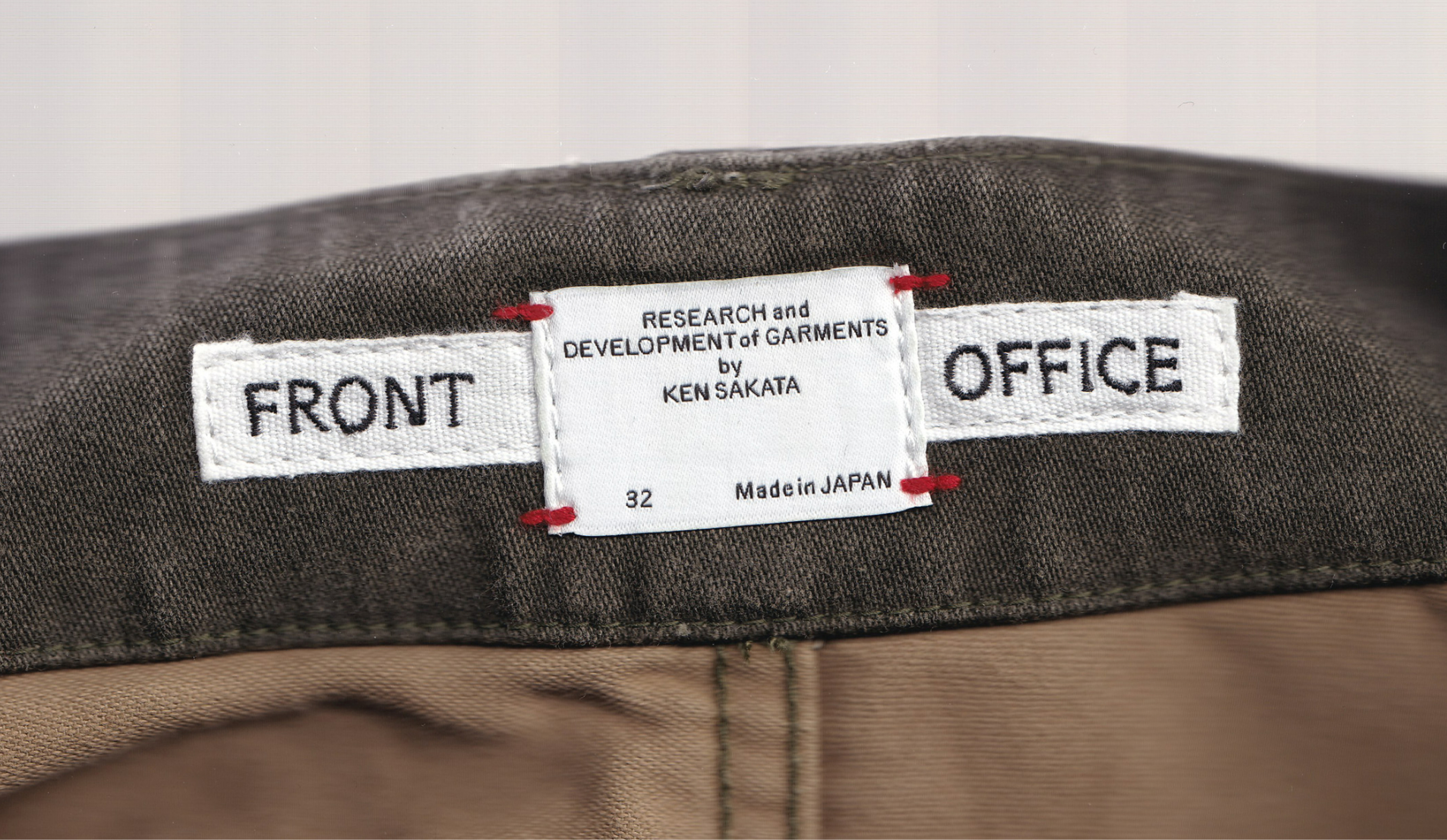
Every detail of the brand was combed through and crafted to mirror Ken's pursuit of knowledge and craft. The brandmark is set in ABC Arizona Flare, chosen for its subtle detailing that positioned itself somewhere between a Japanese Mincho and Gothic typeface. Surrounding it is a typographic system built on Reform Grotesk by Forgotten Shapes, a workhorse typeface informed by the principle of Werktreu (the faithful revival of historical forms). Together, the typography signals a sense of history and archival continuity.